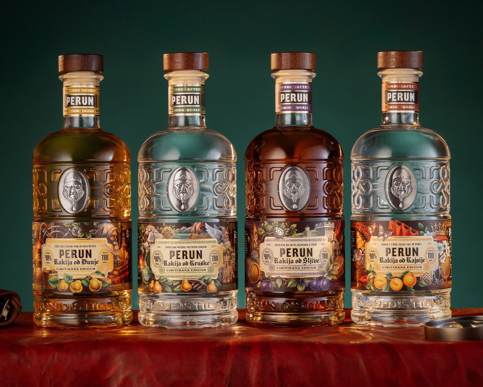
We are happy to share our latest packaging design project: a complete rebrand for Perun Distillery’s range of fruit brandies, including Plum, Quince, Apricot, and Pear. This follows our successful redesign of their gin label, and we are very pleased with the outcome of this new endeavor.
Our primary goal with this rebranding was to create labels that deeply resonate with the rich heritage and powerful imagery of Perun, a revered deity in ancient Slavic mythology. To achieve this, we integrated medieval motifs and developed intricate illustrations that evoke this historical period, giving each fruit brandy its unique visual narrative.
Plum Brandy: As the most popular and well-known brandy in the region, its label symbolizes strength and bravery.
Apricot Brandy: Representing beauty and daintiness due to its gentle taste, this label features Lada, the ancient Slavic goddess of beauty and harmony.
Quince Brandy: Its label is designed with motifs signifying knowledge and wisdom.
Pear Brandy: Drawing inspiration from folk tales where the pear tree is associated with “evil” and mythical creatures, this label embodies imagination and fantasy.
To achieve the best visual effect for these labels, we used two foils (silver and gold) and transparent varnish in the printing process. We believe these rich and evocative designs effectively communicate the essence of Perun Distillery, allowing their fruit brandies to stand out on the shelf while honoring their profound cultural inspiration.


