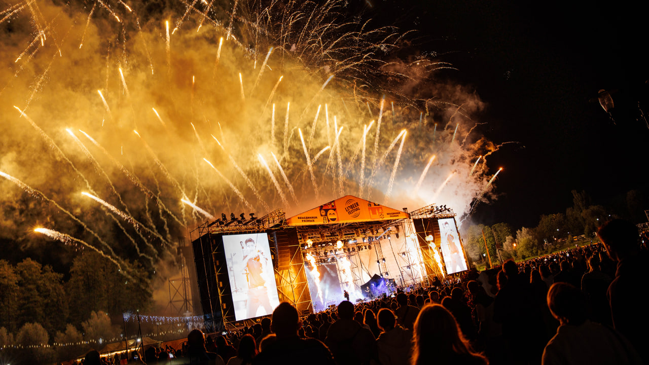
LIDBEER is not just about music and beer. It’s a magnet that draws people together — where the energy of the crowd, the rhythm of live performances, and the joy of meeting friends create a unique atmosphere. To capture this scale, we had to create not just a style, but a complete visual system that would fill the entire space.
We developed a visual language built on the emotions of the festival:
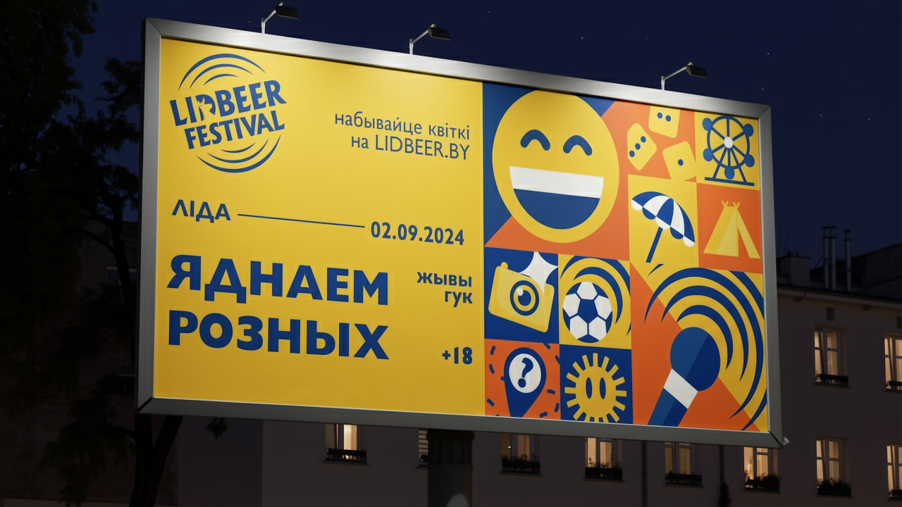
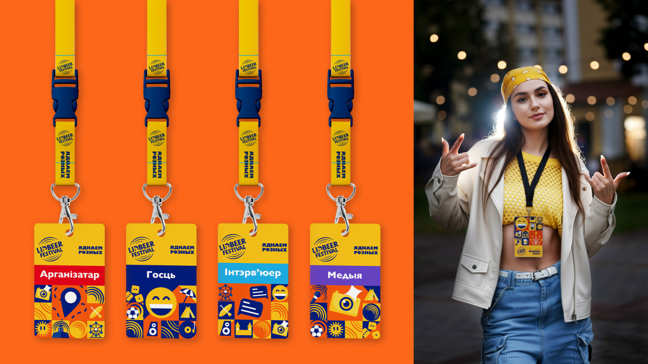
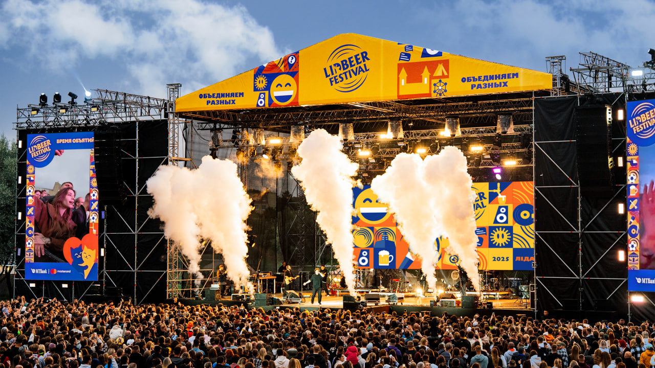
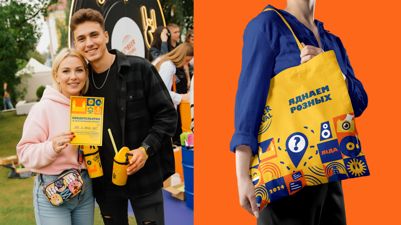
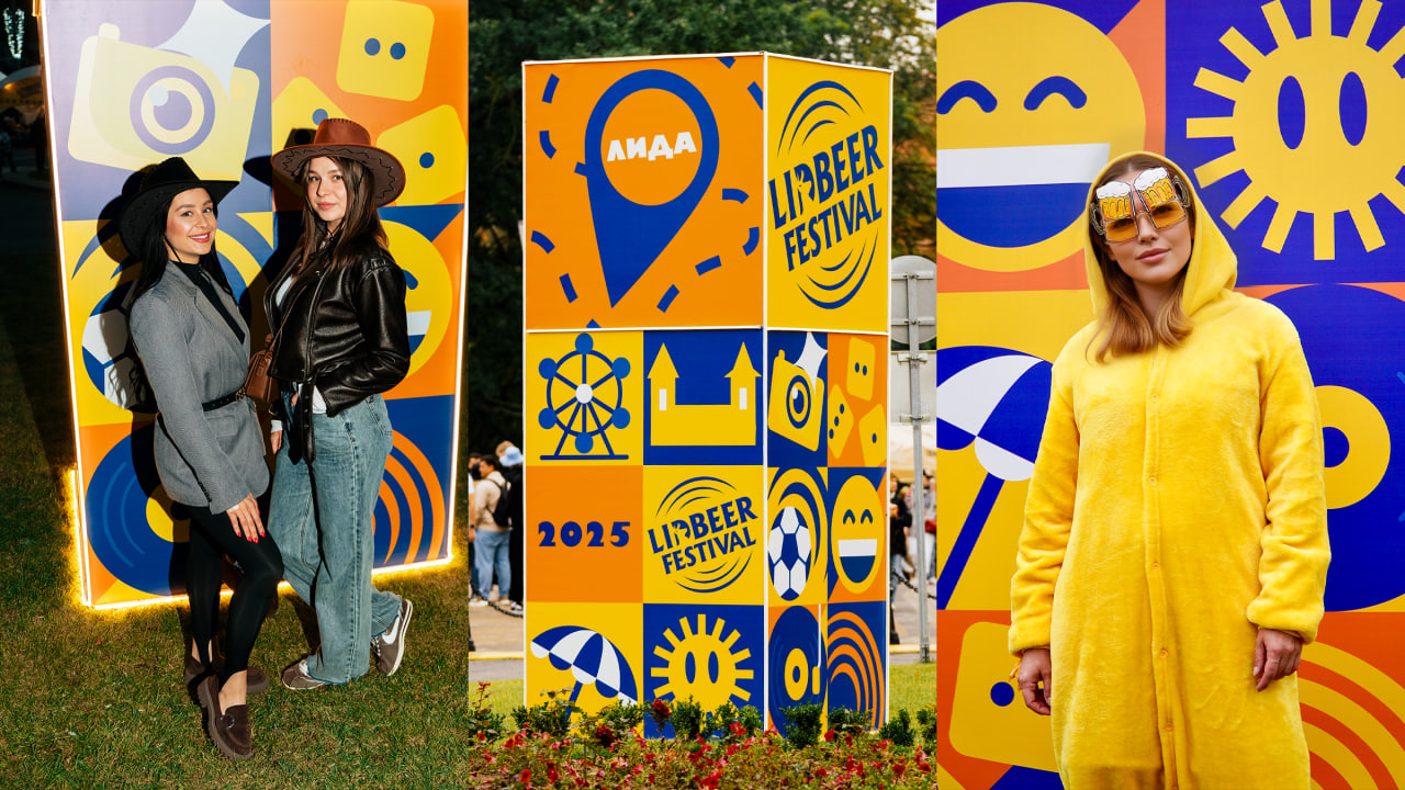
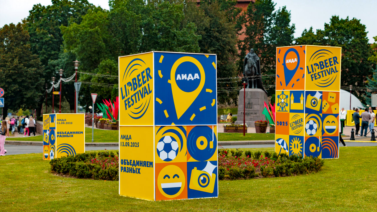
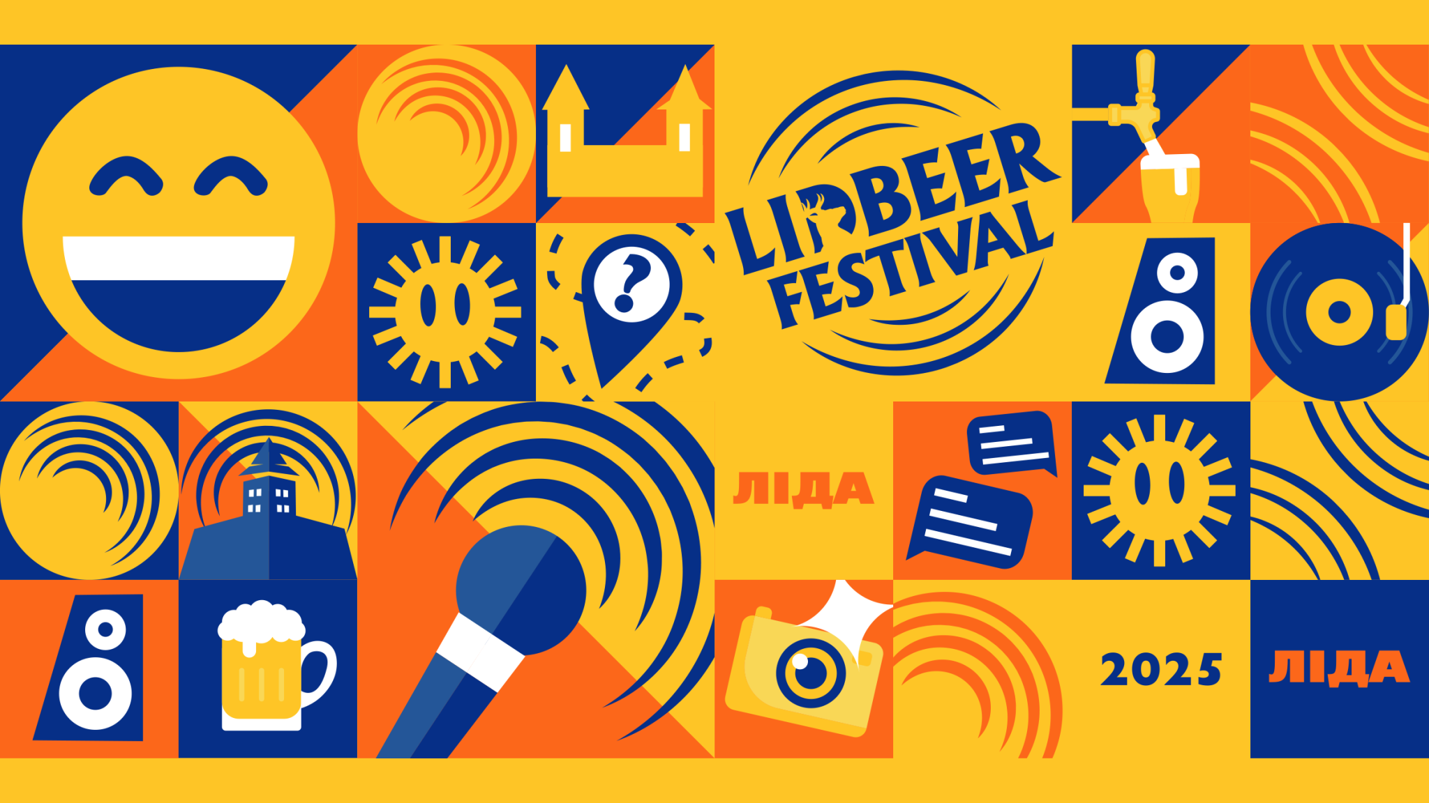
Mood palette: the energy of yellow (stage lights), the drive of orange (the taste of fresh beer), and the depth of blue (the rhythm of night music).Dynamic graphics: arcs from the logo transformed into rhythmic lines, setting the beat for the whole system.User-friendly pictogram system: icons (castle, beer, music, photo, microphone, speaker, and many more) created a simple and recognizable visual code for navigation and merchandise.
Result: This system came alive across all media — from the grand main stage and navigation to badges, souvenirs, and the style of social media posts. Every element now works for a single idea, expressed in the slogan “Яднаем розных!” (“Uniting Different People”).
The new identity doesn’t just decorate — it amplifies the experience, creating a vibrant atmosphere of togetherness.