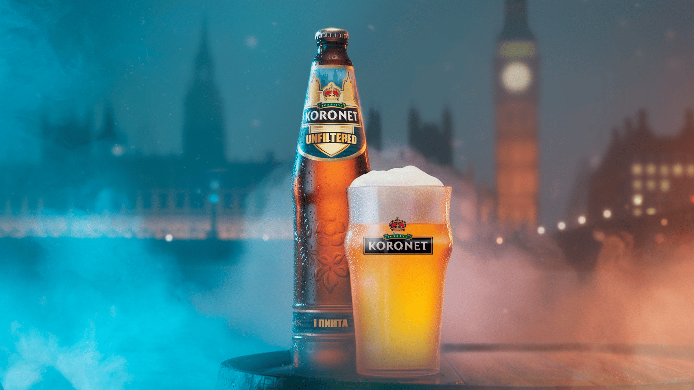
The project became a continuation of our successful collaboration with the Koronet brand, for which we had previously created label designs for the Pub Draught and McKilt varieties. This time, the task was to develop a label design for a new premium beer — Koronet Unfiltered — in a distinctly British style.
The key challenge was to embody the concept of “mist”: the unfiltered nature of the beer became the foundation of this idea. The goal was to convey it visually — to make the mist look atmospheric, British, yet at the same time modern and appealing, rather than dull or gloomy.
As the central element, we proposed a stylized image of London Bridge set against the silhouette of a big city. This recognizable symbol instantly evokes the right associations with Britain and sets the desired mood.
We used a palette of muted gray and silver shades to create the effect of London fog.
The hazy golden tint of the beer itself became the starting point for building the atmospheric background of the label. Through the smoky backdrop — reminiscent of the morning mist over the Thames — the familiar silhouette of London emerges. In the foreground, the iconic bridge rises majestically, serving as a symbolic hallmark of the variety.
The entire composition creates a coherent image that tells the story of authentic English beer, born in the heart of the “foggy Albion,” from the very first glance.
Result: The client was fully satisfied with the final outcome. The Koronet Unfiltered label accurately reflects the product concept, aligns with the brand’s premium positioning, and stands out effectively on the shelf despite the limited design space.