About:
Millet Matters was born from a vision to reintroduce India’s ancient grains in a form that fits modern life. The founders wanted to make 100% millet-based foods accessible, tasty, and aspirational bridging traditional nutrition with a contemporary lifestyle.
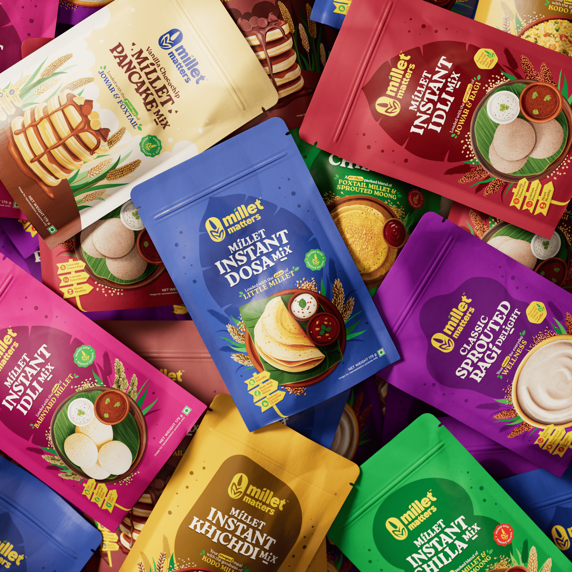
Challenge:
The millet category was still emerging, often seen as either too rustic or too health-focused to appeal to the wider market. Most brands compromised by blending millets with other grains or preservatives. The challenge was to build a distinct identity and packaging system that looked fresh and premium, yet stayed rooted in authenticity.
Solution:
We positioned Millet Matters around the Explorer archetype, reflecting curiosity, adventure, and mindful living. The visual language combines a vibrant color palette, modern typography, and a signature millet-inspired “m” symbol to express purity and progress. The packaging system was designed to stand out on shelves through strong hierarchy, bold product illustrations, and approachable design language making healthy choices feel exciting and easy. From strategy to execution, every touchpoint reinforces the idea of discovery and nourishment.