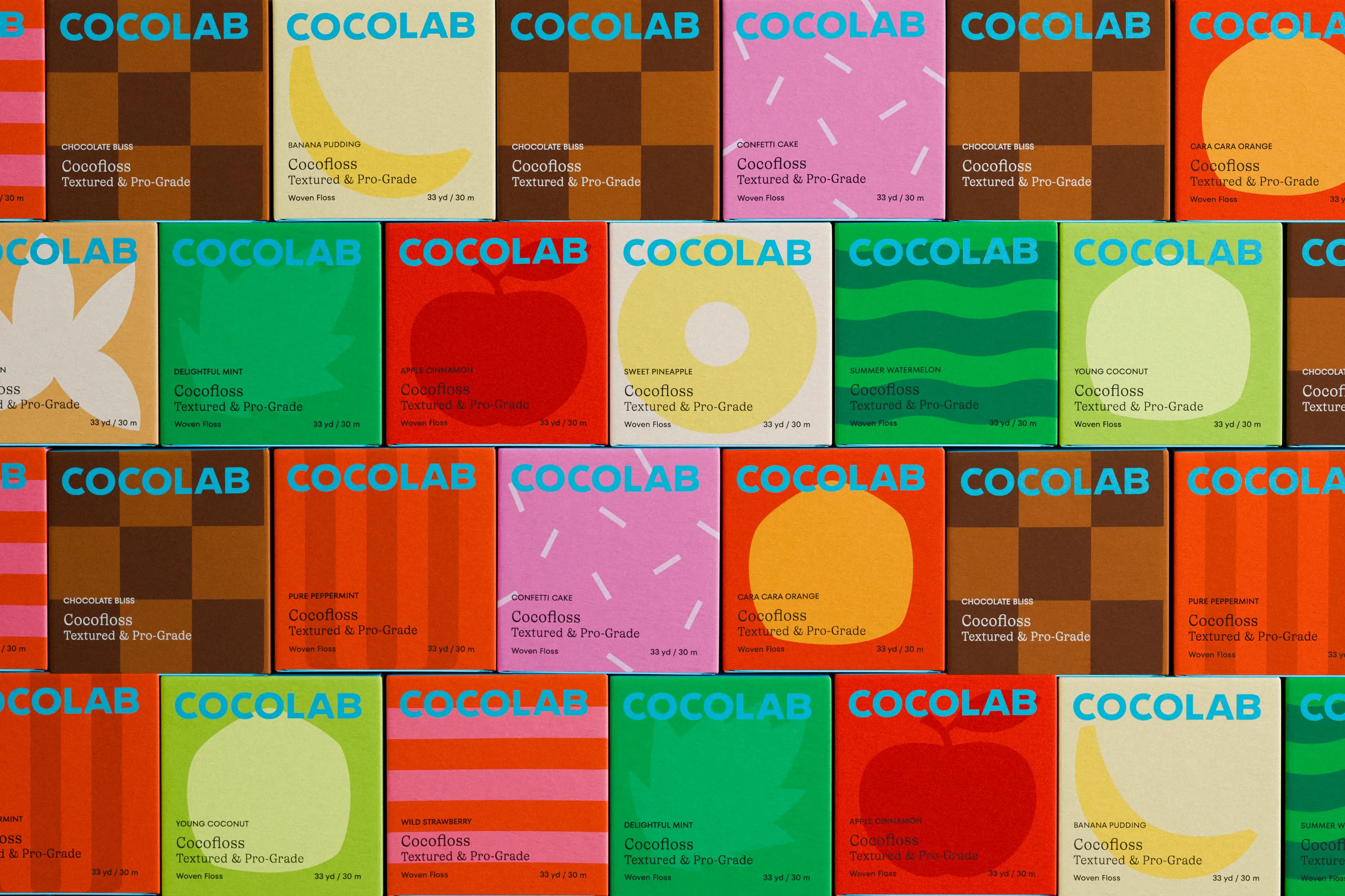

In this Curator’s Insight, let’s take a look at Cocolab designed by Wedge.
What’s striking here isn’t just the colour explosion… it’s the confidence. Most oral care brands whisper “clinical.” Cocolab basically walks into the aisle wearing a neon jacket and says, “Relax, we got this.”
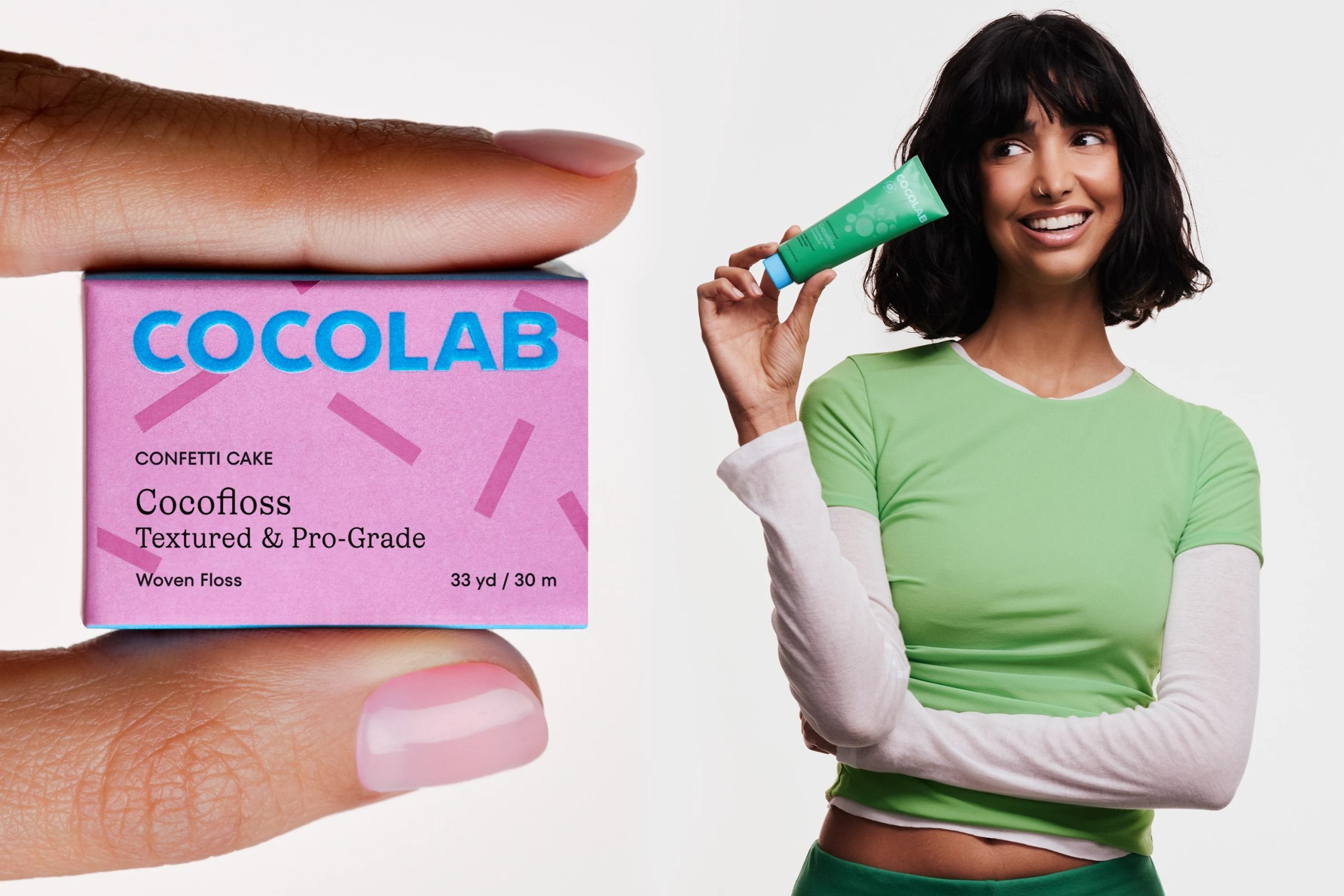
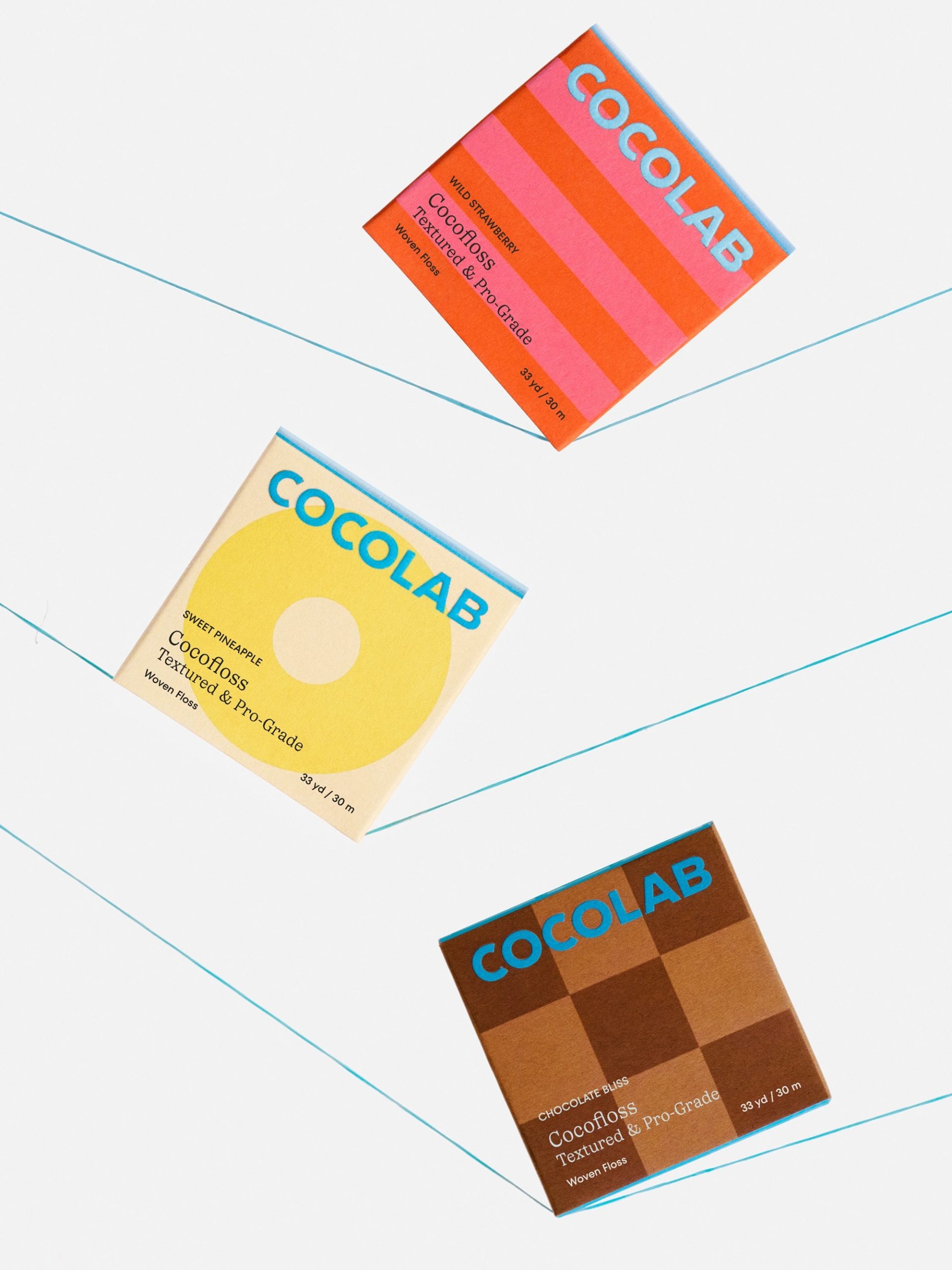
The first genius move? The square format. Floss usually hides in awkward blister packs. Here, it behaves like a collectible object. It feels closer to boutique soap or indie chocolate than dental supplies. That shape alone reframes floss as a lifestyle accessory, not a guilt purchase at checkout.
Then there’s the flavour storytelling. Instead of literal fruit photos (thank goodness), the design uses bold, simplified graphic forms — a flat yellow ring for pineapple, a chunky red apple silhouette, chocolate rendered as a checkerboard block. It’s abstract but obvious. That balance is hard to nail. It feels artistic without becoming confusing. You don’t need to “decode” it.
The typography pairing is another subtle flex. “COCOLAB” in that bright blue sans serif feels modern, punchy, almost tech-brand confident. Underneath, the serif for “Cocofloss Textured & Pro-Grade” adds maturity and authority. It’s basically saying: we’re fun, but we also know what plaque is. That tension is intentional — and smart.
Colour psychology is doing heavy lifting here. These aren’t safe pastels. They’re saturated, almost edible tones. The brown for Chocolate Bliss doesn’t feel like medical brown — it feels like dessert. The pink stripes for Wild Strawberry feel like candy packaging. The mint green is playful, not icy sterile. The whole shelf becomes a dopamine wall. And here’s the thing: when products look collectible, people buy more than one. That’s retail psychology 101, executed beautifully.
Another underrated move? The consistency of layout. Every box follows the same grid. Brand at top. Illustration central. Product info anchored. That system makes the chaos of colour feel controlled. Without that structure, it would look like a kids’ art project. With it, it looks curated — like a MoMA gift shop moment, exactly as intended.
And let’s talk about shelf impact. When lined up together, the boxes form a modular colour mosaic. It’s Instagram-ready without trying too hard. That repeat pattern effect makes the brand bigger than each individual SKU. It’s not just packaging — it’s visual merchandising built into the design.
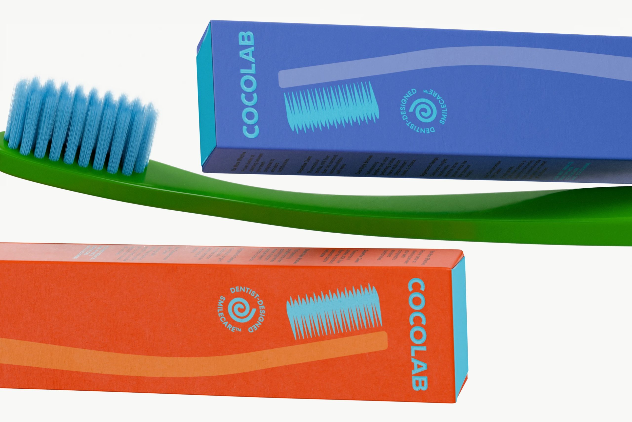
My personal take? This is less “oral care rebrand” and more “category rebellion.” They didn’t just tweak blue to teal and call it innovation. They redefined what dental products are allowed to look like. And they did it without losing trust signals. “Dentist-designed” is still there. “Pro-Grade” is still there. But now it’s wrapped in joy.
The real brilliance is this: the packaging makes brushing and flossing feel like self-care instead of maintenance. It borrows cues from beauty and specialty food. It makes you want to display it on your sink instead of hiding it in a drawer.
 lunapanda
 Tridimage
 Analoguecreative
 lettera7
 alchimistestudioParis
 Lana B
 Colossal
 Pivot Studio
 M&A CREATIVE AGENCY
 monther al omari
 Anastasia Cherepanova | xtramez
 Hollóka Grafikai Műhely / Graphic Design Studio
 BOLD branding
 Antonia Skaraki
 Pâmella Lorrany
 Z9BKAdsgn
 Francesco Paternoster
 b1studio.ro
 Chris Creative Works
 Boordon
 Dmitriy Kuzovlev
 Brand Society
 yasharpic