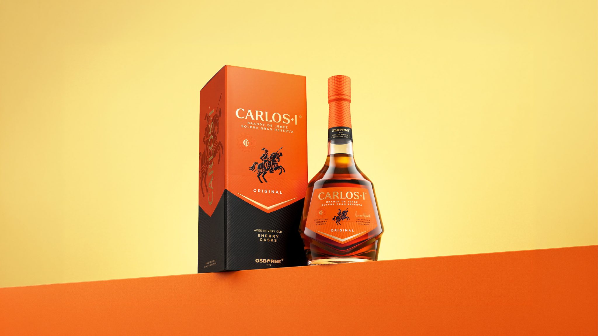

Carlos I, one of Spain’s most distinctive dark spirits, enters a new era with a powerful packaging redesign by Appartement 103, bringing renewed visibility, confidence, and desire to its iconic portfolio.
Born in Jerez and shaped by more than 135 years of expertise, Carlos I is defined by grape distillation, the Criaderas and Solera ageing system, and maturation in very old Osborne sherry casks. Its name evokes stature, its liquid speaks of depth, and its heritage remains singular within the world of premium dark spirits.
Yet, in an increasingly competitive category, the brand’s prestige and historic codes had become more admired by those who knew it than immediately noticed by those discovering it. The opportunity was not to make Carlos I louder for the sake of attention, but to give a spirit of such commanding origin, character, and legacy the visual presence it deserved.
Appartement 103’s ambition was clear: to transform Carlos I from a brand of quiet gravitas into one of magnetic presence, without sacrificing the heritage that made it iconic. This was not an exercise in reinvention, but in revelation.
At the heart of Appartement 103’s work was a simple conviction: a spirit called Carlos I should never disappear into the shadows.
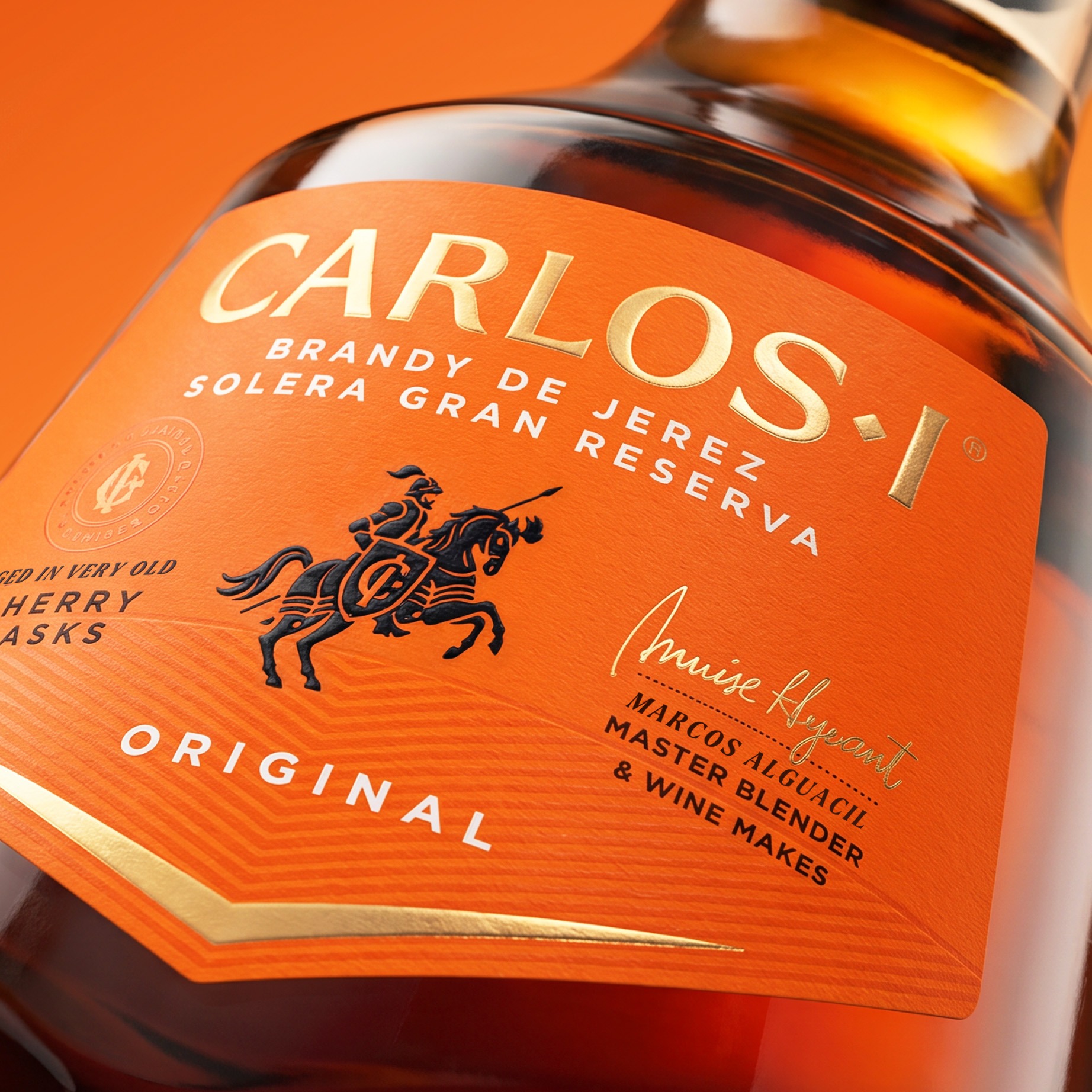
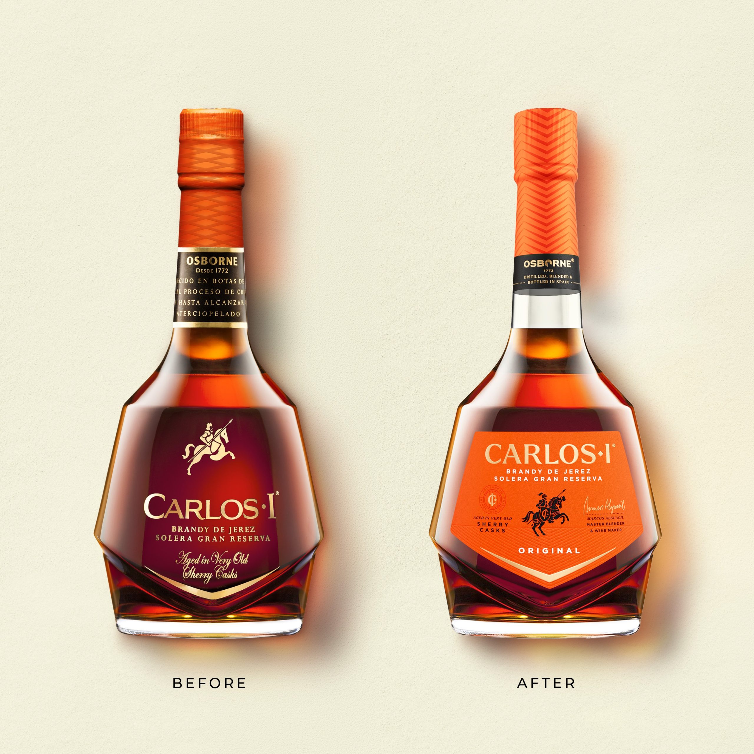
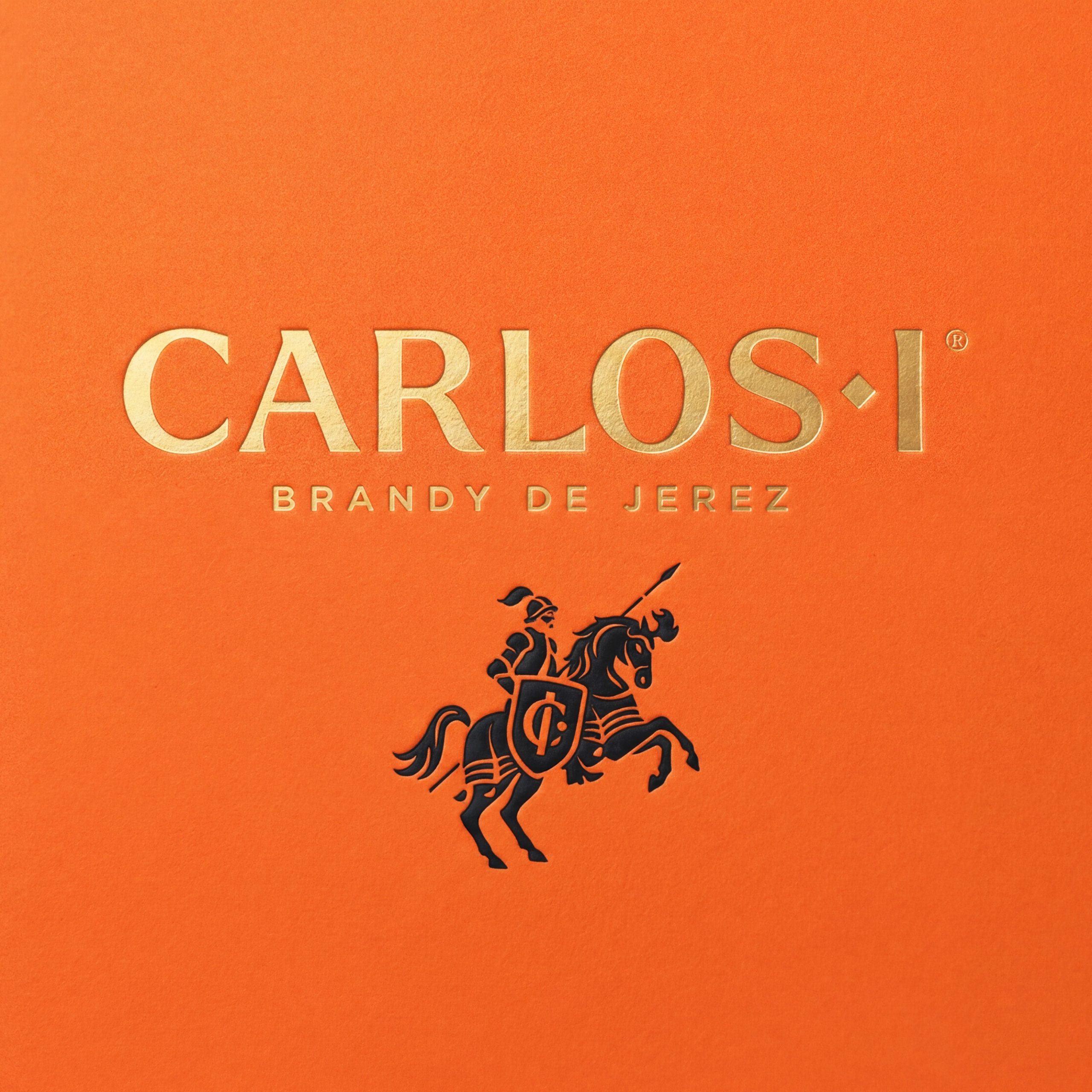
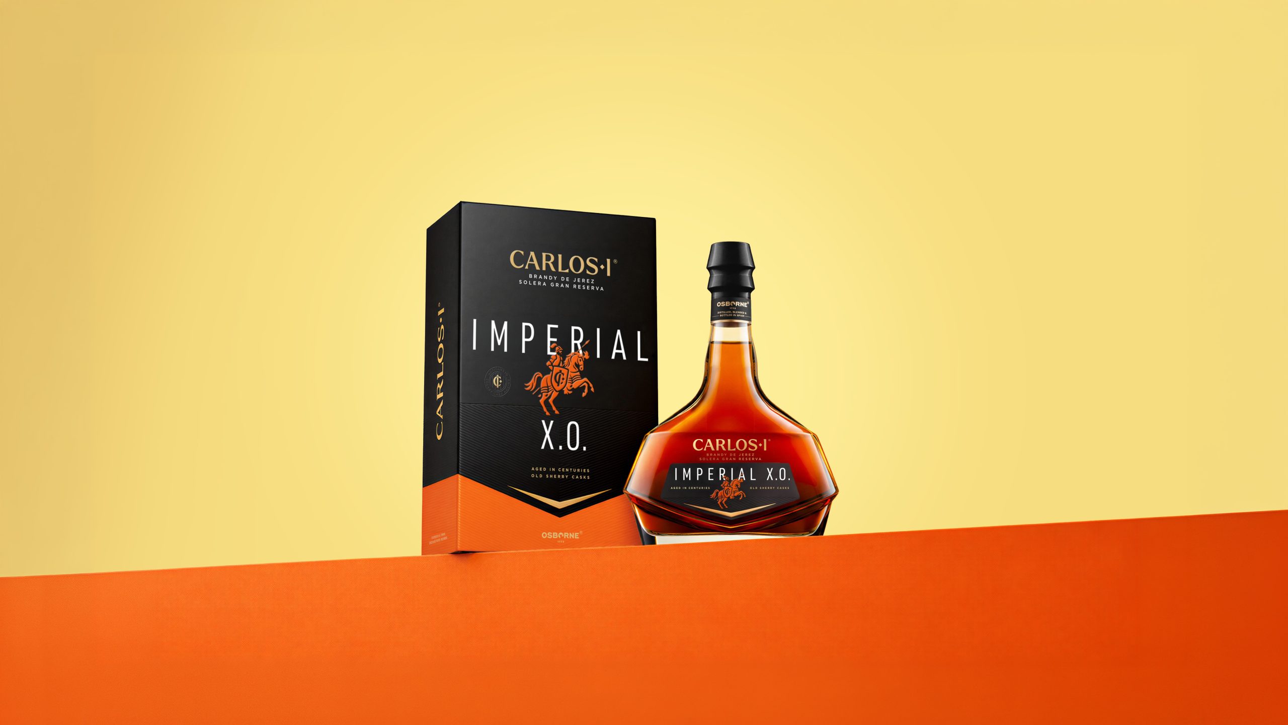
The new design brings the brand forward with greater authority and immediacy. A larger, more assertive Carlos I wordmark now occupies the centre of the bottle, giving the name renewed stature. The knight symbol, one of the brand’s most recognisable assets, has been fully redrawn to become a stronger emblem of legacy, command, and Spanish nobility.
Most powerfully, colour becomes an act of visibility. The vivid orange of the core expression marks a decisive shift from the darker, more recessive language of the previous design. It catches the eye, radiates warmth, and gives physical expression to the intensity and richness of the liquid within.
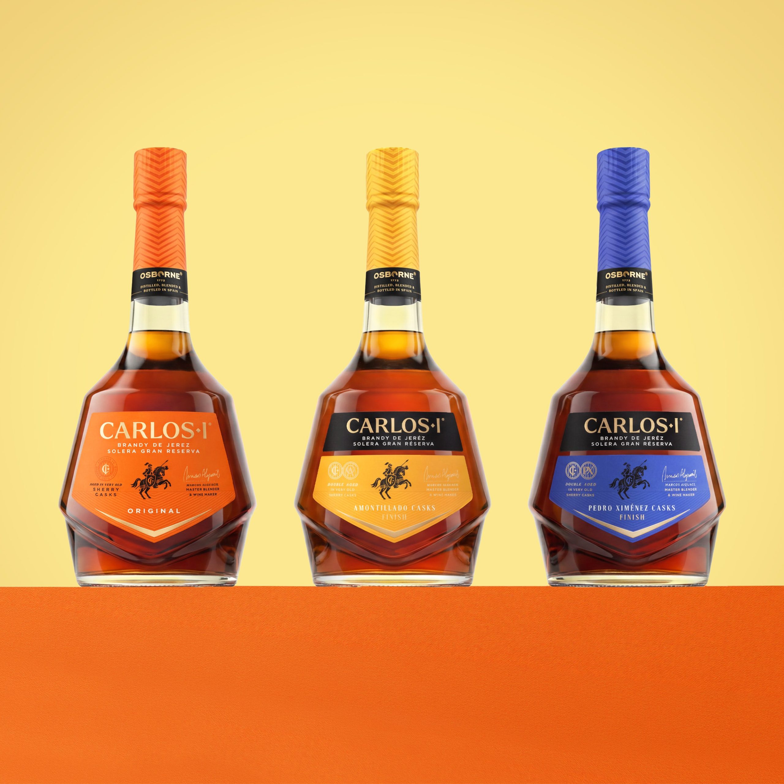
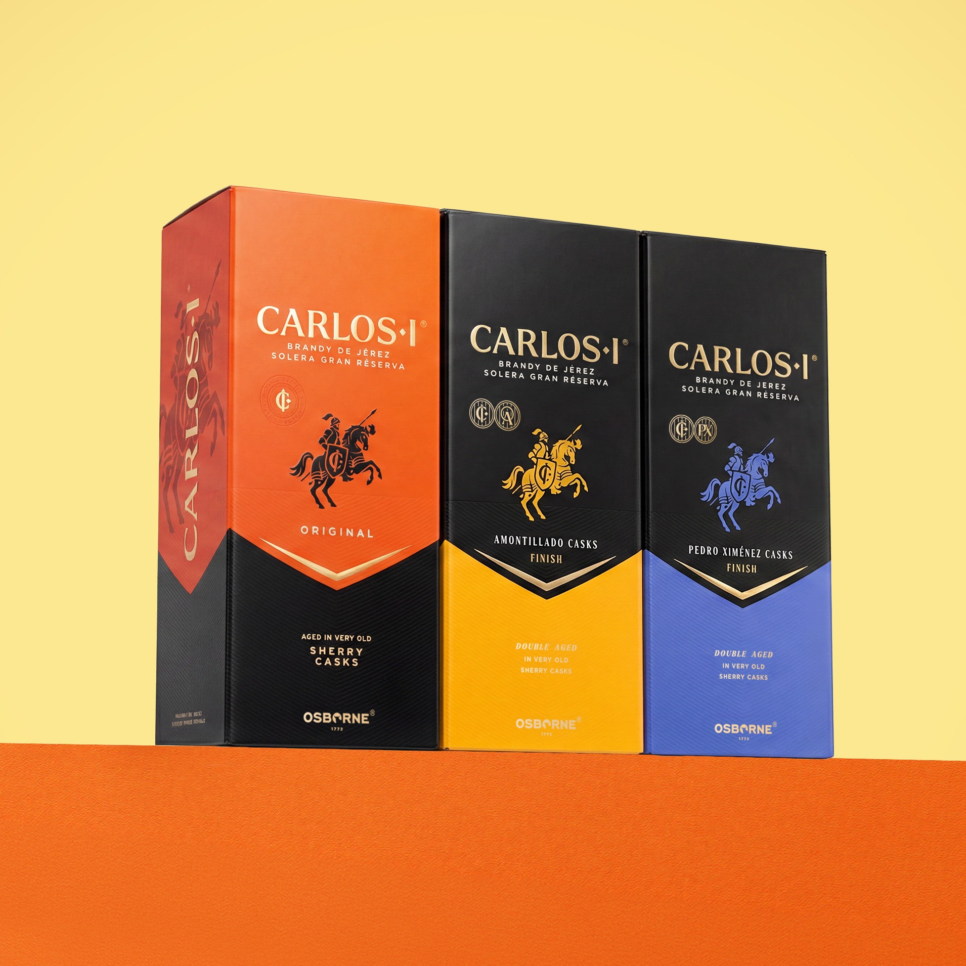
Across the portfolio, Appartement 103 extended this renewed visual confidence through bold colour coding, matching capsules, chevron textures, refined finishes, and a more disciplined hierarchy of information. Each expression gains clearer individuality, while the range comes together as a more coherent, recognisable, and premium family.
The redesign also brings Carlos I’s liquid credentials into sharper focus. Solera Gran Reserva, sherry cask maturation, double ageing, cask finishes, Osborne expertise, and Spanish origin are no longer hidden within the design; they become visible sources of craftsmanship, distinction, and desire.
The result is a Carlos I that remains deeply historic, but no longer reserved. Still noble, but more charismatic. Still singular, but now impossible to overlook.
A spirit with the presence to match its name.
A Spanish icon with the courage to be seen.
 NEV
NEV Stefano Bracci
 Alina
Alina monther al omari
 Lizakjx
 JOAOMARCOSDESIGN
 alchimistestudioParis
 Harriet Neild
 octavio rojo
 宏洛图品牌设计HONGLT
 DESIGN CONCEPTS
 Alexander Skurihin
 Studio K95
 ARMBRAND
 Richa Rai
 houseoferas by Miti
 Agence des Coteaux
 Kushi Eaknath
 Ann Treasa
 Xiao Ning
 krrrrrllii
 babyage
 Deep
Deep