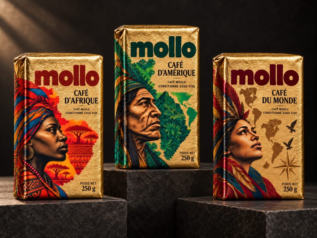

Mollo Brings Coffee Origins to Life Through Design
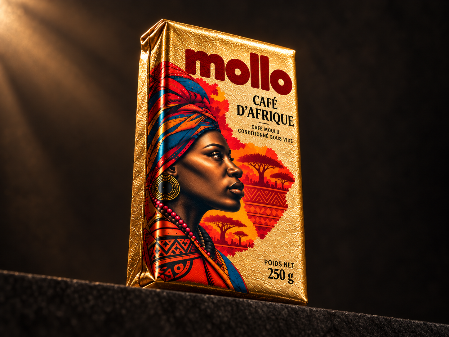
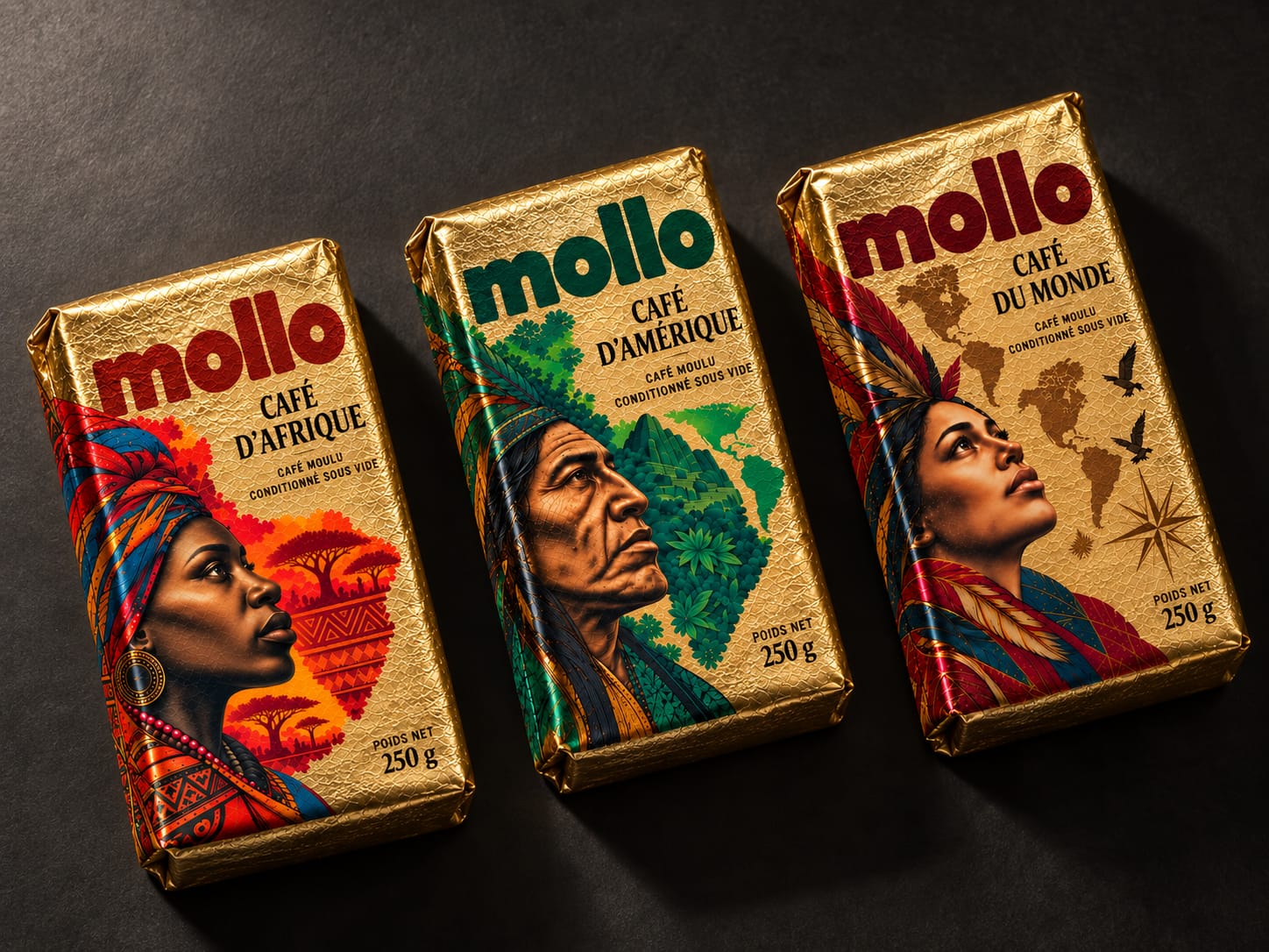
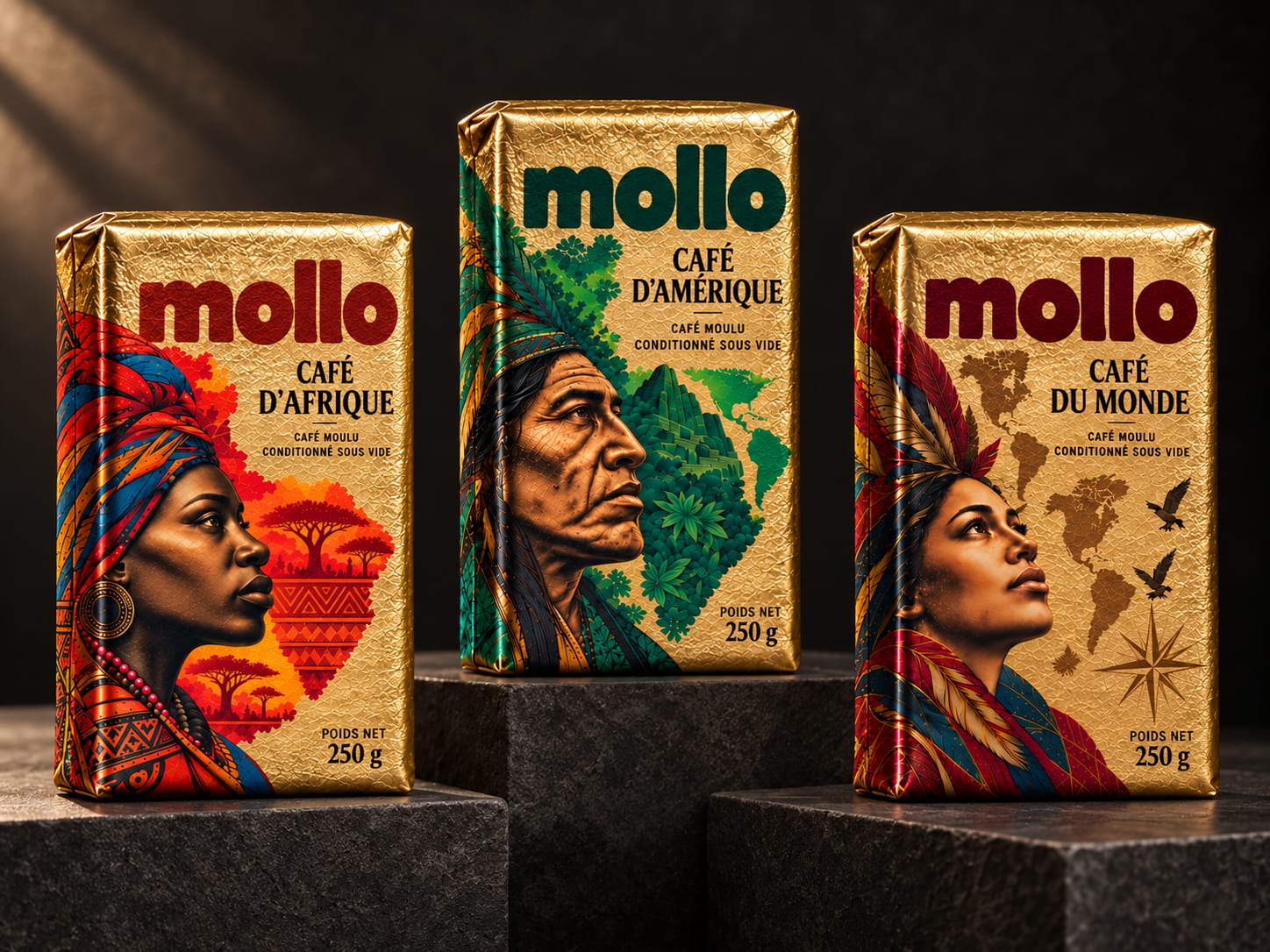
Mollo is a coffee packaging concept by L’Alchimiste Studio that brings expressive portraiture, gold foil and bold typography into a distinctive three-part collection: Café d’Afrique, Café d’Amérique and Café du Monde.
The creative challenge was to balance the richness of the illustrations with a clear, recognisable brand identity. Each pack carries a large portrait, surrounded by landscapes, foliage and cartographic elements that build an imaginative narrative around the collection’s geographical themes.
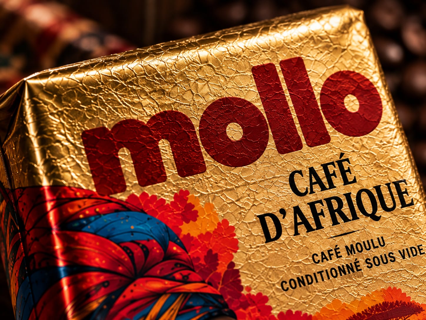
A generous lowercase wordmark anchors the composition. Its rounded, substantial letterforms introduce a contemporary character alongside the detailed illustrations. Printed directly onto the gold surface, the logo changes colour across the range: deep red for Africa, forest green for America and burgundy for the World edition. This colour system distinguishes the variants while maintaining a consistent brand presence.
Condensed serif typography gives the coffee names an editorial quality. Smaller supporting information completes the hierarchy, leaving space for the portraits to remain central to the visual experience.
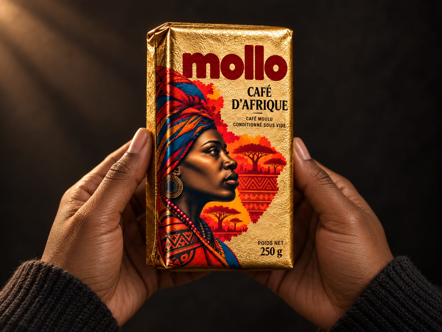
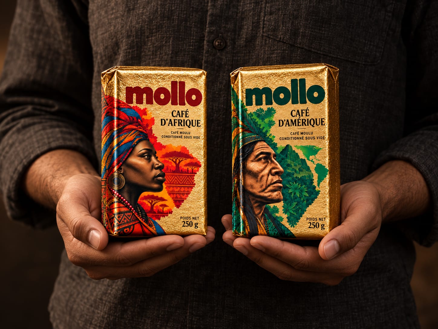
The material treatment is equally important. Gold is conceived as a flexible, finely crinkled vacuum wrapper, with visible folds and compressed edges. Its tactile surface catches the light unevenly, giving the packaging a physical character that complements the density of the printed artwork.
The presentation extends this approach through a coherent photographic language: dark architectural settings, controlled warm lighting and close human interaction. Across group compositions, suspended views and handheld scenes, the packaging remains the focus.
Mollo brings these elements together to create a coffee identity built around visual storytelling, tactile appeal and recognition across the range.
 Derrick Lin
 VincoStudio
 lisakaplina
 CreativeWise
 Adriana Adamo
 tauqueer
 MAISON D'IDÉE Prague
 Pixels Studio
 Atchayaa
 DESIGN CONCEPTS
 hello ocean
 monther al omari
 the Labelmaker
 alamgirbrands
 kat bres
 Vantablack Studio
 GruppoSaida
 studiorevv
 grafisercreative
 Kate Reichel
 UPRISE
 Modern Theory
 By siddika
 Kinshuk Bainss