

ABOUT
This project is a redesign of a leading Ukrainian mass-market spice brand. The line includes mono-spices for everyday home cooking, targeting middle-income households. The category is visually overloaded, making product search difficult and slowing down consumer choice. The goal was to modernize the brand and create a clear, intuitive shelf system.
CONCEPT
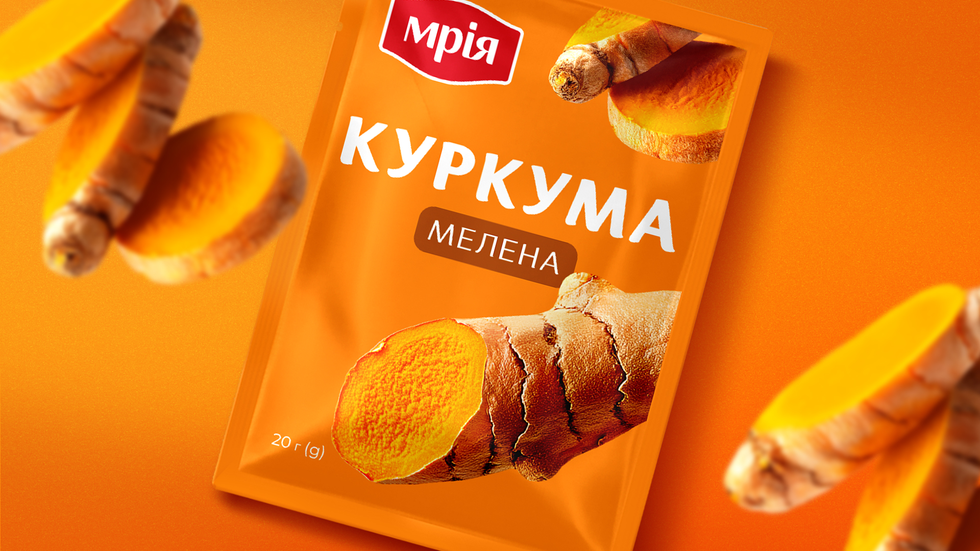
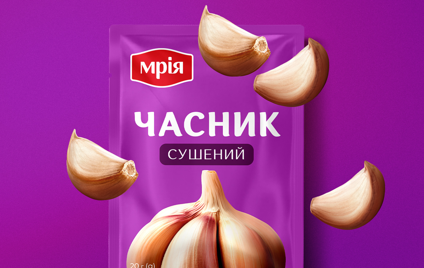
The brand stands for simplicity and everyday cooking. We built the redesign around two principles: bold macro visualization of the ingredient and highly readable typography. Since these are mono-spices, the ingredient itself becomes the hero. No dish photography. No clutter. Just clarity.
SOLUTION
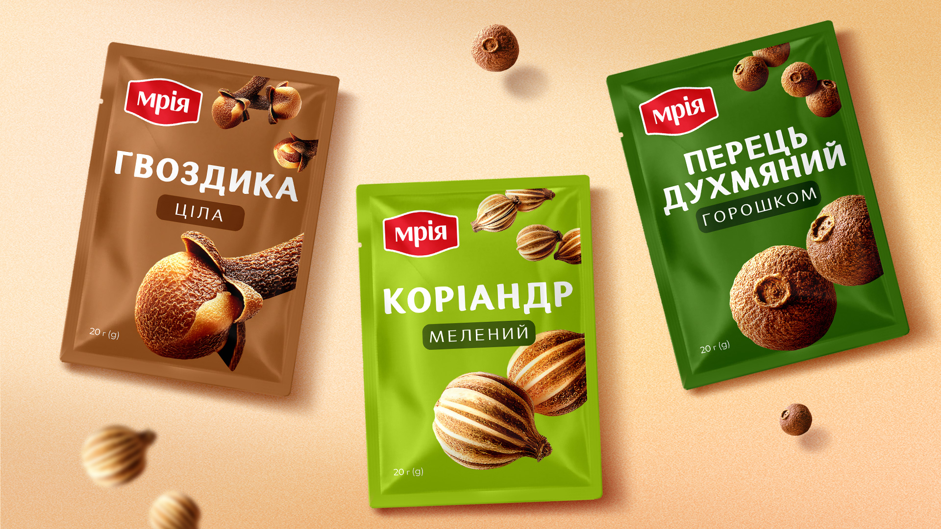
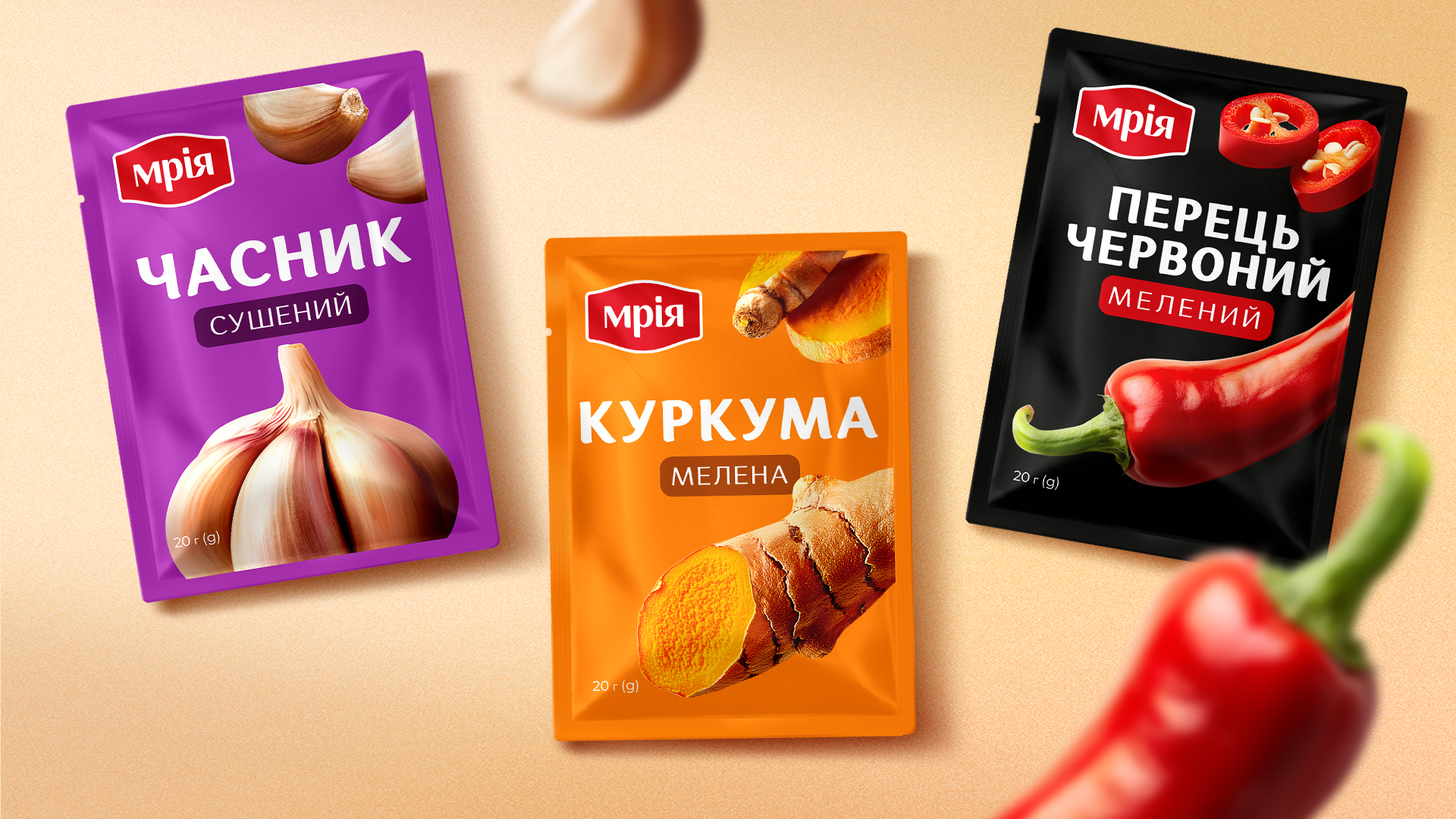
Each SKU received a strong color-coded background to improve navigation. The layout hierarchy is straightforward: brand block, large product name, dominant ingredient visual. The system allows consumers to instantly locate the needed spice. If you’re looking for paprika — you immediately see paprika.
PRODUCTION
Printed in flexography, the visuals were carefully optimized for accurate color reproduction. Smart channel separation and Pantone integration ensured sharp contrast and realistic texture. All ingredient visuals were developed in 3D or AI-assisted workflows and finalized through detailed retouching and print preparation.
RESULT
The redesigned packaging strengthens the brand block on shelf and simplifies consumer choice. The product became more recognizable and easier to navigate within the category. In a crowded spice segment, clarity became the strongest competitive advantage.

 Derrick Lin
 Biaa
Biaa Petitmoulin Studio
 White Bear Studio
 Eva Chistyakova
 monther al omari
 Atipus
 alchimistestudioParis
 oneandother
 bloomburo
 helocrene
 Shapers Studio
 Denver Design
 Aidearte
 andrew.huerta
 softmachine
 airobtq
 Buzz & Co.
 Ruby
Ruby themythographer
 IDNB Inc.
 viktorflr
 Zenpack