

Mamato & Co. was created around a simple idea: turn the feeling of a traditional orchard into a jar.
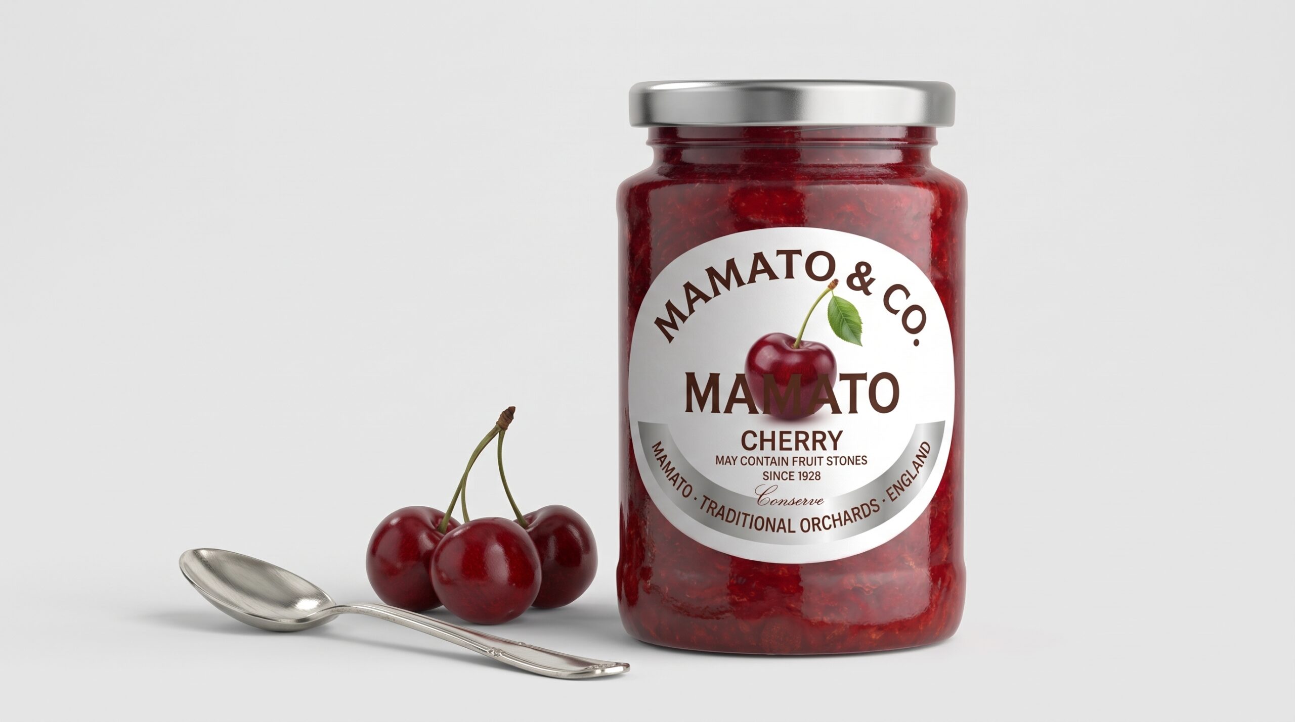
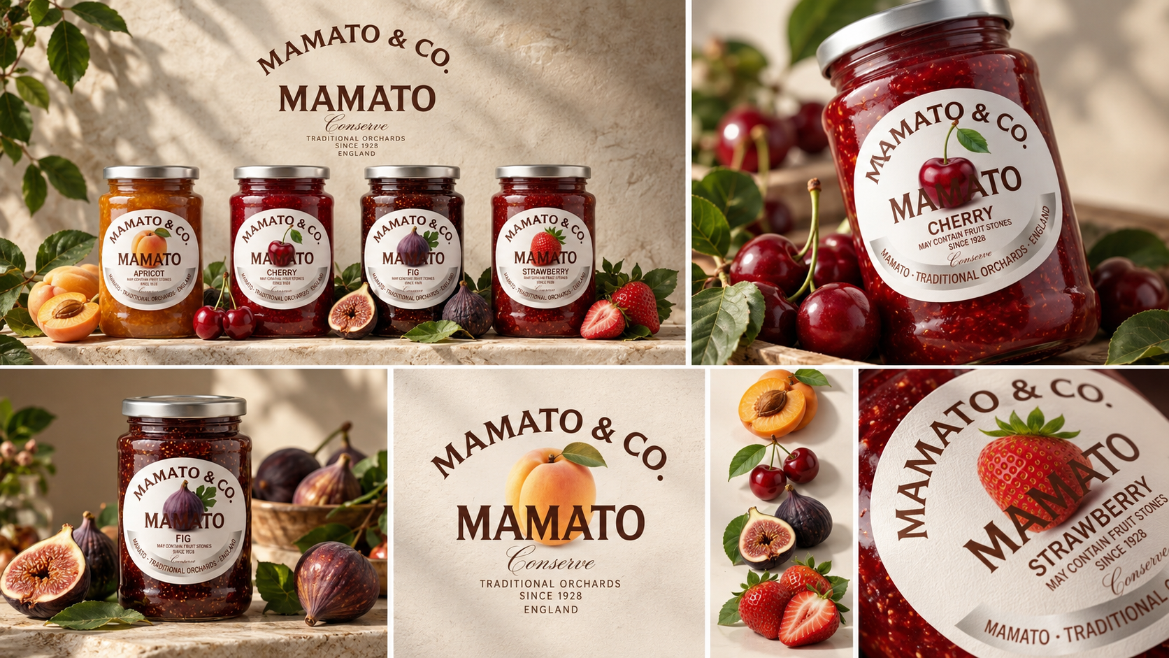
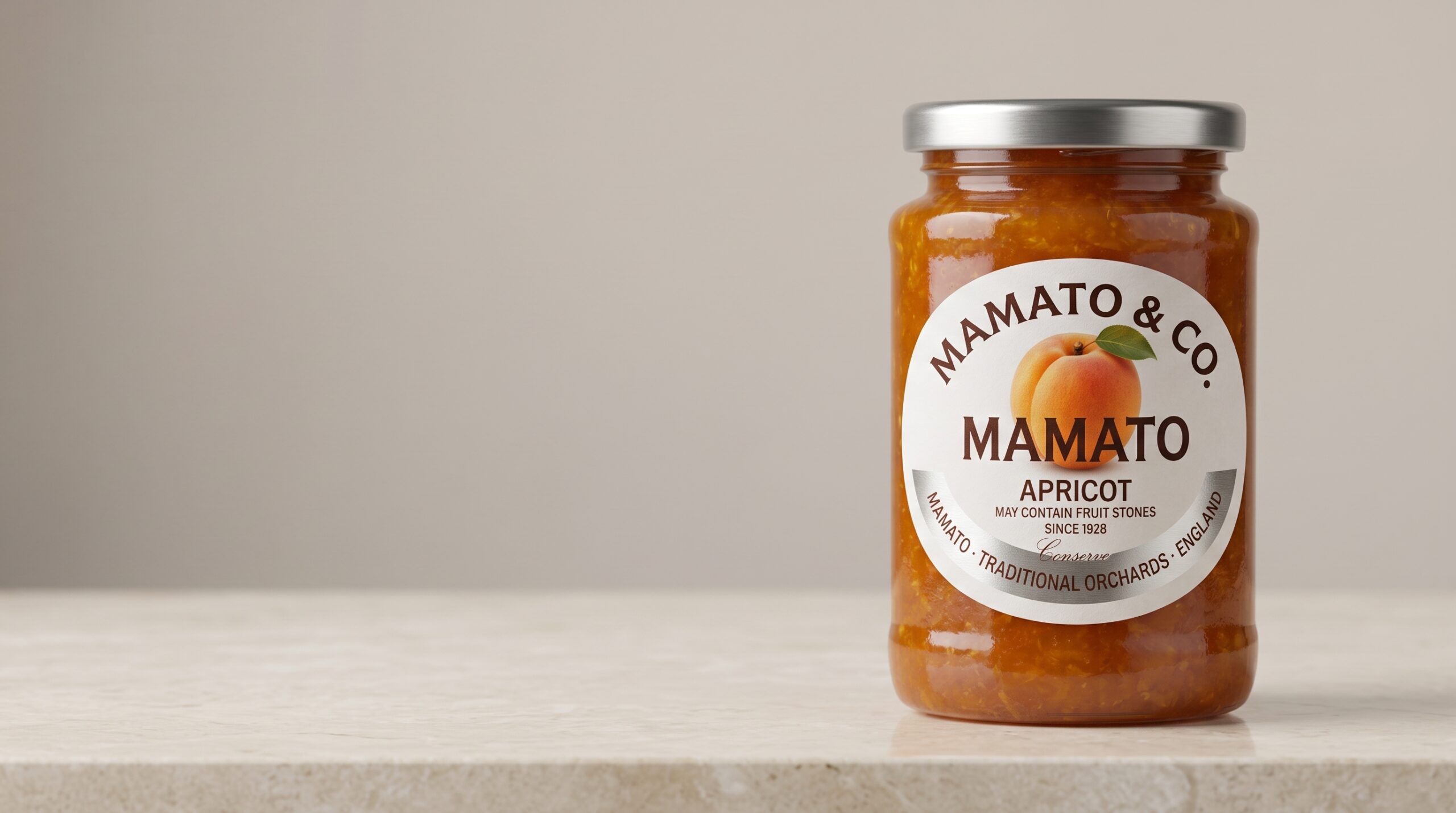
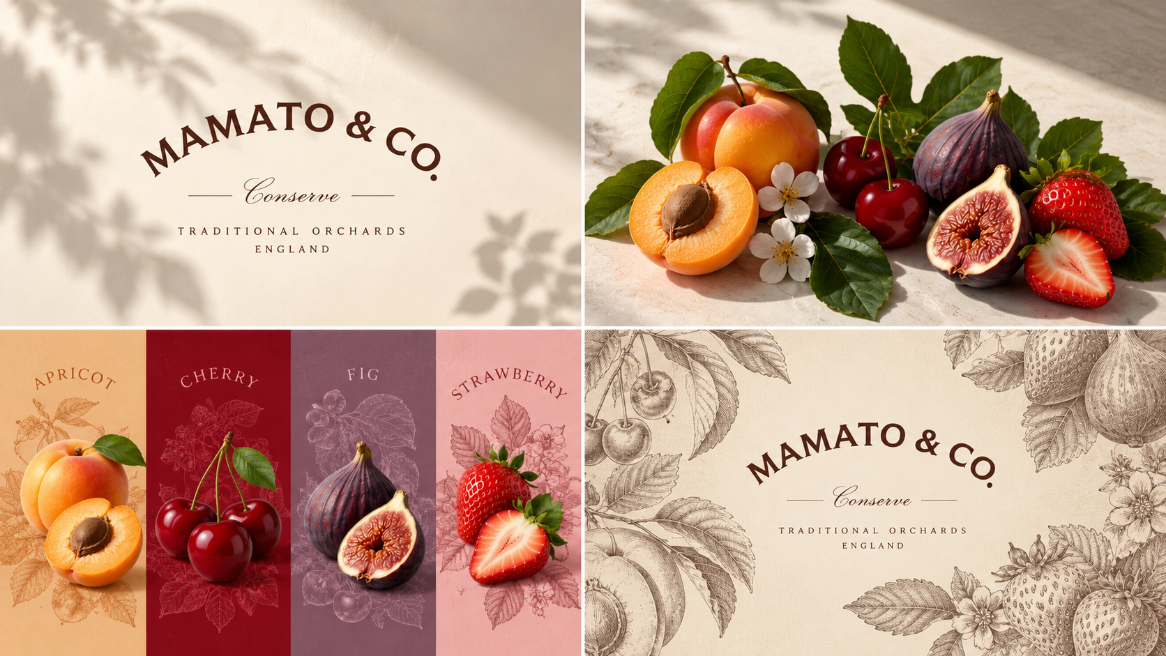
Inspired by sun-ripened fruit, handmade preserves, and the warmth of countryside kitchens, the packaging combines classic typography, natural fruit imagery, and a soft, timeless palette. Each flavor—Apricot, Cherry, Fig, and Strawberry—has its own character while remaining part of one recognizable family.
The circular label becomes the heart of the identity, framing each fruit like a small orchard emblem. Warm photography, fresh leaves, and natural textures extend the story beyond the jar, creating a world that feels authentic, generous, and rooted in tradition.
Mamato & Co. is more than preserve packaging—it is a celebration of fruit, craft, and the timeless pleasure of something made to be shared.




 Natasha Spitsyna
 babyage
 GruppoSaida
 ahmedraoudgfx
 Hi estudio
 Nadezhda Gorelikova
 Studio Garces
 Brandsbylufo
 Rewot
Rewot alchimistestudioParis
 Asprey Creative
 kat bres
 Valérie Colace
 Atiq Alam
 Sara Communications
 David Hakobyan
 Innovāt - Empowering Creative Innovation
 mmdesign
 Amjad Battal
 Hollóka Grafikai Műhely / Graphic Design Studio
 Palashcc
 ABC Design Communication
 ChrisSkarlatos
 Hedayat Hadavi
 Tia Nguyen
 étiquette