Agency: Agência BUD
Creative Director: Franklin Zampani
Designer: Denis Santos
Copywriter: Helena Lima
Location: Brazil
Project Type: Concept
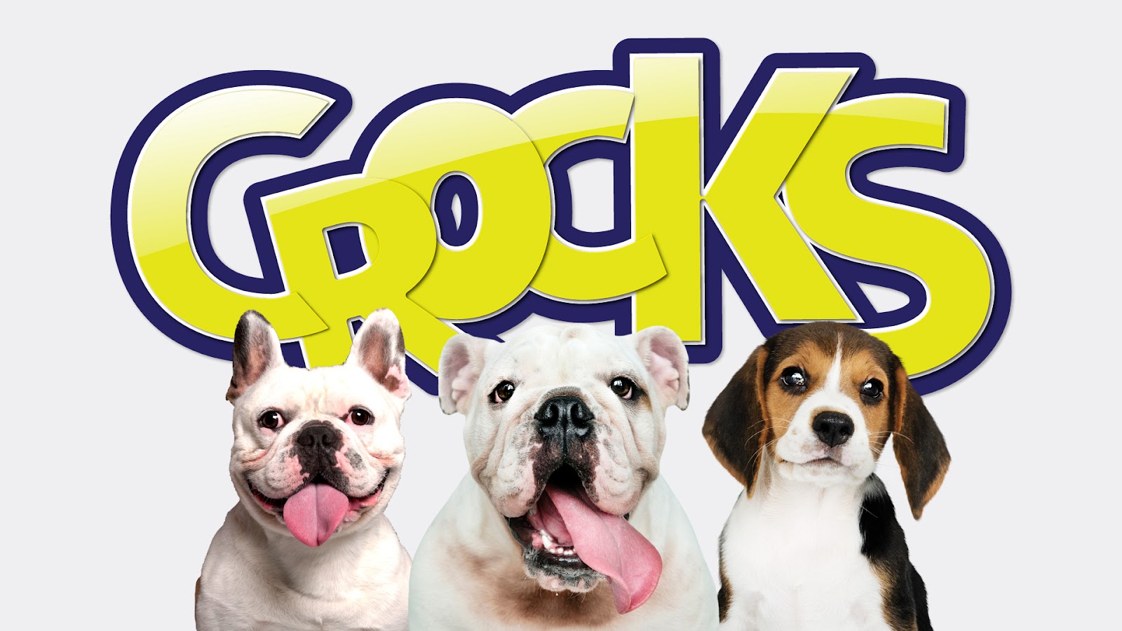
Thinking about your pet’s health, the Crocks Bites Snacks line was developed and elaborated to meet the three main food demands of dogs. For this, it was necessary to create a package that stood out in the midst of a wide competition.
The visual identity was maintained in the three packages, showing variation only between the colors: yellow, blue and purple. They were chosen because they have strong shades that stand out when placed on a shelf together with other products in the same segment.
The packaging format followed a more traditional line, as the objective was to ensure practicality when the buyer needed to open the container to have access to the product. Regarding the layout, we also continued with a simpler language, seeking to highlight what was main, in this case, the specification of each product and the logo.
In relation to typography and textual content, we chose to put only what was essential. In this case, the slogan (crunchy and healthy snacks for dogs), for whom the product was indicated (digestive, pupies and joints), and some additional information that could encourage the potential buyer to choose the product. The use of block letters and cursive letters came to complement the look of the packaging, adding a modern and contemporary touch to our product.
Finally, to illustrate and differentiate the packaging, we added the image of a dog. The insertion of this element was fundamental, because with it, the consumer can quickly identify which animal the product is recommended for.