Behold the mighty macadamia.
CLIENT
Mauna Loa was founded in 1976 in the shadow of the mountain that is the brand’s namesake. In the 40+ years since then, Mauna Loa has grown to become the #1 brand of macadamia nut. Beloved in Hawaiʻi, given regularly in Asia, and enjoyed with nostalgia in the lower 48, Mauna Loa is one of Hawaiʻi’s most iconic brands.
CHALLENGE
Macadamia nuts offer many of the benefits that today’s health-conscious consumers are hungry for. For starters, they’re low in carbs, high in fiber, and have an outstanding ratio of omega-3s to omega-6s. What’s more, they’re vegan, non-GMO, gluten free, and keto and paleo friendly.
What’s not to love, right? Still, most consumers considered them a special treat rather than an everyday snack.
Moxie Sozo was tasked with helping to change that, reimagining Mauna Loa’s identity and packaging to invite new consumers—and new product lines—into the brand without alienating current consumers who cherish the brand’s rich heritage.
SOLUTION
Hawaiʻi is a brand of its own. For decades, it’s been a destination for active and enlightened individuals alike, seeking wellness of mind, body, and spirit. The reimagined brand and packaging were designed to bring that raw “force of nature” to consumers around the world.
Our work began with the articulation of a new brand voice and story—one that captured the spirit of Hawaiʻi and invited consumers to find that spirit anywhere, creating the “macadamia powered paradise” they most longed to find.
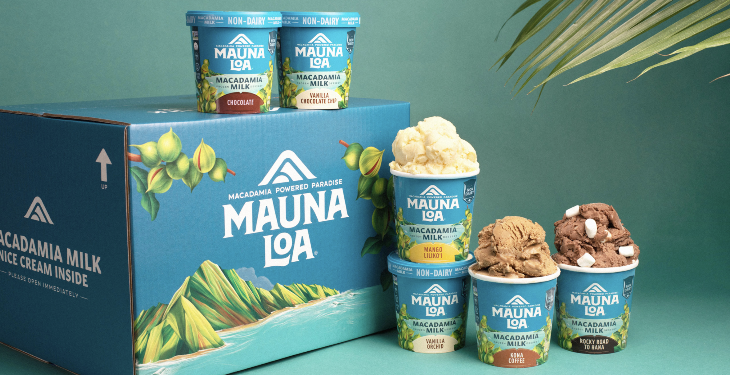
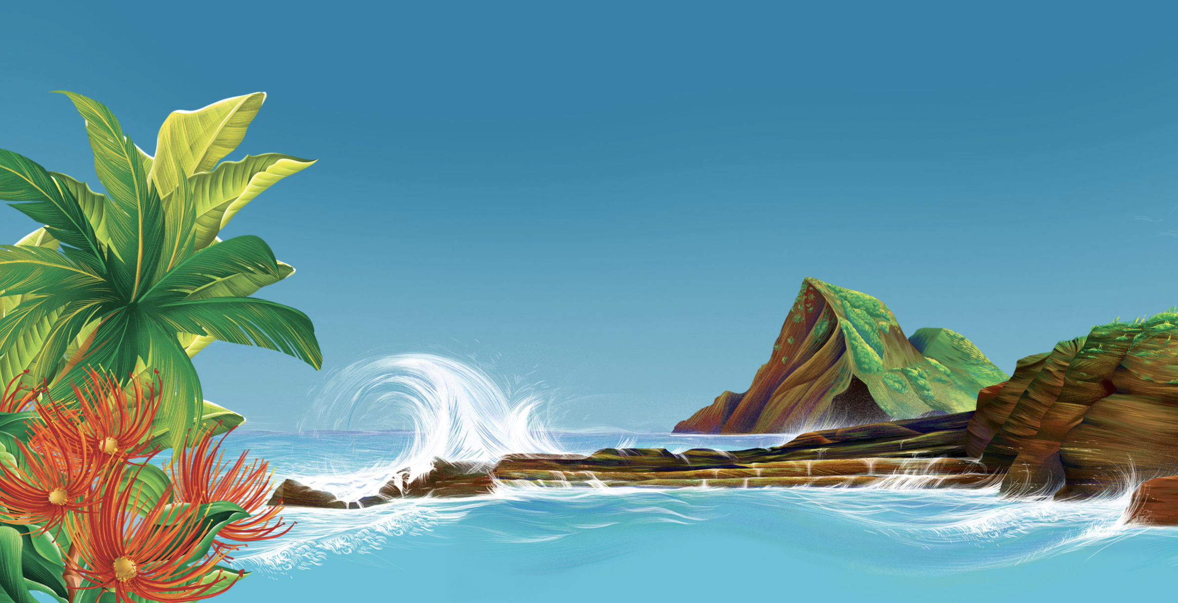
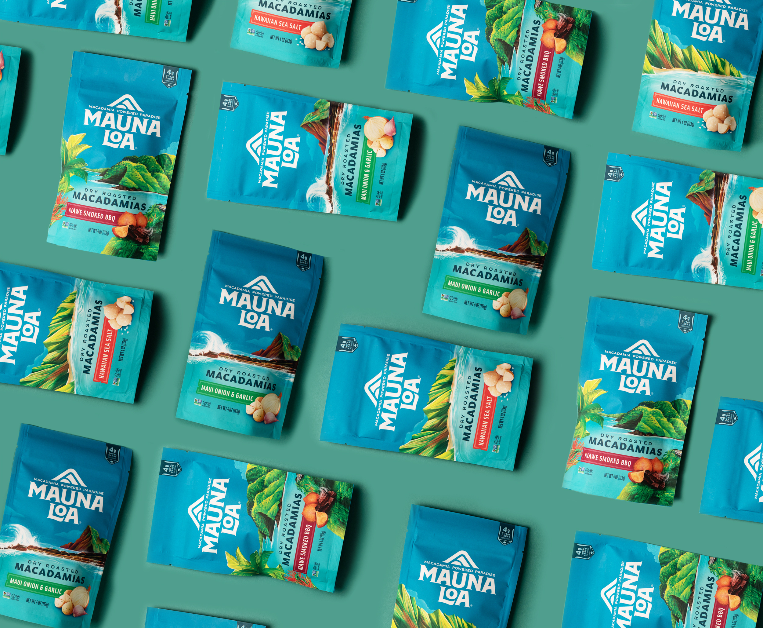
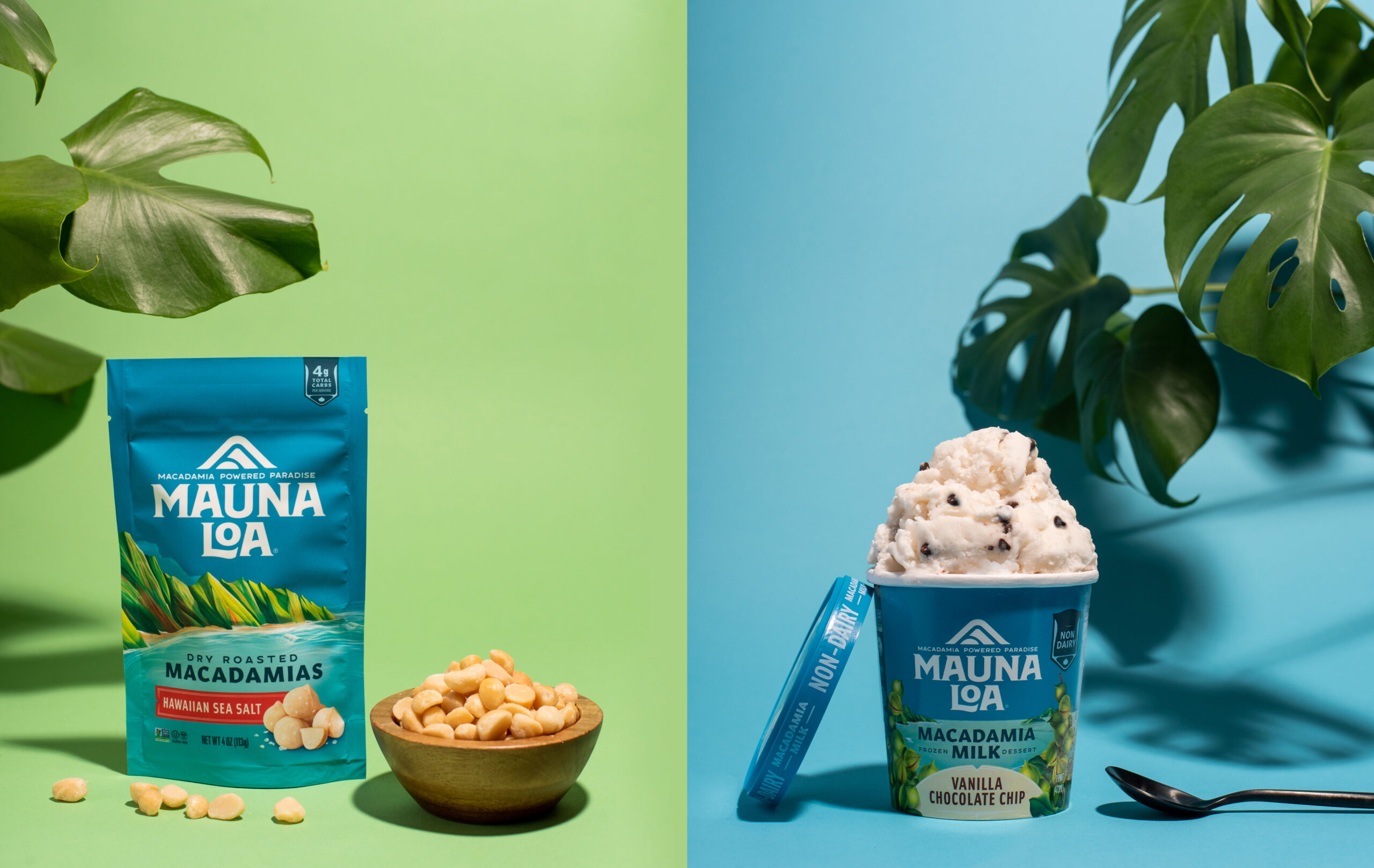
The new packaging features vibrant illustrations of landscapes from throughout the Hawaiian Islands, which put Hawaiʻi’s natural wonder front and center and helped to invoke the “force of nature” at the heart of the brand. These, along with evolved, more natural colorways, helped to better convey the products’ simple, plant-based power.
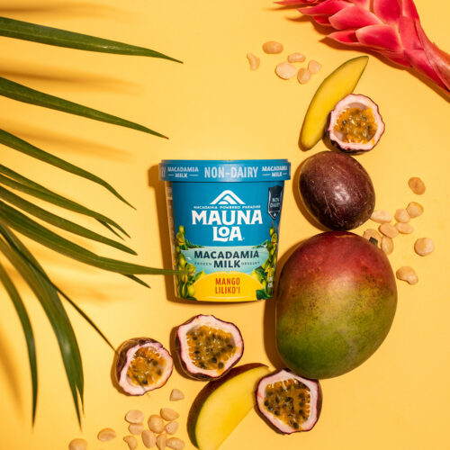
Mauna Loa’s new look and feel transferred seamlessly from salted snacks to frozen desserts with the brand’s introduction of macadamia milk-based “ice creams.” The packaging retains many of the same Hawaiian elements that only a brand like Mauna Loa could own while also adopting more indulgent category cues to compete with a new shelf set.
Despite these new introductions, the new brand does not forget its roots.
The evolved brand identity contemporized the existing Mauna Loa wordmark while retaining its distinct personality. We also resurrected and modernized iconography from the brand’s more distant past, a nod to the brand’s rich history and the mountain where it got its start.
RESULTS
Mauna Loa’s core products and new innovations has spread across the mainland United States, gaining shelf space on hundreds of new store shelves in both the natural and conventional level. Also, the rebrand was just recognized by NOSH as the Best Packaging of 2021.
All photography by Lindsay Kreighbaum