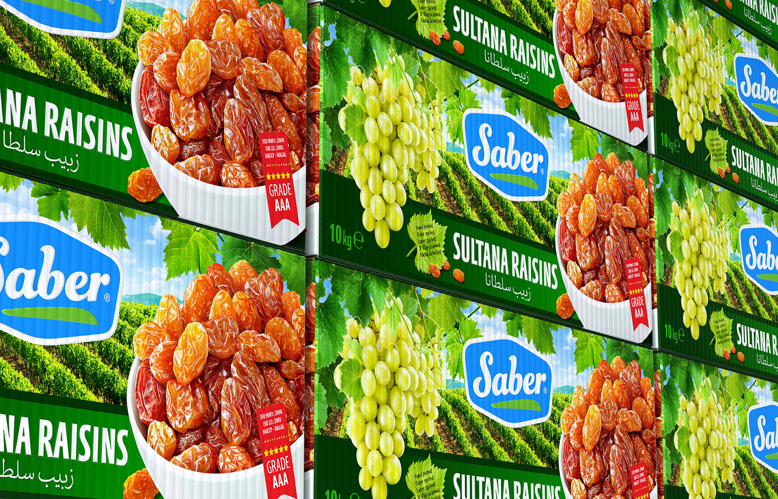
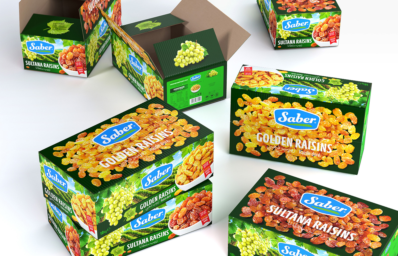
SABER raisin packaging design. A product intended for sale in bulk is usually packaged in cardboard boxes with a 1-2 color print. From there, the essence of design comes down to showcasing the brand and key information. Such packaging can successfully solve the problems of transportation and become an additional carrier of TM. We were tasked to expand this limited functionality. The need to visually display the difference between the types of raisins, demonstrate the grape variety from which they are produced, and create an image of a natural, environmentally friendly product of high quality led to the emergence of colorful and bright packaging. A landscape with vineyards stretching into the distance against the background of mountains on a sunny day, a ripe bunch of grapes in the foliage and selected raisins in a snow-white bowl in the foreground became the main design elements. In order to enhance the difference between GOLDEN and SULTANA, scattered raisins of the corresponding type are depicted on the top flaps of corrugated boxes. A dense dark green color combined with a bright light green gave the packages the right image of a product grown naturally in an ecologically clean region. Laconic, easy to read and positively perceived TM took a worthy central place.