DS1 branding has developed the identity of a new brand of vodka ReVolt for the Urzhum distillery
Urzhumsky distillery is one of the largest producers of spirits in the Kirov region, leading its history since 1833. To date, the company’s portfolio includes 16 brands of strong classic alcoholic beverages aimed at the target audience of 35+.
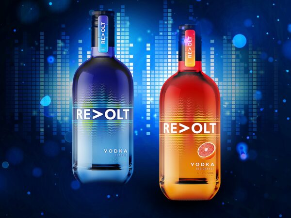
Based on research, the younger generation currently shows less interest in strong alcoholic beverages with traditional tastes. In this regard, in order to expand the target audience of its products, the USVZ company has developed a new product line of the sub-premium segment, aimed specifically at a young audience. The line consists of 4 SKUs – classic vodka and drinks with fruit flavors: raspberry, mango and orange. These drinks are great for creating cocktails popular at parties.
The team of the company “USVZ” turned to DS1 branding for the development of a new brand of vodka from scratch. The task of the agency’s team was research, development of the brand platform, verbal and visual identity.
During the analysis, it became clear that in the sub-premium segment of strong alcoholic beverages today there are many brands focused “on everyone”, so it was necessary to develop a more accurate hit on the target audience.
With the help of research and in-depth interviews, the analytical department of DS1 branding has identified the target audience of the new product – men and women aged 25-35 who are actively moving in the rhythm of the new time and “dancing through life”. They are driven by what happens to them: they love their work, they love their life, but from time to time, like all of us, they get tired. And music and parties for them are an opportunity to relax, let go of themselves and enjoy life.
The insight found by the analytical team is clear to every representative of the target audience, and that is why it is so close to him: in any, even the brightest life, there is a place for routine and fatigue – obligations and deeds sometimes require full dedication from us and take a lot of energy. And alcohol with taste returns this forgotten feeling of lightness, gives you the opportunity to remember who we are, remember our dreams, feel the drive and surge of energy again.
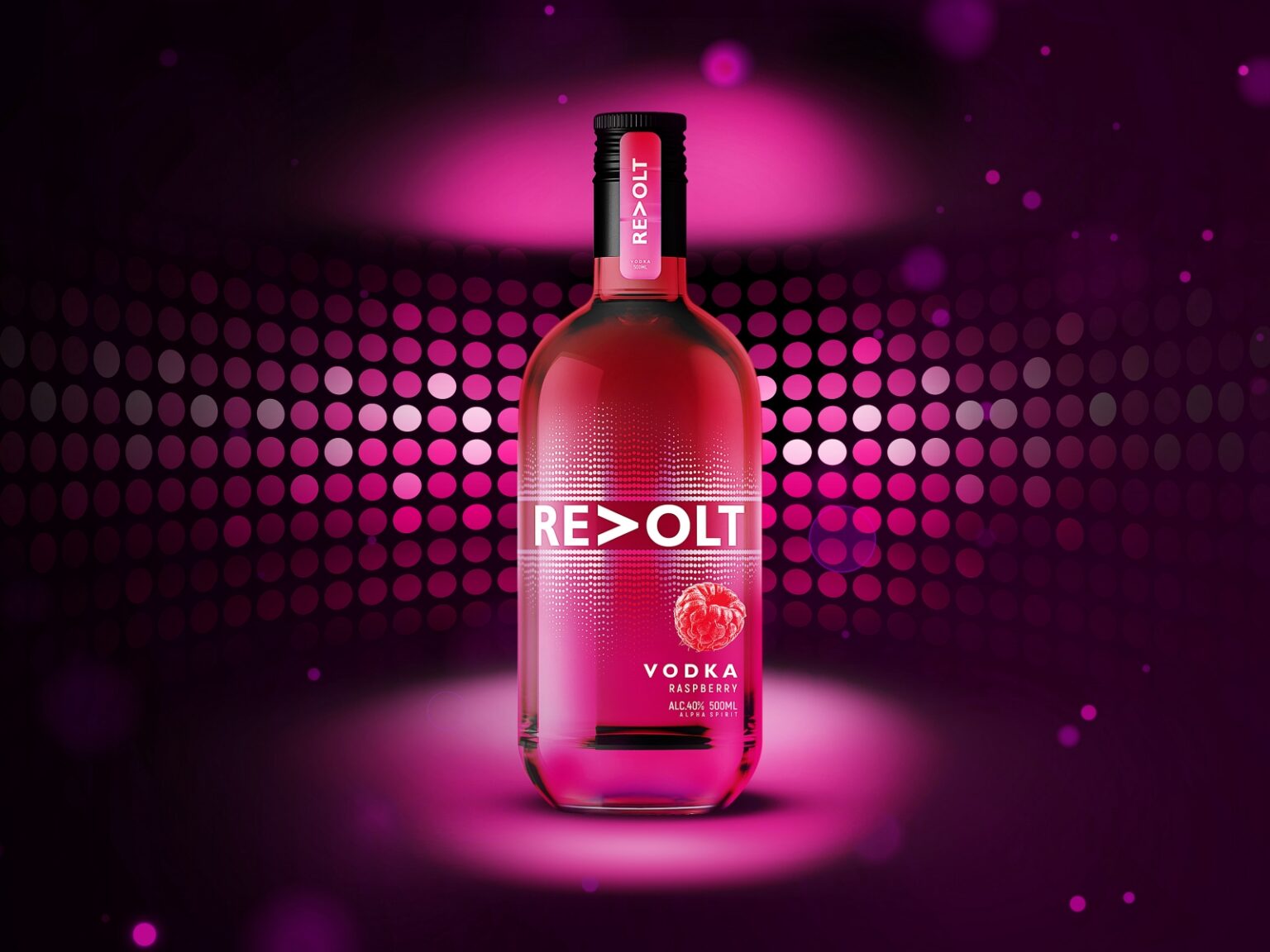
The creative team put exactly this idea into the developed Revolt name – drive, impulse, reboot, return to yourself. Created from the prefix “Re”, indicating the reverse course of action, and the root “Volt” with the meaning “volt, voltage”, neim conveys the idea of an electric discharge that brings you back to life as a powerful energy pulse.
“The main element of the visual identity of the new product has become an equalizer – a symbol of a party, loud music, fun, lightness and laughter. The changed position of the letter “V” in the outline of the name also creates a reference to the situation of consumption – a party where loud music is always playing. On the label, the letter “V”, rotated 90 degrees, resembles a well-recognized “Play” icon,” – Svetlana Klupinska, CEO of DS1 branding.
The bright colors of each SKU allow the new brand to stand out on the shelf and build up from competitors. Contrary to the general trend in the vodka segment, where the classic technique is the illustration of Russian frosts, ice and imitation of a misted bottle, the identity of “ReVolt” distinguishes the product in a competitive environment, and also asserts the positioning of the brand as a youth, bright, party.