New brand identity and packaging work for Strykk, building on the original foundations we developed for them in 2018. Whilst our underlying strategy remains the same, a number of external factors have led to the need to reinvigorate the brand and re-align the growing portfolio.
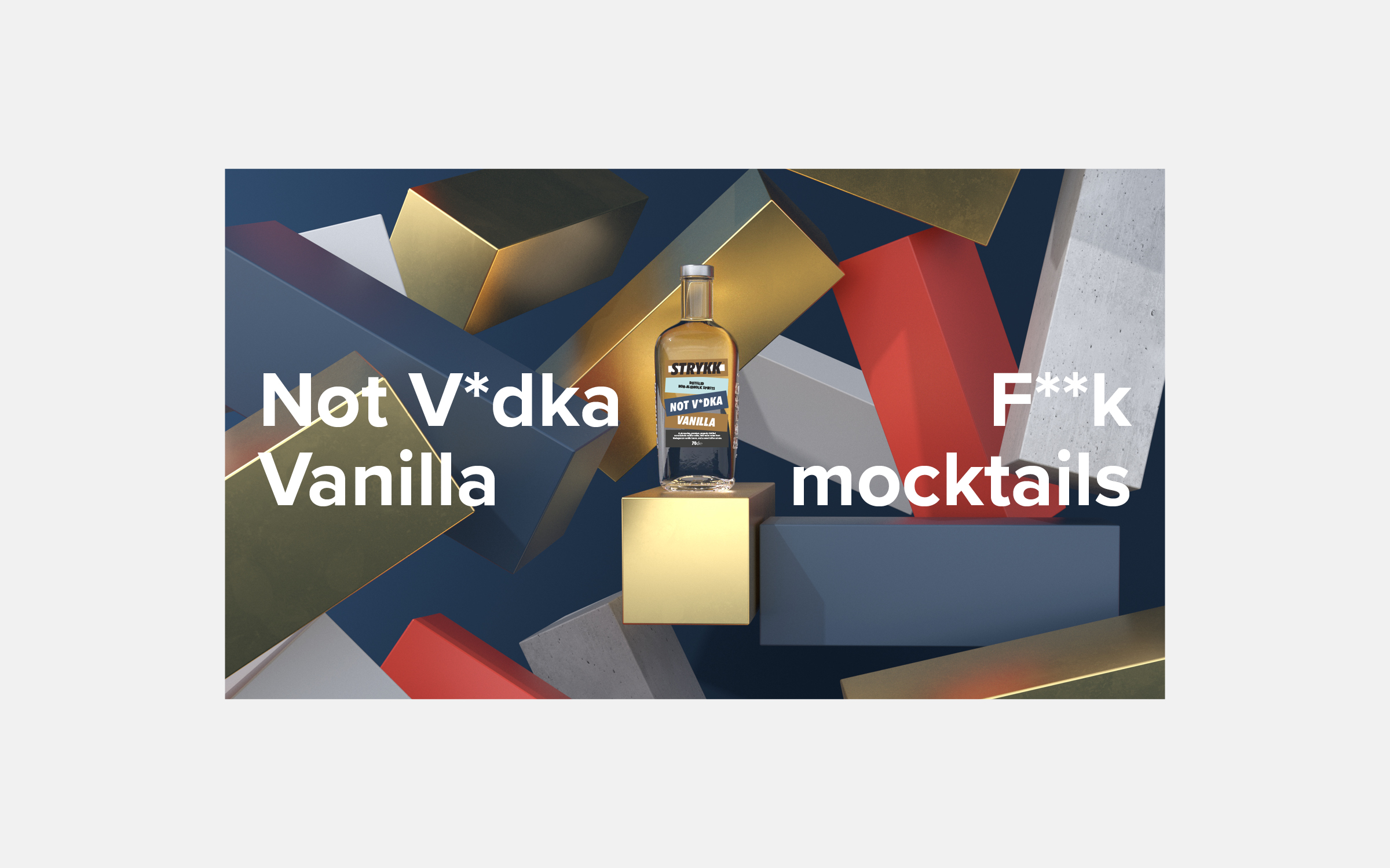
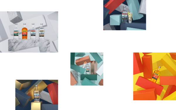
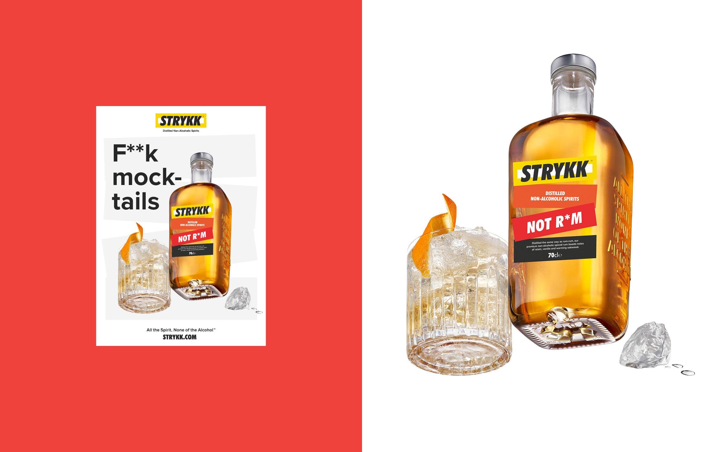
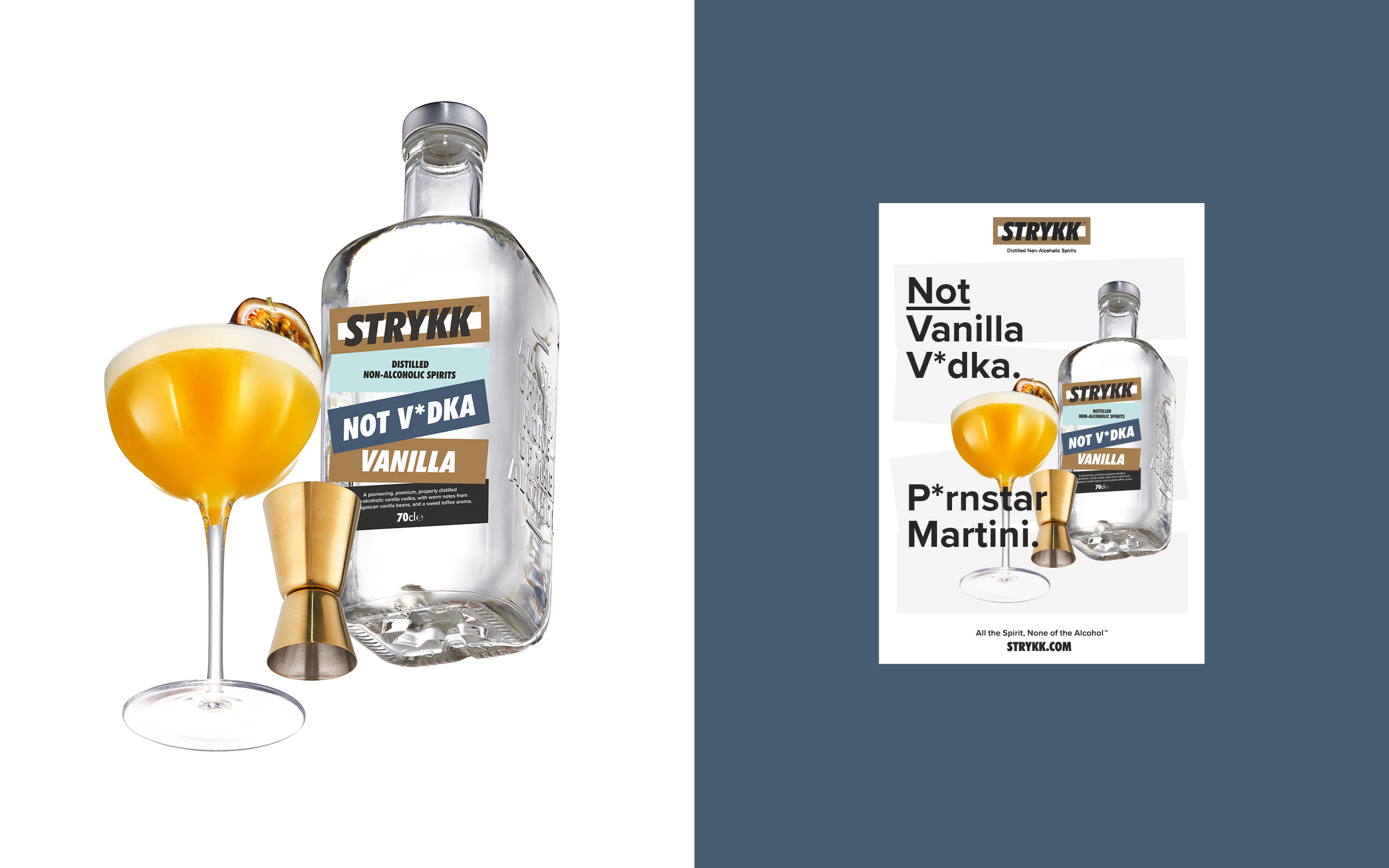
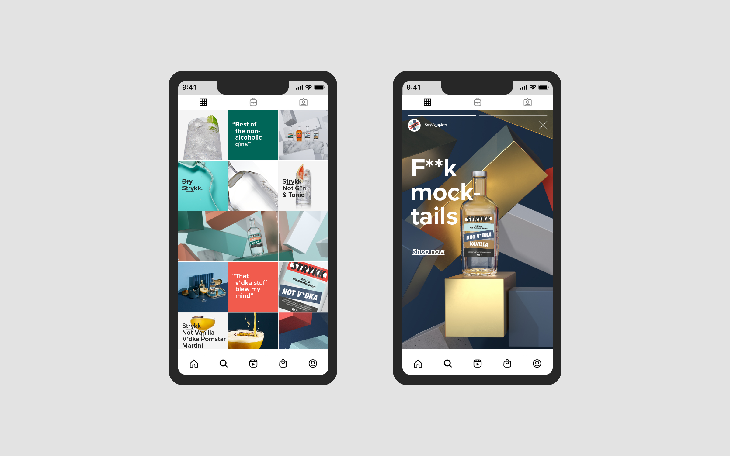
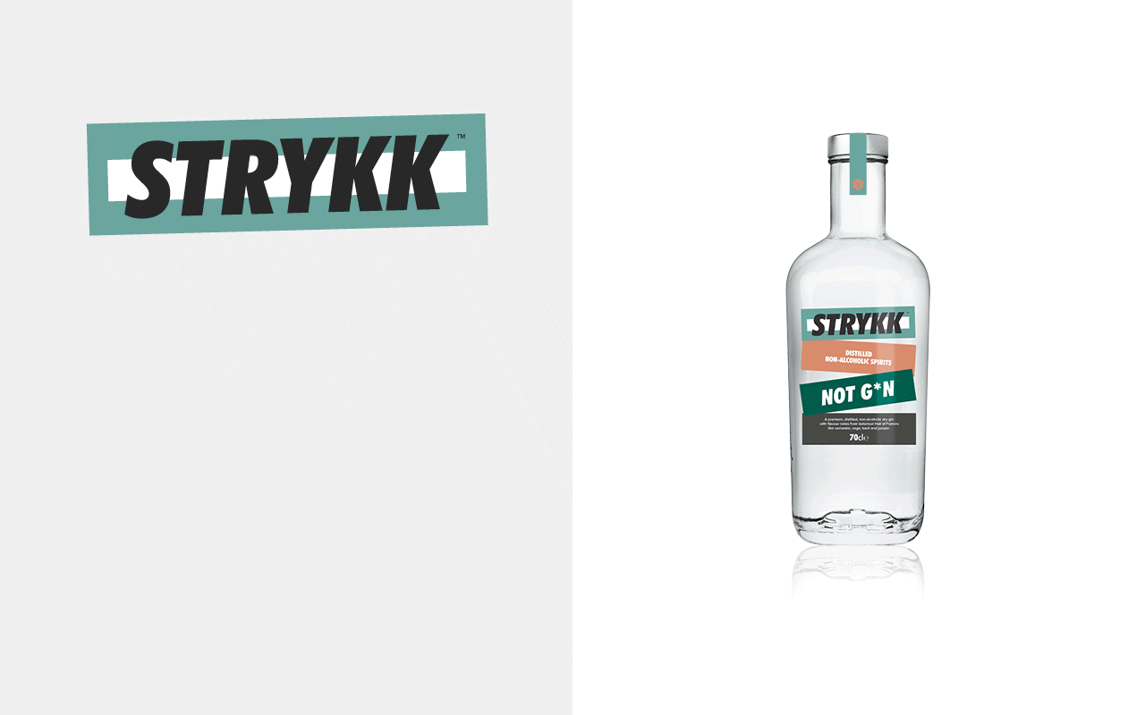
Starting with refinements to the logo, we opted for a holding shape that become the central block device that runs through the whole identity. Extrapolated from the three overlapping oblongs that created the original Strykk asterisk, it builds as the common thread for packaging, and is both exaggerated or subtly implemented as a consistent graphic device across all channel executions.
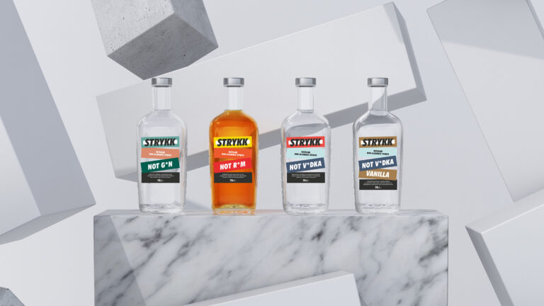
We’ve built on the strong colour palette, bringing in a wider set of bold and complementary tones to increase standout and build better differentiation between products. Typography opts for a more refined sans serif and a slight coming of age, moving from the unruly uppercase Futura Condensed used previously, to a more conversational approach. As before our focus on tone of voice remains confident and unapologetic, a key pillar of the brand.
The original strategy and positioning remains, inspired by the idea of enjoying a night out without compromise. A love of going out, being part of the story and not missing out. Removing the stigma of ‘not’ drinking, by delivering a product with the taste and complexity to build a proper drink with 0% Abv Distilled Spirit.
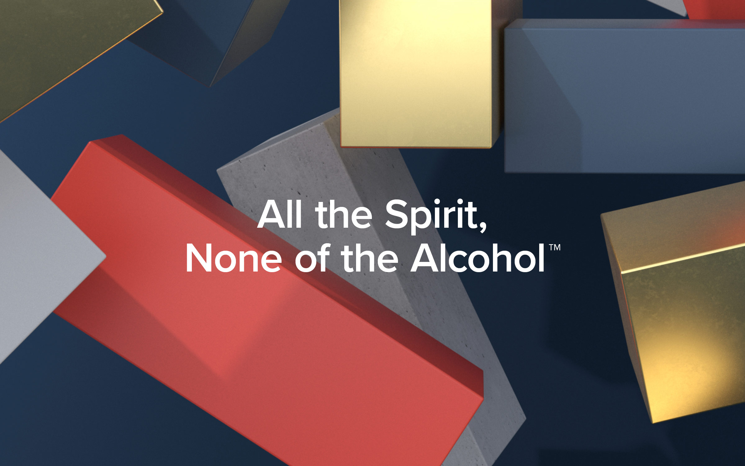
At the heart Strykk remains disruptive and steadfast in its unwillingness to just fit a mould. A bold approach that needed a bold brand, unapologetic and full of energy. We’re not about kooky craft, forced aspiration or self-importance. Uniquely summed up as; All the spirit. None of the alcohol.