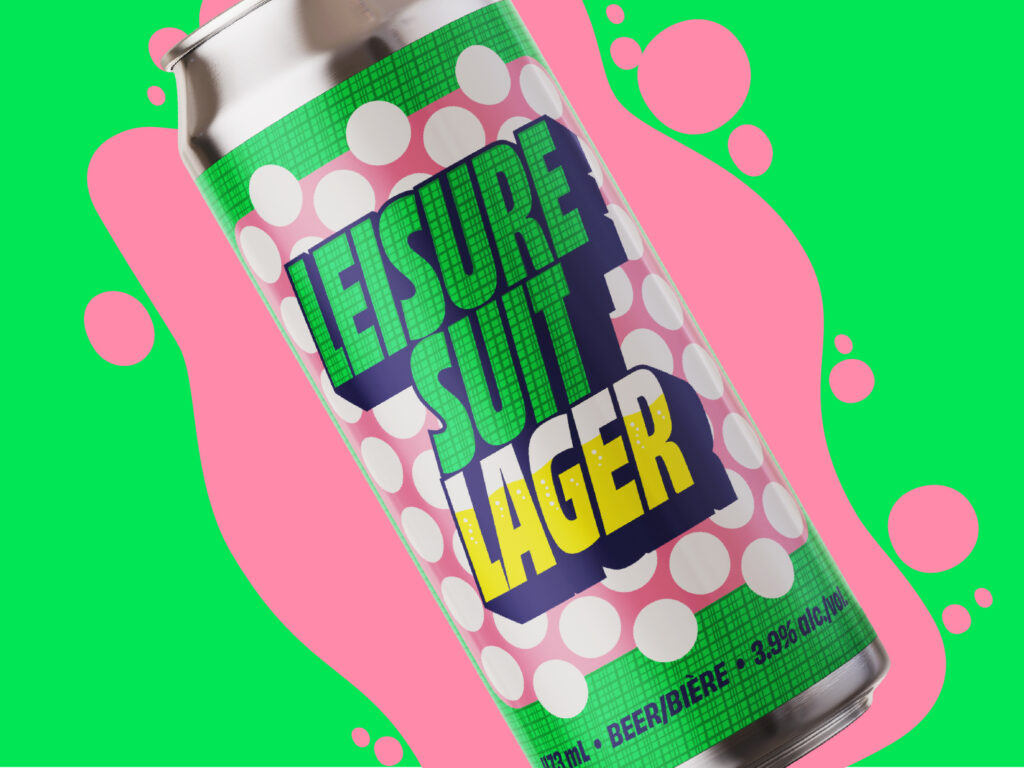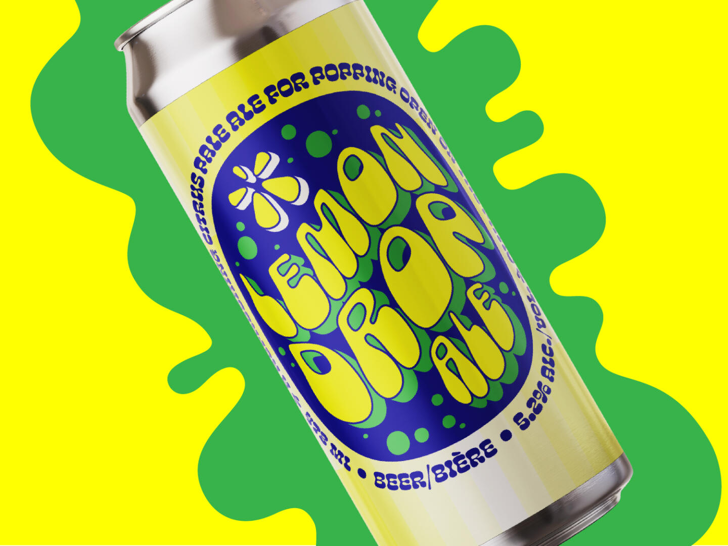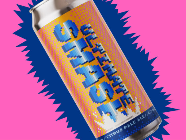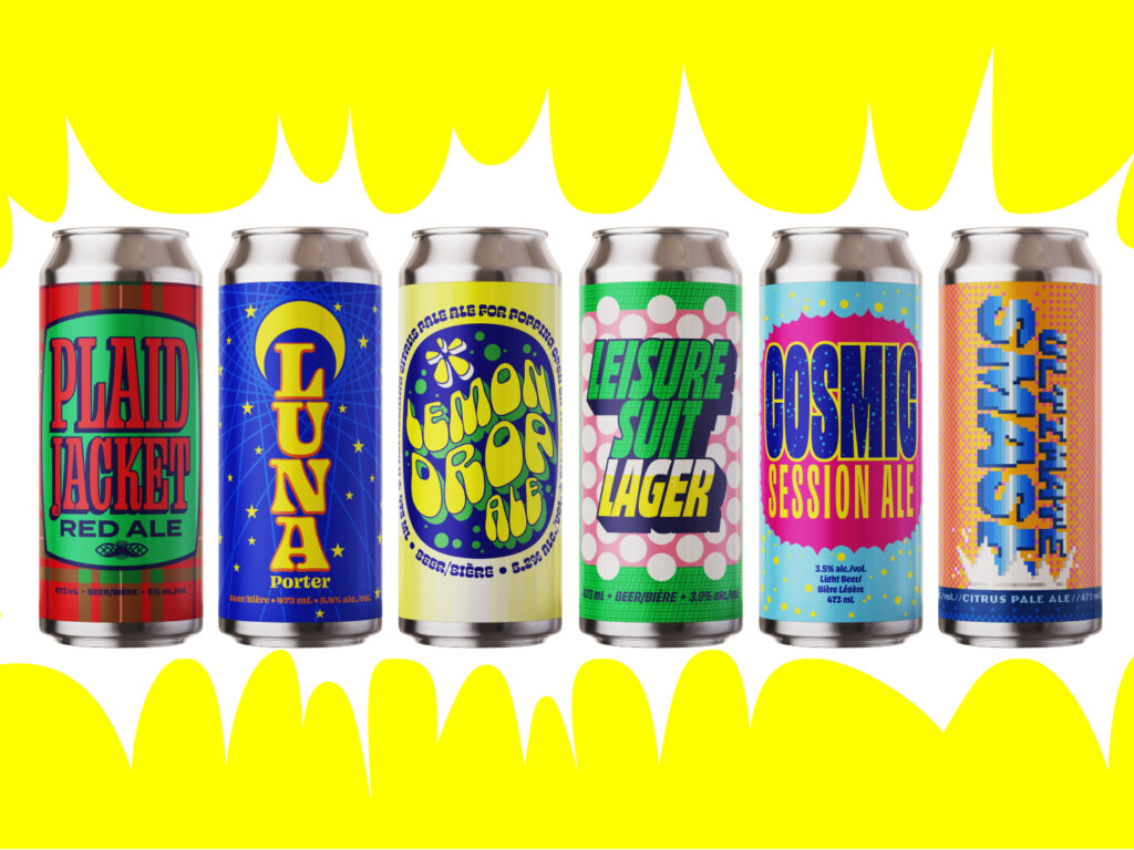
Cliffside Brewing asked Leechtown for a fairly dramatic label makeover to increase their brand’s eye appeal and help it stand out in retail locations. Their goals were simple and direct: every beer should have an individual look and feel, colours should be bold and saturated, and the direction should feel fun, striking, and unlike anything else.
Chunky type lockups and contrasting colours established the lineup’s big personality. Whenever possible, Leechtown makes references to concepts indirectly, to put a subtle spin on the most obvious interpretations of an idea. Using textures and patterns as supporting elements kept things interesting without clutter. Statement typography did most of the heavy lifting.