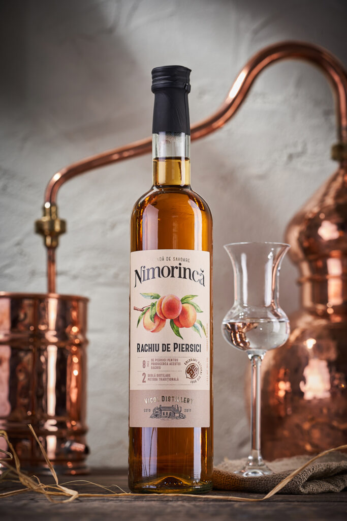
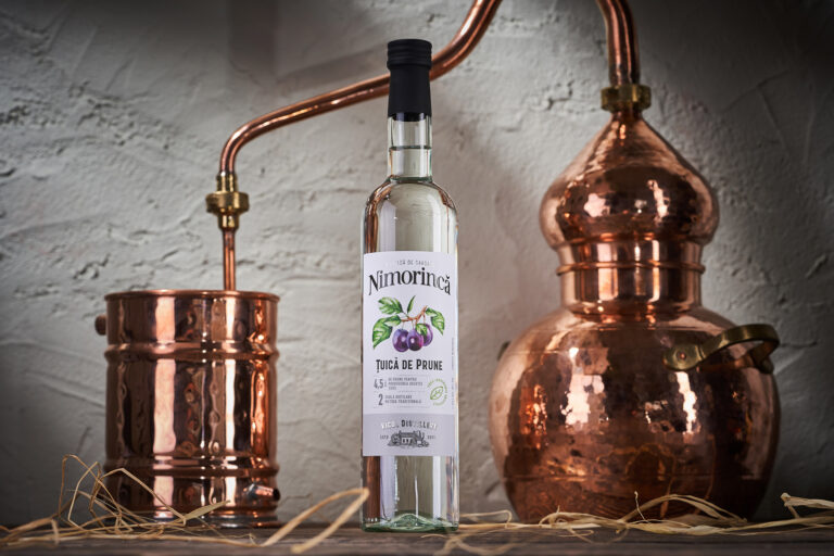
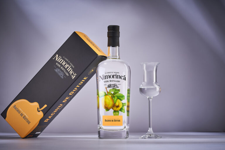
Nimorinca is one of the most famous Moldavian brands associated with the production of fruit distillates. A distinctive feature of Vicol Distillery, which owns this trademark, is the full production cycle: from growing fruits in their own gardens to bottling the final product, everything happens under strict control within the enterprise itself. And for many years on the market, the Nimorinca brand, named after the village of Nimoreni, has attracted the attention of a rather narrow, but very loyal audience that appreciates the quality and scrupulous approach of the manufacturer. However, over time, the need for a more detailed and serious positioning of the brand became obvious, which now included several product lines at once from different price categories. This is exactly what our studio did as part of a large-scale project of redesigning and rebranding Nimorinca distillates.
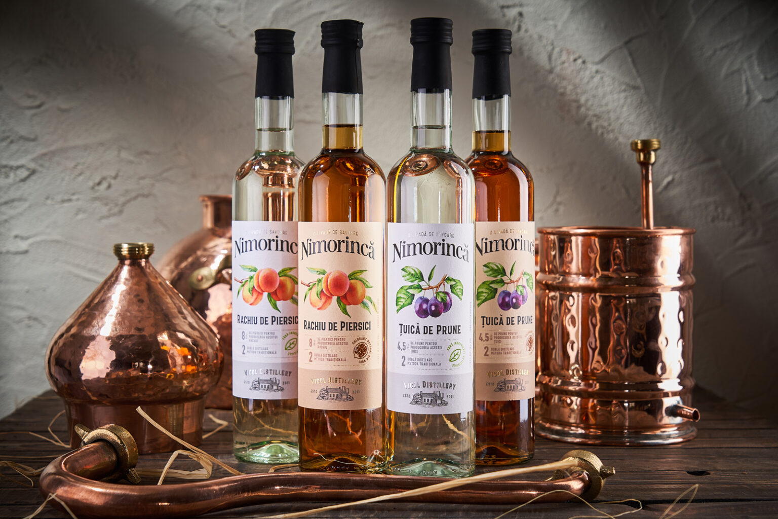
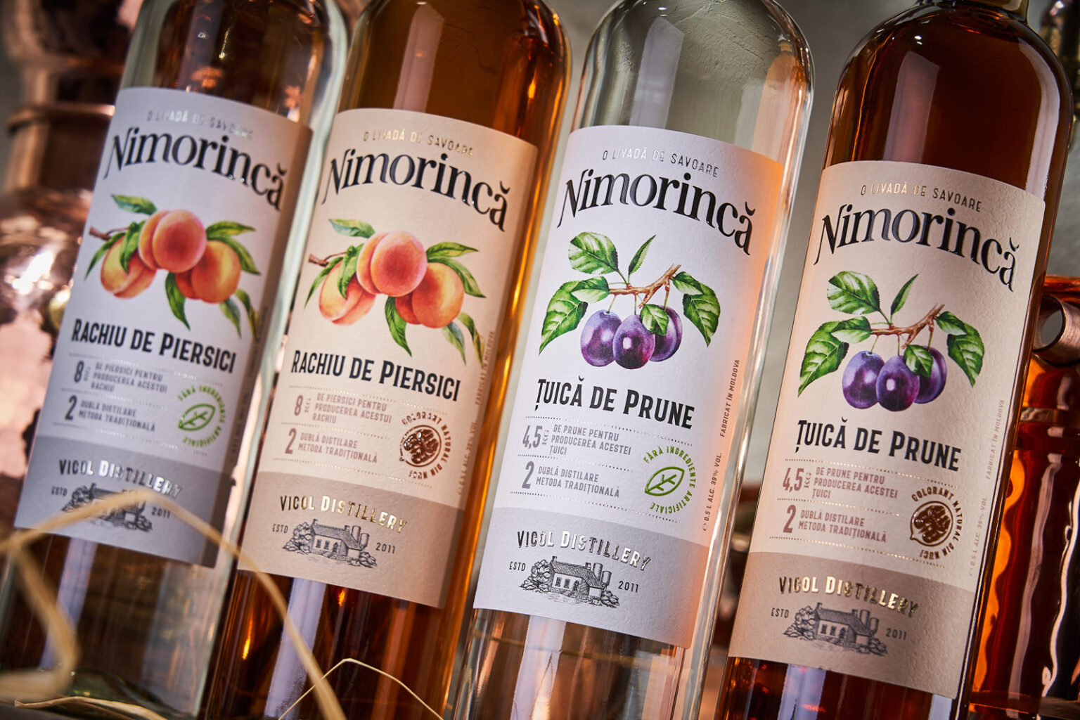
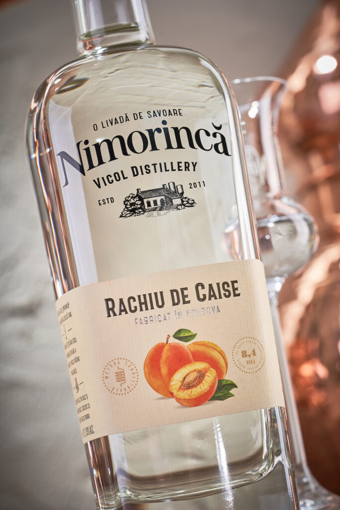
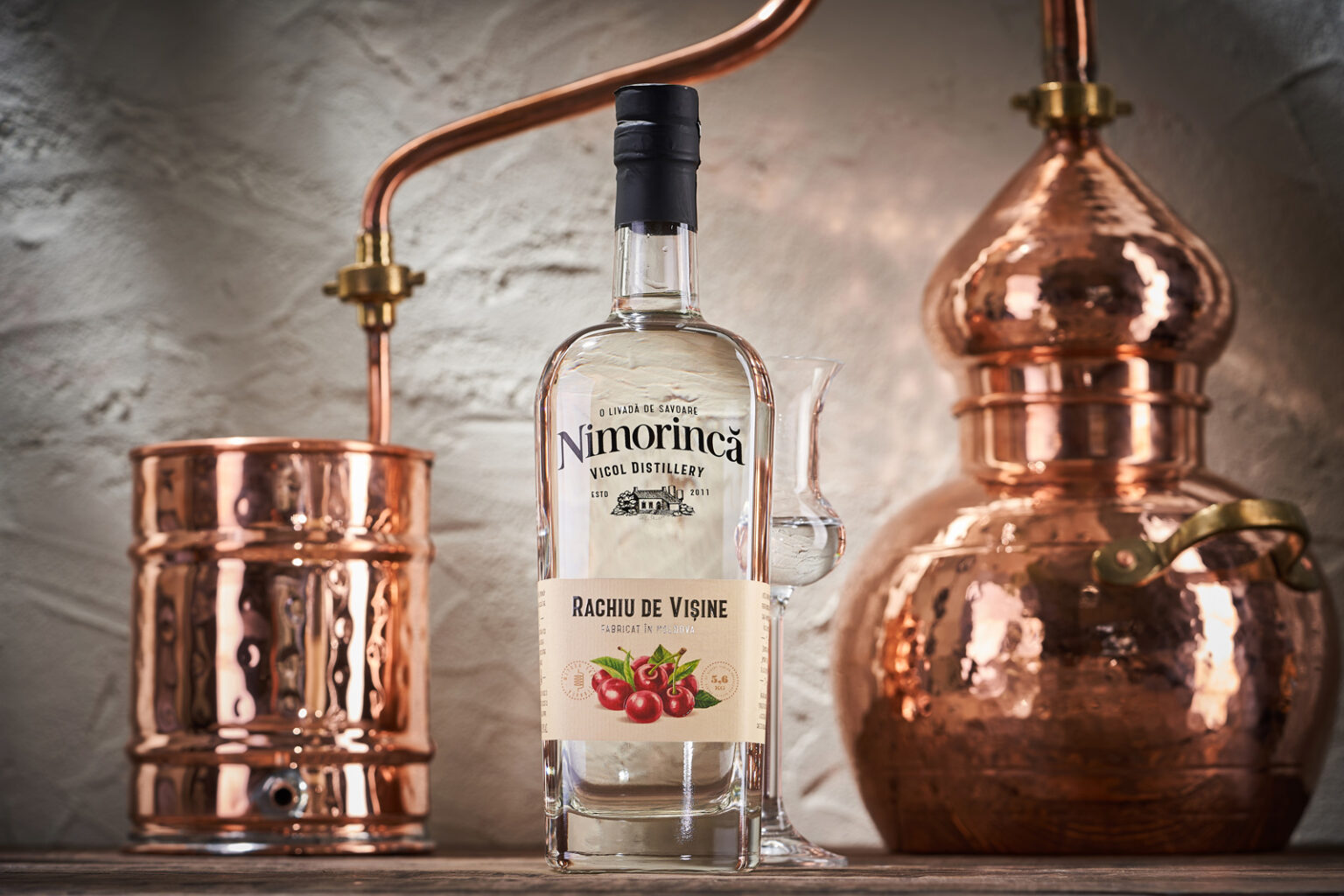
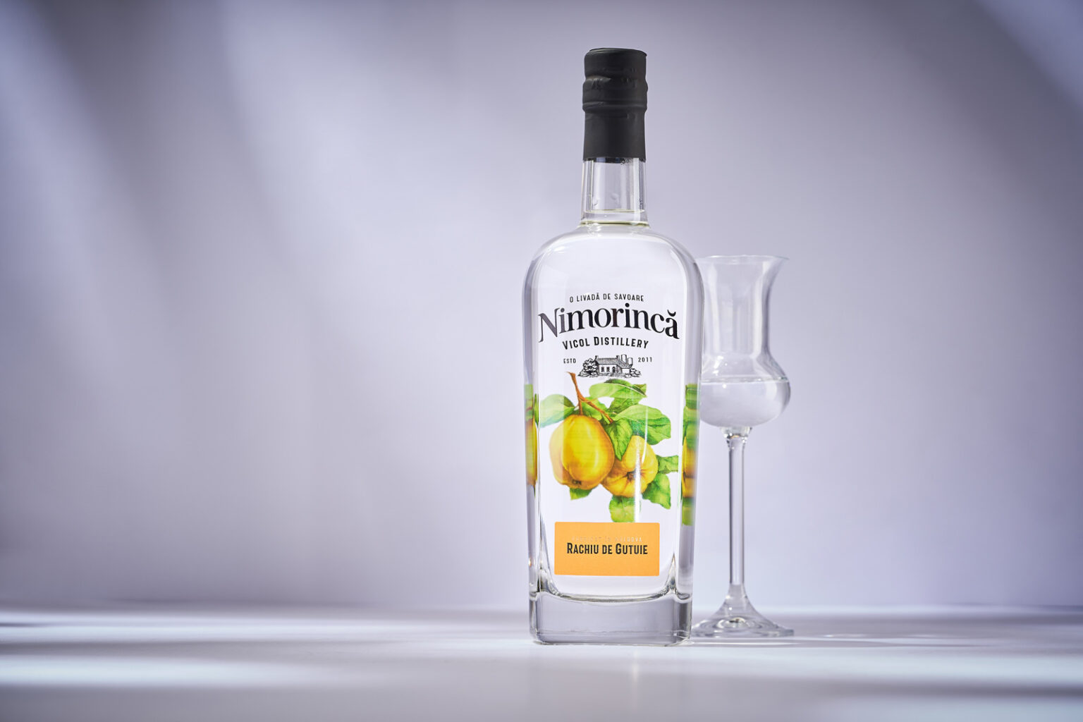
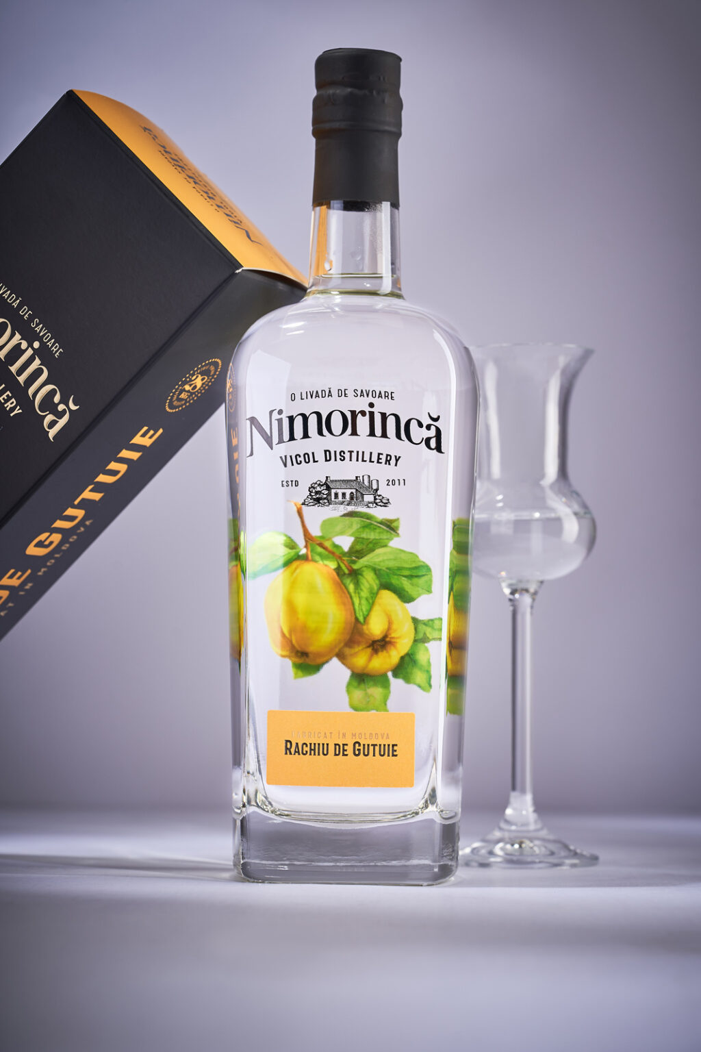
The primary task from the extensive list for the Nimorinca project was a clear division of product lines within the brand portfolio. To accomplish this task, for each product line, which are divided both by price and by the method of production, a different bottle shape and packaging solution was chosen. In general terms, the design of the label for all product lines is consistent with the same style, based on the craft material aesthetics and realistic illustrations of the fruits from which the corresponding distillate is made. However, each series uses its own set of printing technologies, which, together with the special shape of the bottle, clearly separates the products between the different categories. The brand logo was also updated and the logo of the manufacturing company itself was created, which was placed on the front of the bottle along with some technical characteristics of the product. And for the premium quince distillate, which has a special place in the brand’s portfolio, a gift box has also been developed that emphasizes the exclusivity of this drink.

