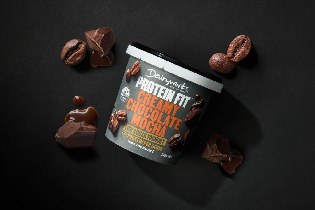
Having built a successful brand portfolio in convenience cheese, Dairyworks is moving into other dairy-based categories with their ‘Make life Easier’ brand platform.
The yoghurt category is a busy environment, with various corporate and artisan brands that offer similar styles and flavours of products. While Protein-based propositions have created a new sub-category, these are still based on the same standard (and boring!) flavour recipes. This was the opportunity for Dairyworks to create a new range of Protein-rich yoghurts which had flavours that consumers would crave after.
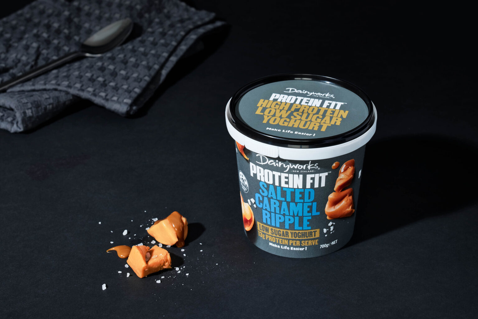
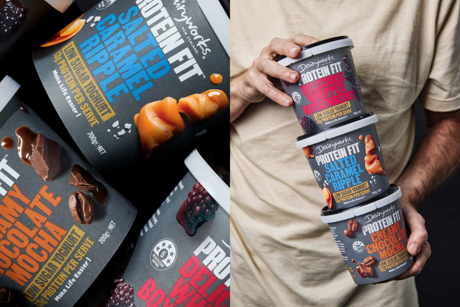
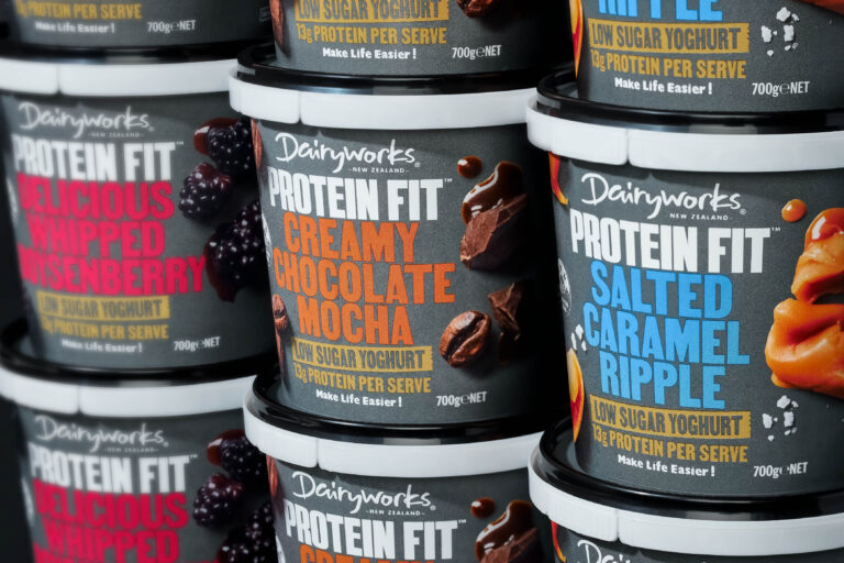
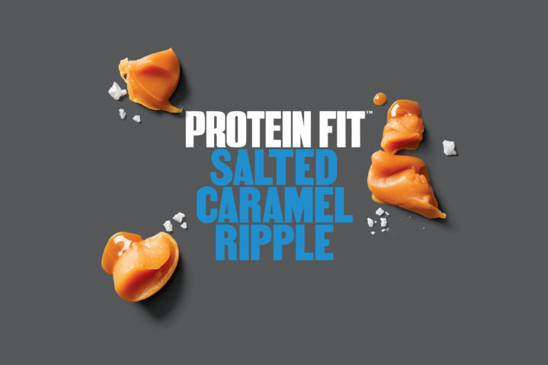
We created a new design language that disrupted this growing category. Ignoring the incumbents’ standard black colour coding, a dark grey brand block creates a compelling alternative for the protein consumer. Typography is big, simple, bold and uncompromising – communicating flavours that verge on indulgence rather than meh! This is complemented by oversized macro photography of key flavour ingredients showcasing the rich colours, textures and luscious shapes. This range packs a protein punch, with more of the flavour consumers desire.

