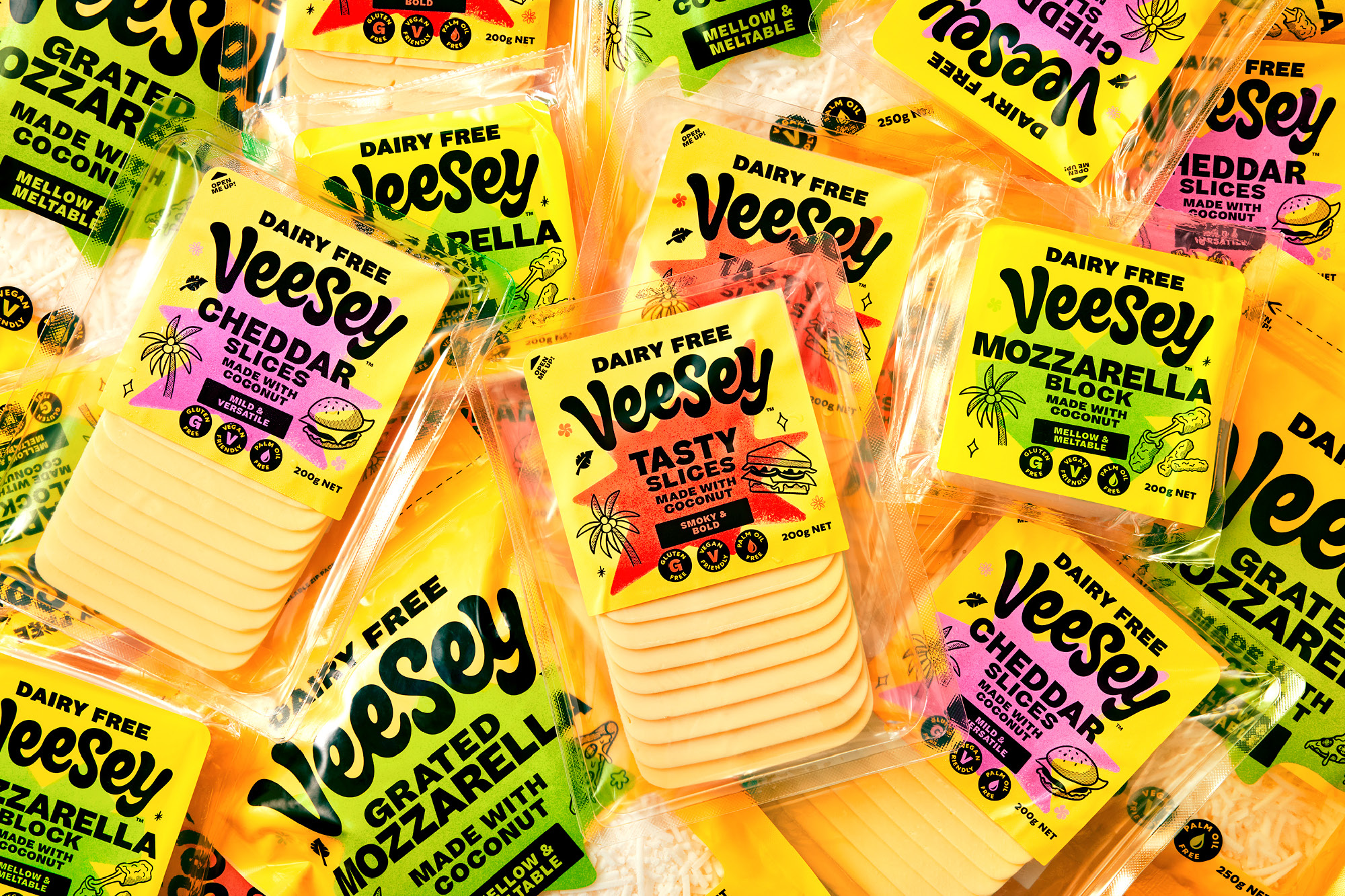
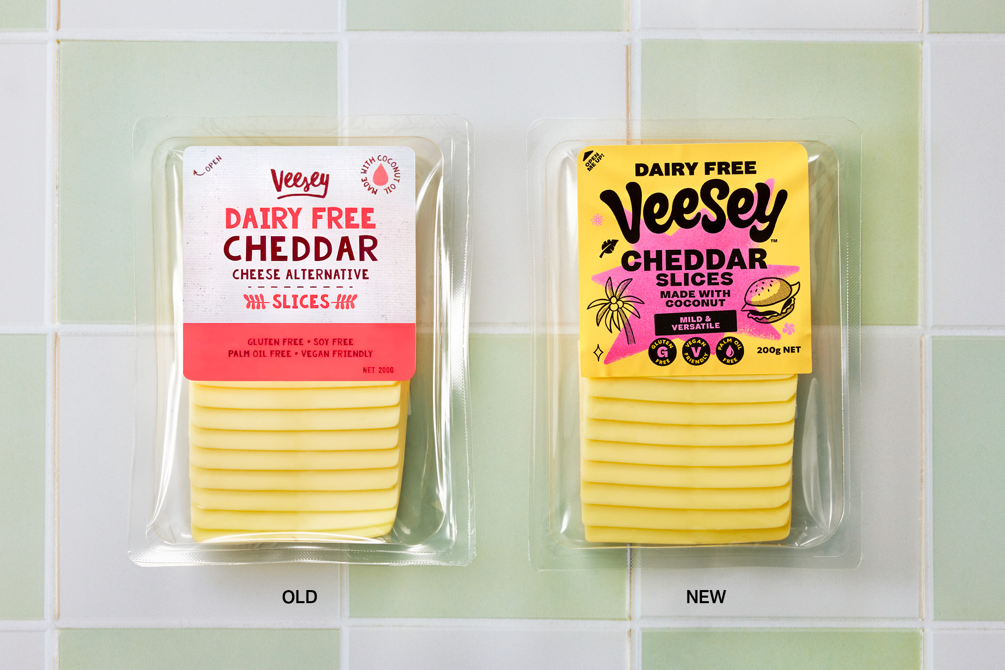
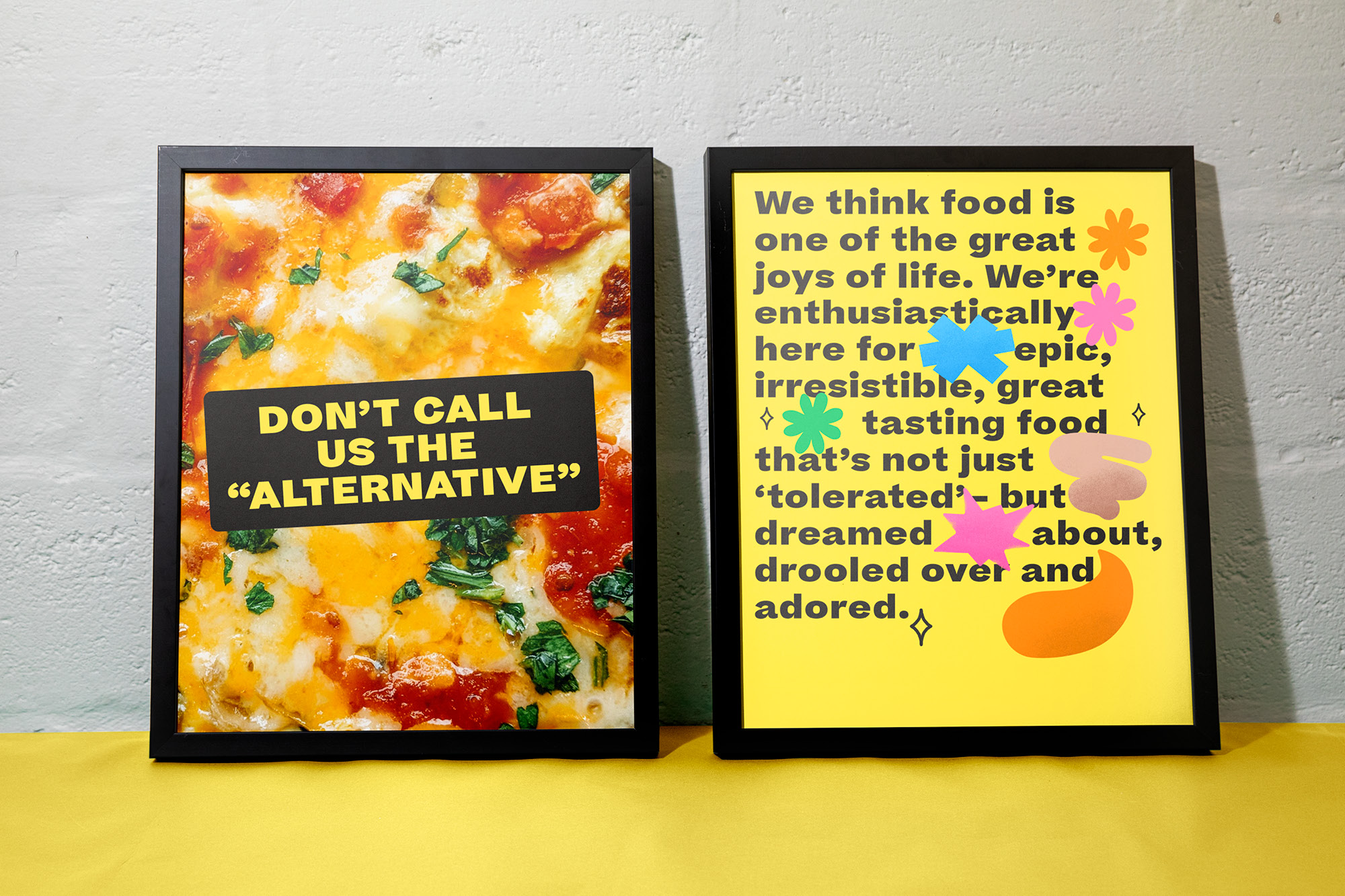
Veesey is combating the idea of being the ‘alternative’ to dairy. Having established itself in the growing dairy-free cheese category, the brand needed to refresh its packaging and positioning to help differentiate from competitors using similar free-form language and assets. This would then support the brand’s future growth and expansion.
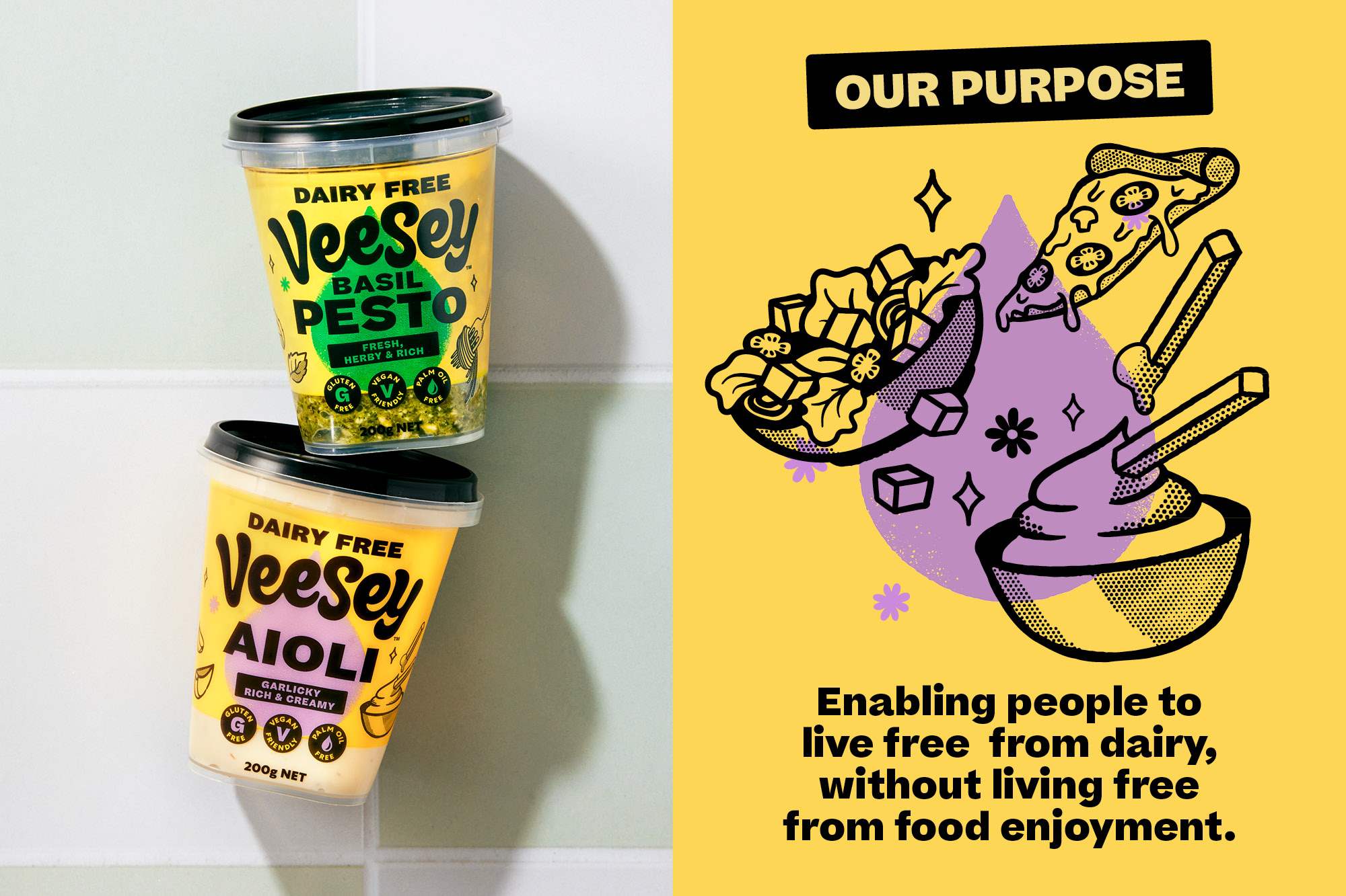
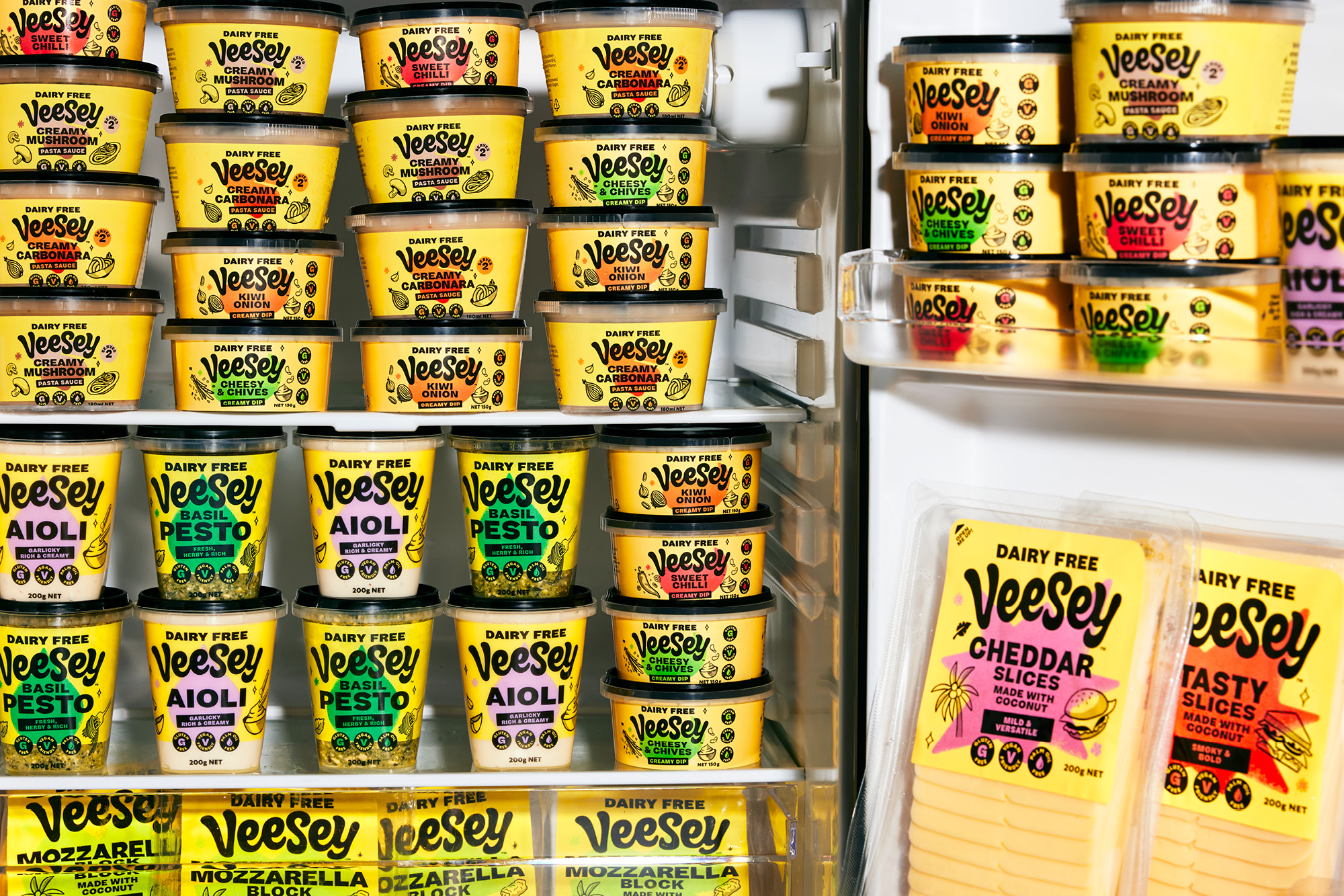
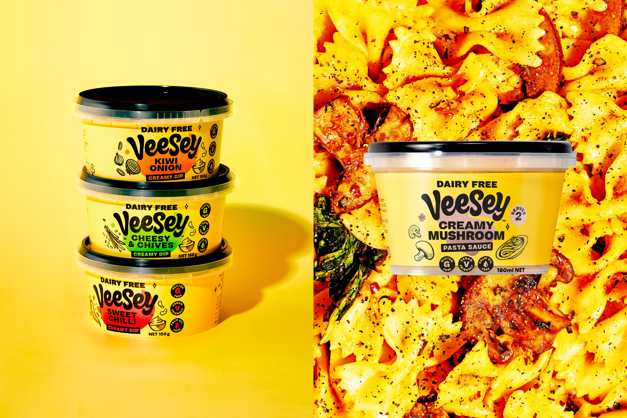
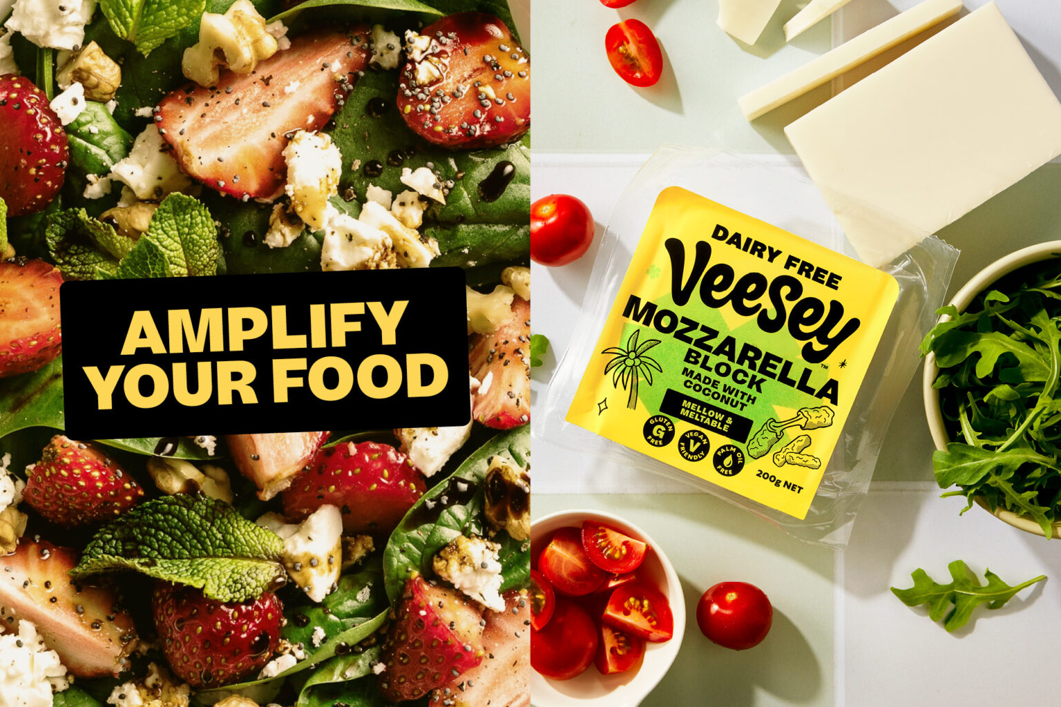
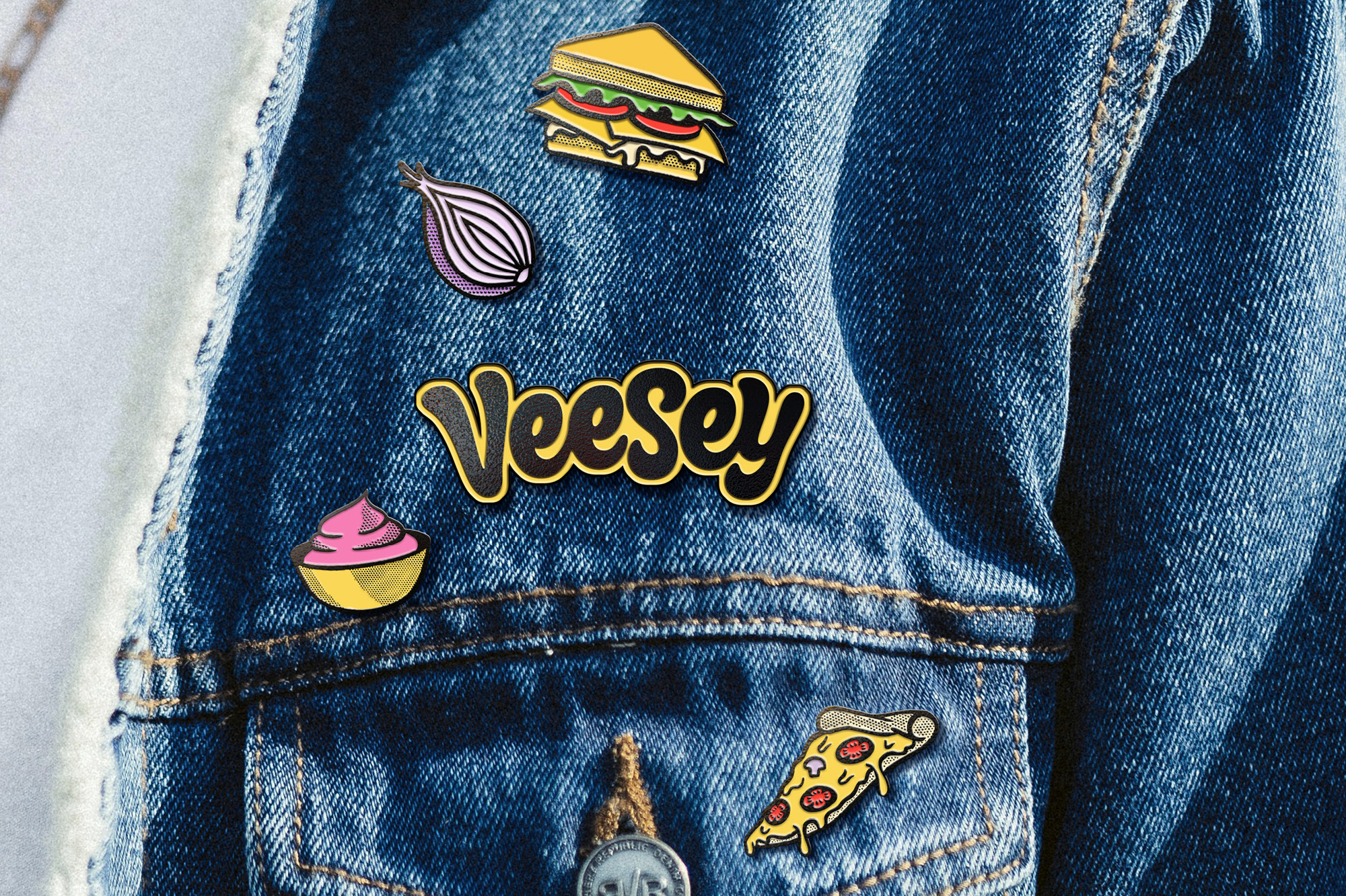
‘Intolerant to boring’ was our new positioning, opening up a design language based on happiness, epic food, and enthusiasm. The refreshed brand intentionally shifts the narrative from the category conventions of being ‘brand-light, product-focused’ to loud and proud. The new Veesey wordmark is lively and spontaneous with a heavy dose of soft, melted, cheesy goodness. Pack formats are bright and punchy, embracing a bright yellow brand block instead of the category-standard pastels and whites. Bright colour explosions help product navigation, while hand-rendered doodles indicate food suggestions.
Copywriting and on-pack messaging embrace positivity. Statements are short and sharp, and the vocabulary is filled with adjectives and descriptions that highlight taste, flavour, and enjoyment. Relaunched back into the market, Veesey is the modern non-cheese cheese brand that is difficult to miss in chillers and challenges consumers to rethink their perceptions of what dairy-free cheese should look like.