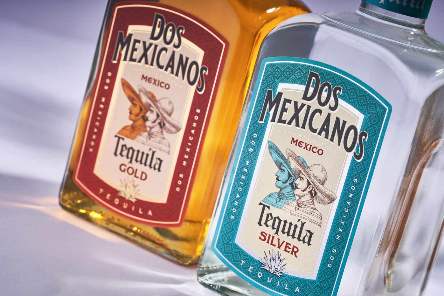
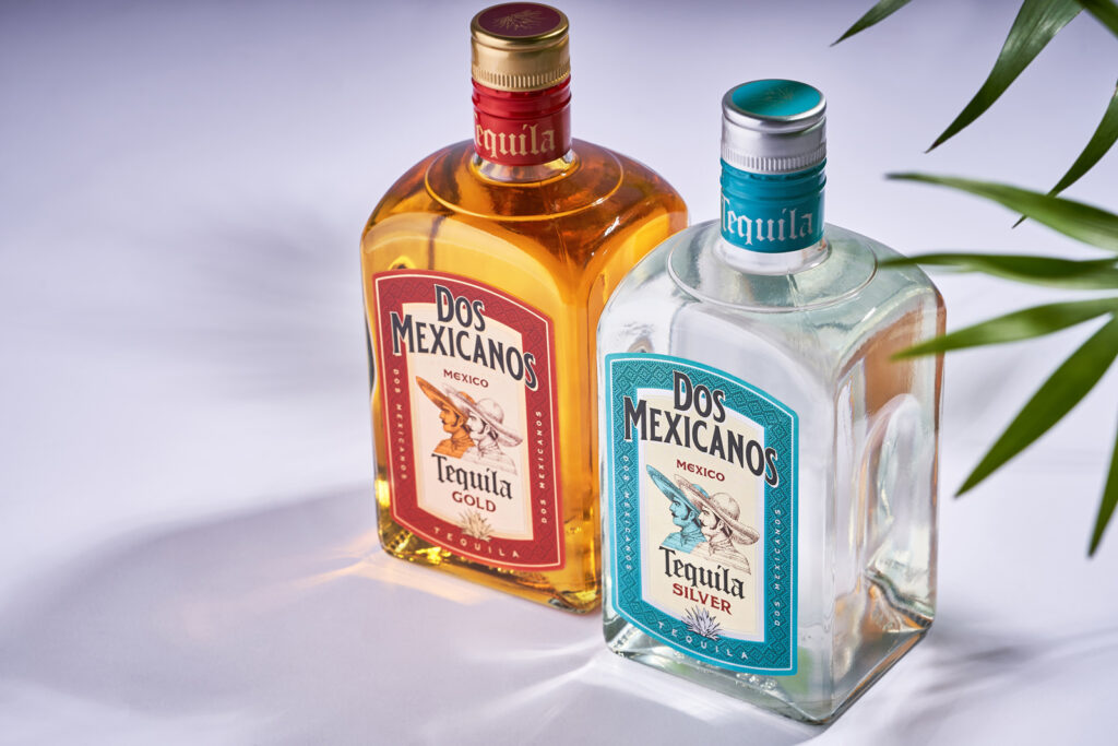
The fruitful cooperation between our studio and the Belgian company Sodiko, specializing in the production of various spirits, implies constant work on updating their extensive brand portfolio and creating new brands. In the case of Dos Mexicanos tequila, our task was to update the visual for a fairly popular product that is present on the market almost all over the world. Therefore, we had to retain the main message of the product, while updating its visual component and making it more competitive with current trends and offers. This is exactly what our studio delivered as part of the global redesign project for Dos Mexicanos tequila by Sodiko Beverages.
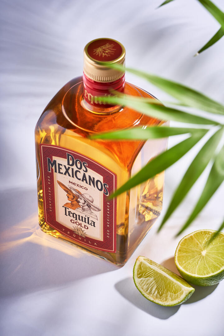
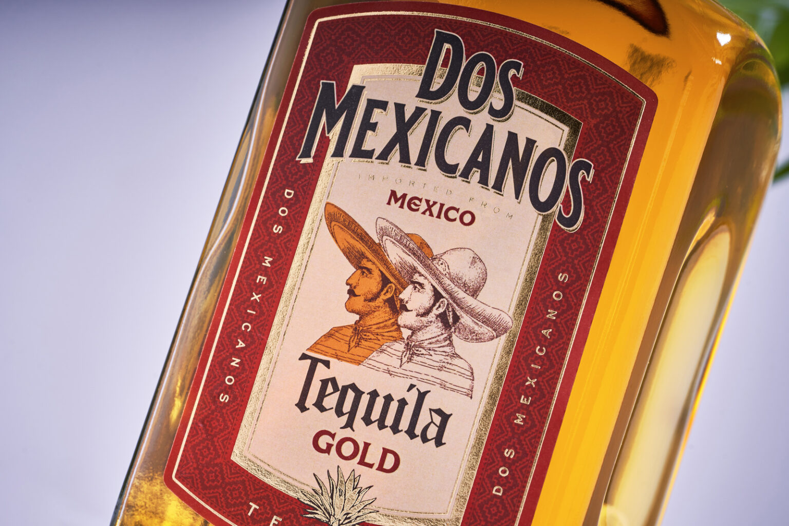
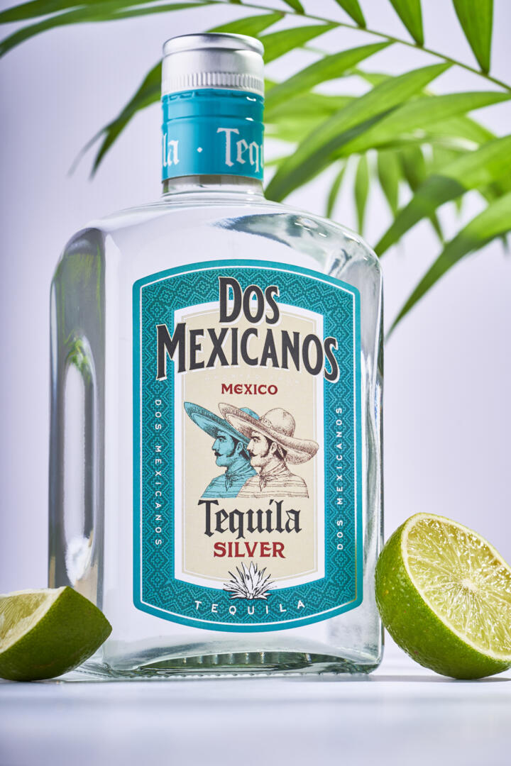
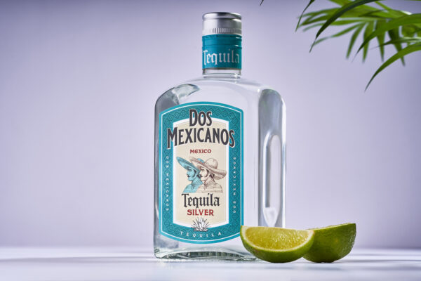
When embarking on an extensive project to redesign the packaging for Dos Mexicanos tequila, we were faced with the need to completely restyle the label, which has lost its relevance and effectiveness in comparison with competitors over the years. Therefore, the updated design can be regarded rather as an ideological successor to the old packaging, since we have redesigned absolutely all graphic elements and rethought the overall composition of the packaging design for this product. The new design delivers a brighter and more colorful sensation, with an emphasis on ethnic patterns and a central illustration that embodies the name of the product. As a result, even with a cursory glance at the bottle, the drink is instantly identified as authentic Mexican tequila, which is exactly what was required to achieve as part of the redesign of this product.