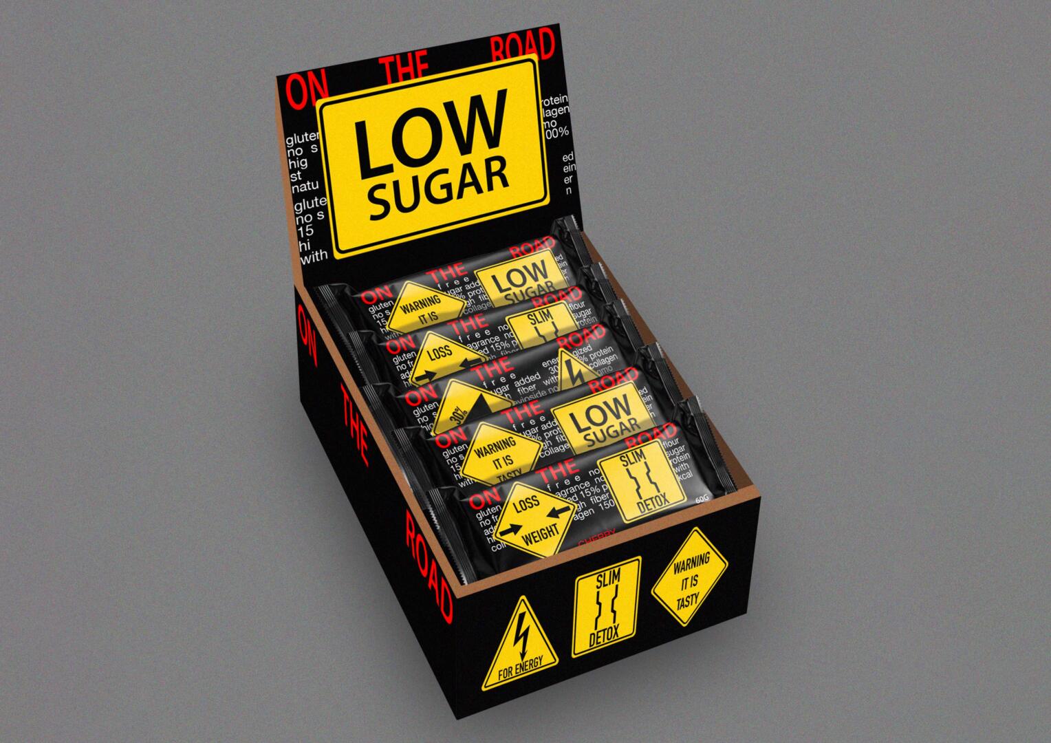
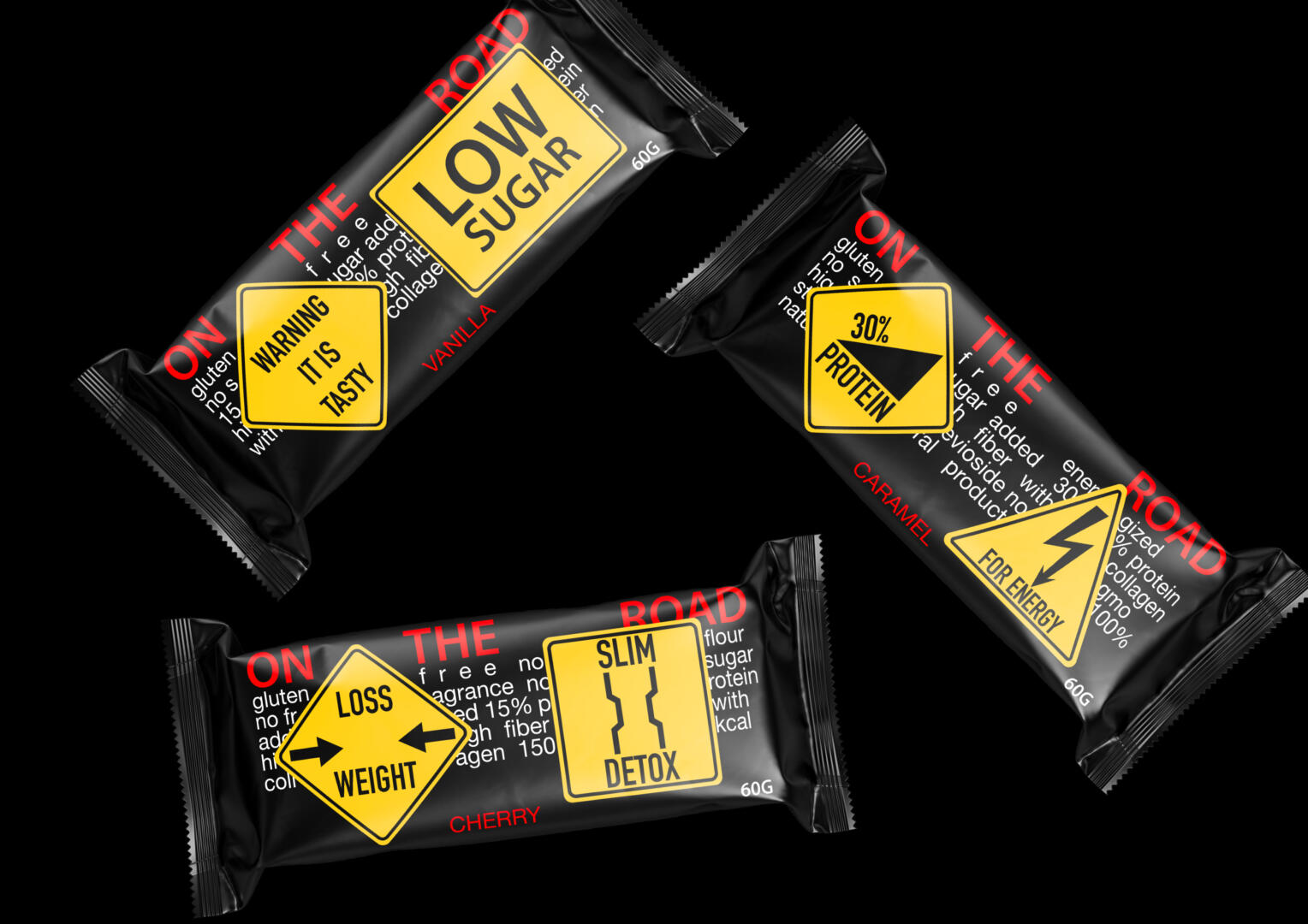
ON THE ROAD
The brand speaks for itself.
The packaging is presented in a grunge style that comes from the musical style. He gave the idea of possibly combining road signs that signal important information to us and active typography. So the packaging gives information about what you will get by buying one of the bars, thanks to the bright road signs.
The beginning of the style takes from the country style — roads, cars, signs, but since the story turned out to be more active and aggressive, then the style should be appropriate.
Primary colors: black, red, yellow and white. They blend well with each other and make brutal mood. The brand name and flavor descriptors are in red, additional text and weight — white as they are secondary information. The main signs are yellow, they carry important information about the content and purpose of the bar. In such packaging, the energy that the product contains is visible.
Grotesque was used in the title and additional text, because it is strict and conveys information well. The signs used special designations about the purpose of the product, similar to real road signs.
A healthy and satisfying snack for athletes, active people who want to lose weight, gain weight, as well as for students, motorists who have to eat on the go.
The bars come in three different flavors: vanilla with low sugar, cherry for weight loss and detox, and caramel with protein and energy.
The product can be sold in gyms, specialized stores, gas stations, driving schools, motorcycle shows, karts and car dealerships.