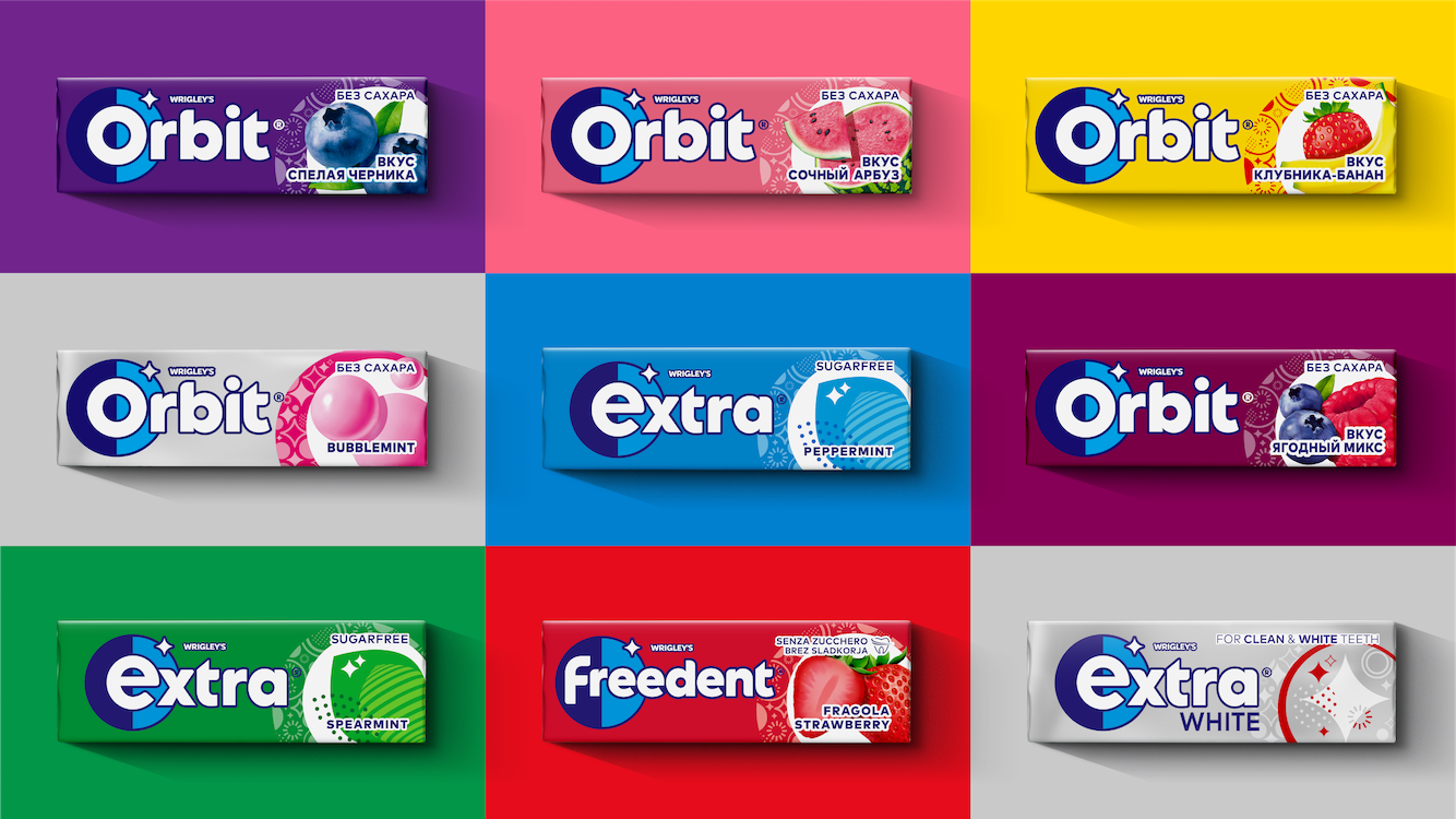
Elmwood London helped Wrigley’s Extra achieve its bold ambition to shift its positioning, focusing on flavour and moments of confidence and leaving behind the traditional dental hygiene codes. Extra needed a new brand expression to unify global markets, appeal to younger consumers and transform Extra into an iconic lifestyle brand for a digital-first generation.
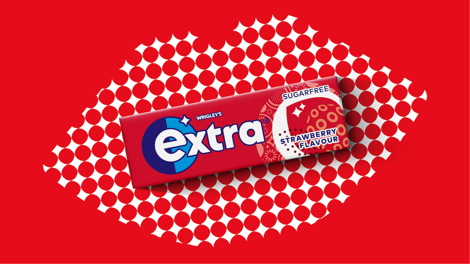
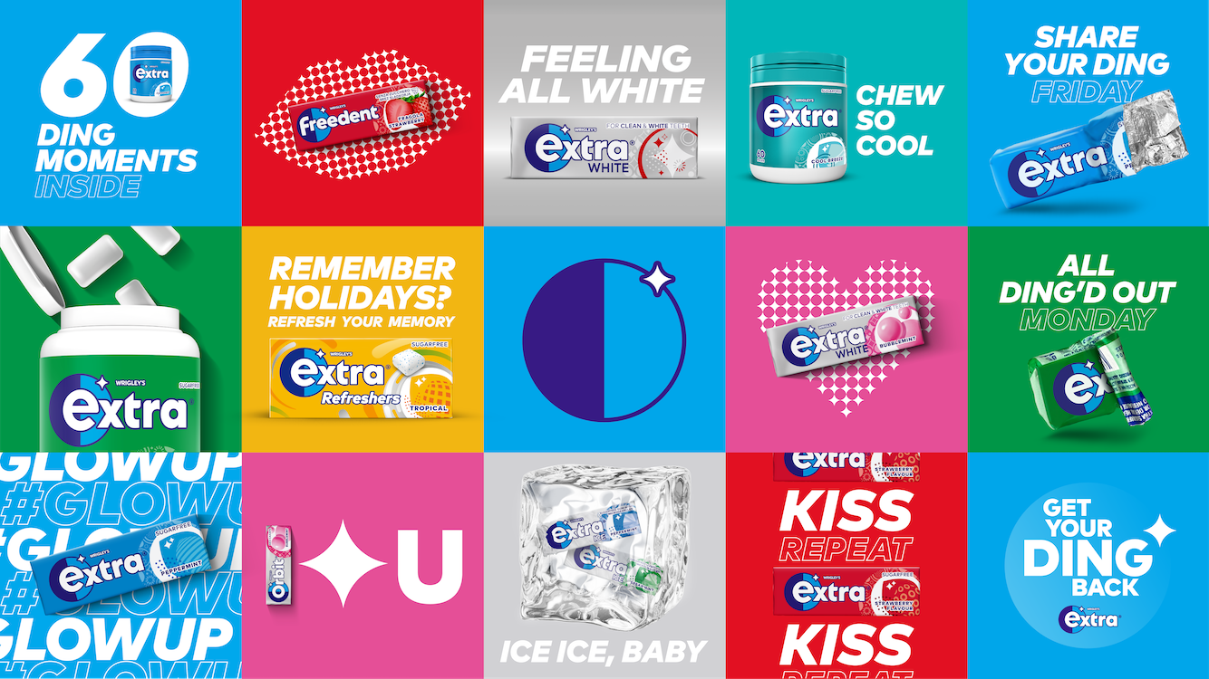
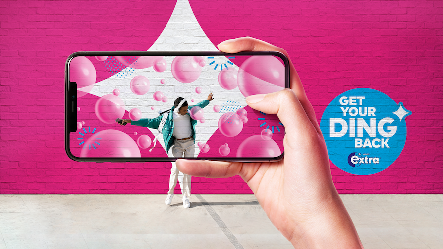
Elmwood London transformed the Extra brand into an iconic lifestyle brand amongst younger Gen Z consumers, a digital-first generation. Updated with softened curves, the new Extra brand look is outstanding. Extra’s “ding”, one of the major brand’s key assets, has been reimagined, set beside a circular ‘shield’ shape for greater flexibility. This shield shape is also used alone as a universal icon across all touchpoints. This feature gives the brand potential, in the digital age by bridging the tension between iconicity and flexibility. In addition, the initial letter of each brand name is highlighted to form the full brand flag suite bringing consistency and memorability across all markets.