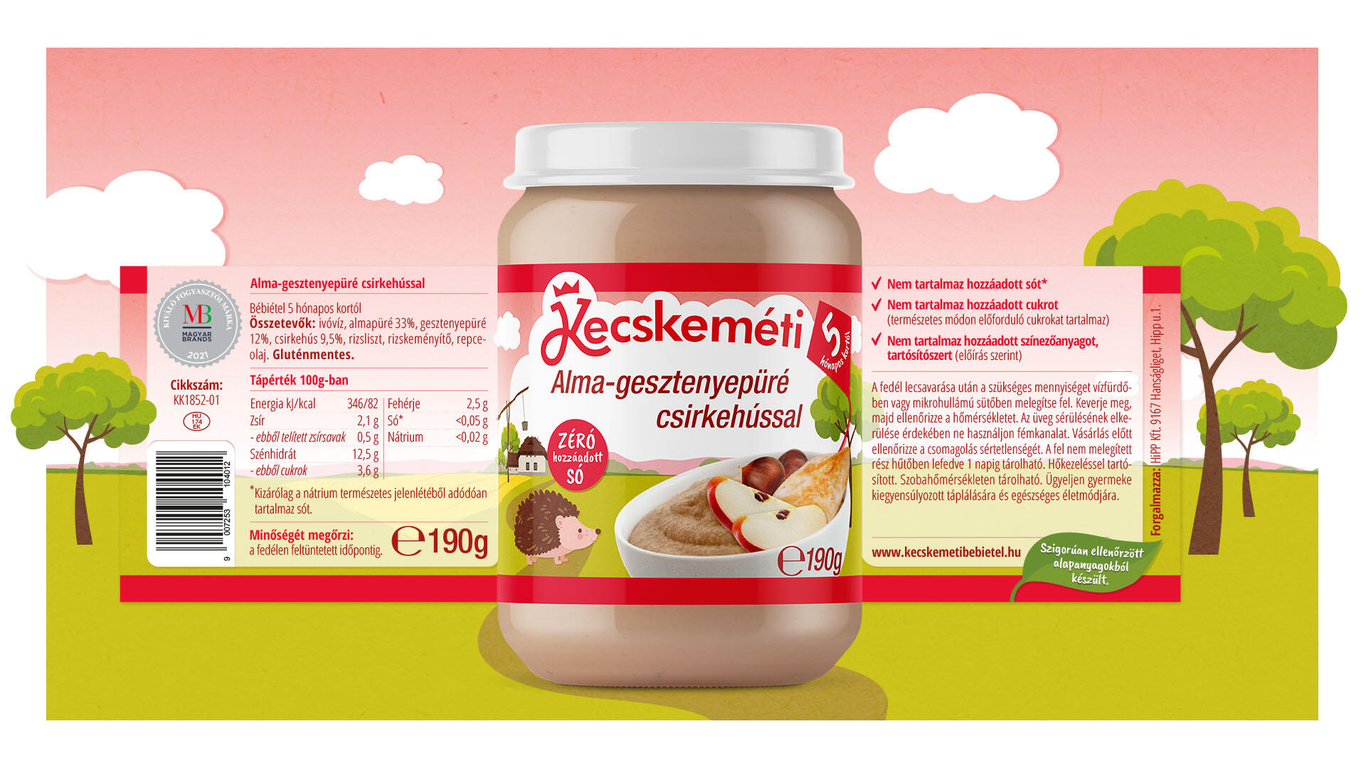
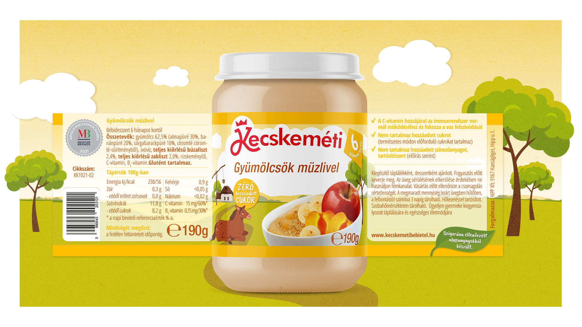
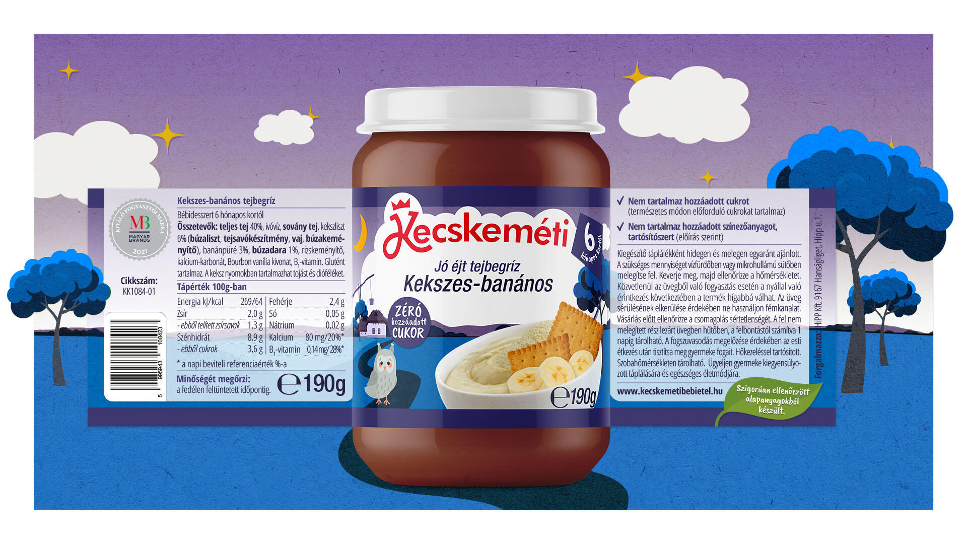
The traditional Hungarian baby food brand consists of nearly 70 types of products. Pre-design market research has revealed that the graphics on the previous label are outdated and do not communicate what the manufacturer wanted to say to the consumer. The target audience is health-conscious parents and grandparents who prefer the flavors of the home.
During the redesign of the logo, we retained the style features of the brand: typography style, colors and crown symbol. We kept the different color codes on the label, which illustrates the product families. Age and product benefits have been incorporated into the graphics as symbols.
As the market research shows that consumers prefer locally made food, thats why the landscape and animals on the label are all typical of Hungary, strengthening the local connection. The cartoon-like presentation of animals and the environment capture the baby’s attention and also provides an opportunity to tell a story for happier moments.