The beauty and skincare industry has long been associated with unattainable & unrealistic ideals. This has had several repercussions damaging the self-confidence of millions in India beyond leading to an unhealthy obsession of unrealistic skin expectations. When we were approached by Dr Aimee Daxini, a renowned dermatologist and founder of Think Skin Clinic, Bangalore, they were embarking on a journey to redefine the conversation around skin and skin care in India. We ran Dr Aimee through our ‘Brand Builder Workshop’.
What emerged very clearly from this exercise was Dr Aimee’s drive and focus on shifting the conversation around skincare in India. And also about the fact that we often use far too many unnecessary products in the pursuit of ‘the perfect skin’.Goskin+ range of products is exclusively focused on using new materials and ingredients which are extracted from plants that have been dermatologically tested and proven. These inputs fuelled the visual identity and communication design elements of the brand. It embodied an element of honesty that was baked into every bit of communication right from the labels to brochures, websites etc.
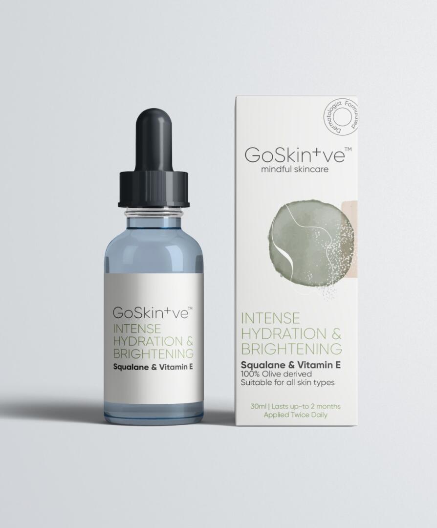
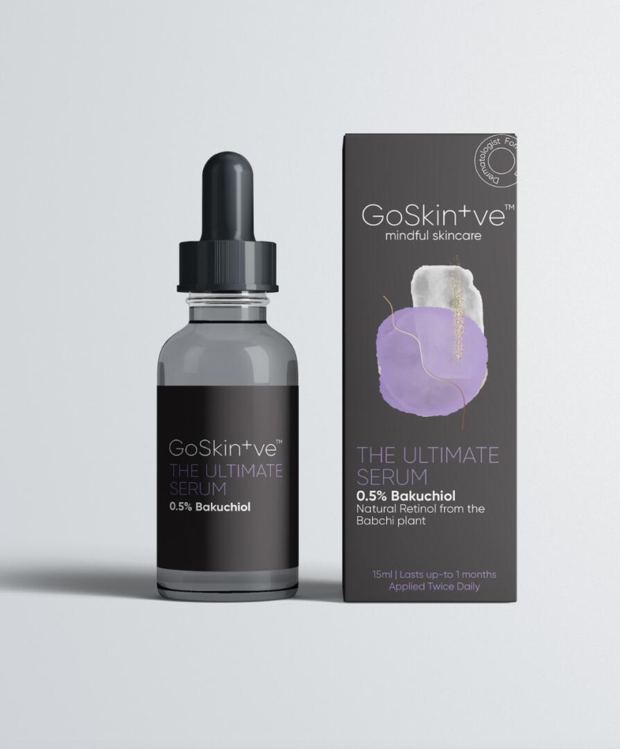
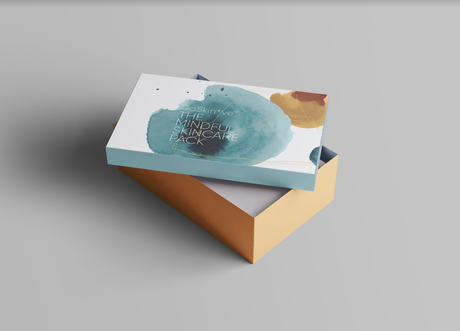
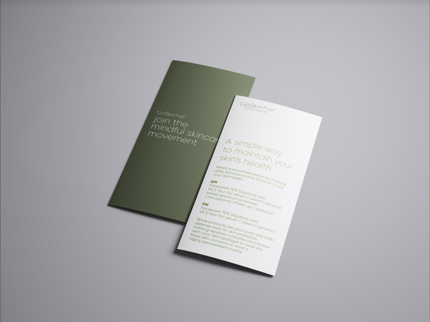
Visually this translated into a minimal clean sans serif typeface as the primary font. Furthermore, the shape and types of bottles along with the messaging that accompanied these products on leaflets were all designed to help further this idea, vision and communication about skin positivity. Each of the outer boxes for the packaging featured one panel that explained the nature of the primary ingredient and how it helps your skin while another key panel explained the idea of mindful skincare. A gift pack was also created as part of the packaging process that was used to send samples to key customers, friends and family.
Each of the packaging features an abstract illustrated representation of what the benefits of the product are. While the graphic design & typography of the packaging follows a serious pharma approach – reflecting the science behind the products, the illustrations represent the art behind a holistic look at skincare. Each of the illustrations are an abstract representation of the formulation and the benefits of the core ingredient. Squalene – the active ingredient in Intense Hydration serum is naturally derived from olives and naturally hydrates the skin – this became the inspiration for the artwork on the outer box.
Some of the constraints we worked through this project were around the ability to convey important information about the product and ingredients on small labels given that a lot of these bottles were physically ‘relatively small’. We also developed an integrated identity guideline that helped create consistency across all consumer touch-points for the brand.