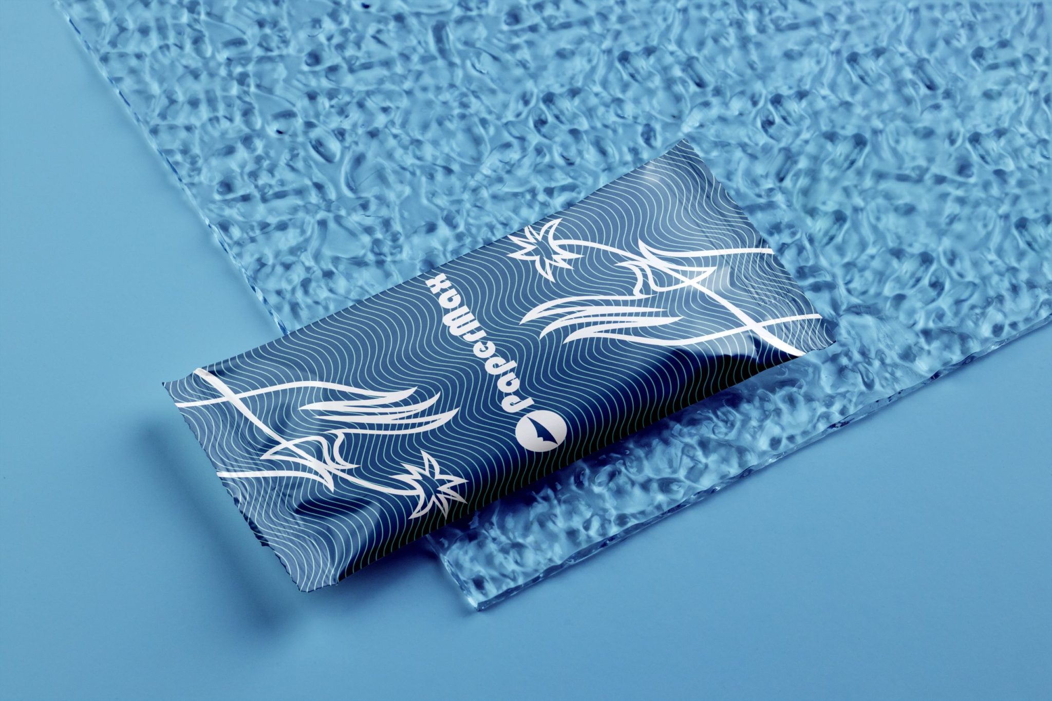
Description: The PapreMax wet tissue packaging design embodies and elegant, minimalist aesthetic inspired by NATURAL elements and fluid lines. The core concept features a linear illustration of a woman’s hand gently a star-like flower, symbolizing delicacy, purity, and care. This refined illustration is complemented by a dynamic wavy pattern, reminiscent of water’s soothing qualities, enhancing the design’s connection to wet tissues.
The color palette predominantly uses deep blue and white, emphasizing cleanliness and reliability while creating a visually appealing contrast. The layout prioritizes simplicity and functionality, aligning with Scandinavian and European minimalist design traditions.
The packaging effectively combines MODERN BRANDING elements with a NATURAL TOUCH, making ita standout choice in PaperMax’s product lineup.
Project: PaperMax Wet Tissue Packaging Design
Client: PaperMax Nepal Pvt. Ltd
Illustrator: Grigor Mnoyan
Graphic Designer: Grigor Mnoyan
