THE CLIENT
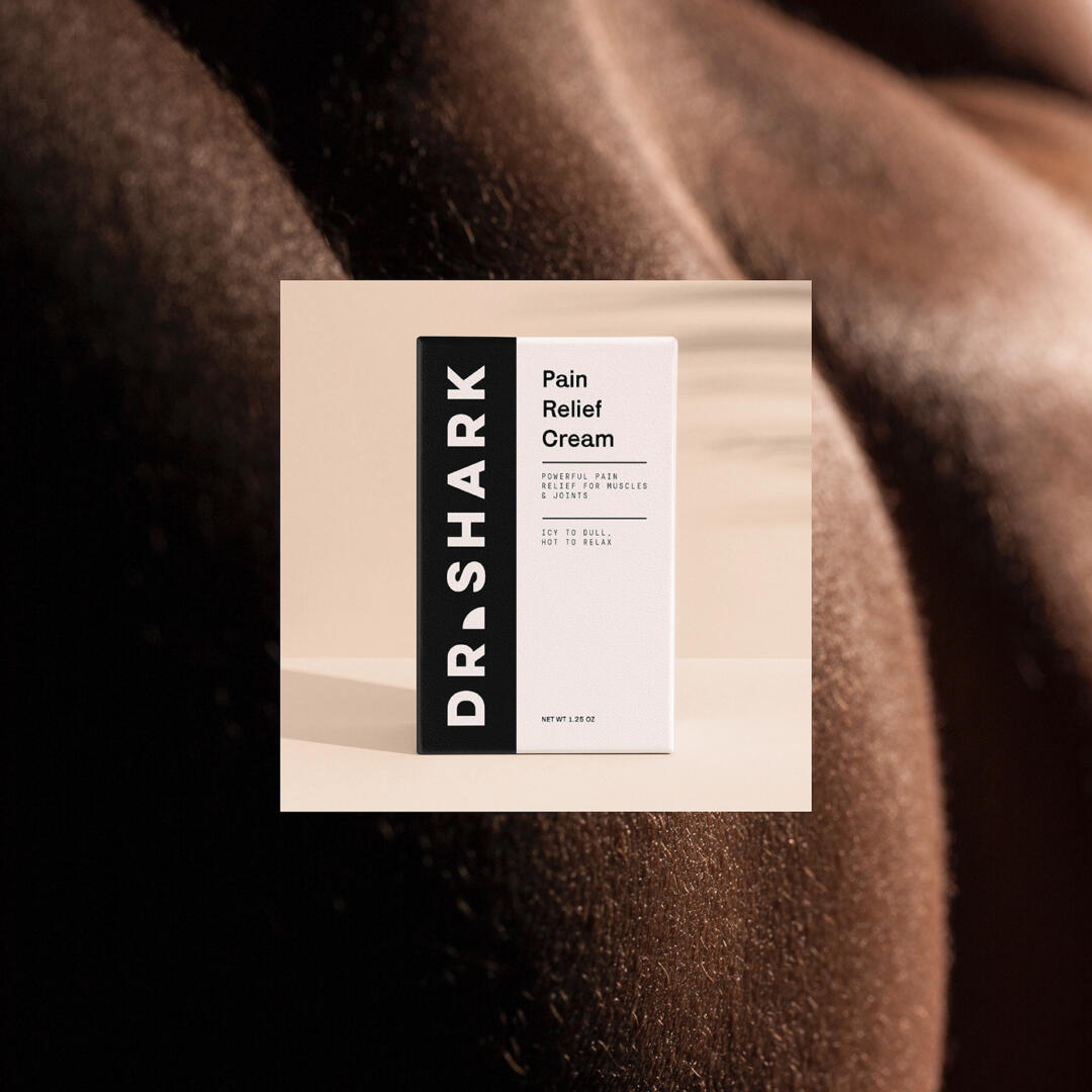
Dr. Shark is a new start-up based in New York. The brand is targeting young adults, and its first product is a pain-reducing cream for those who love sports, aren’t afraid of challenges, and are willing to move on with harder and harder levels of testing.
THE KEYWORDS
Bold / Minimal / Highlighted / Outstanding
THE SOLUTION
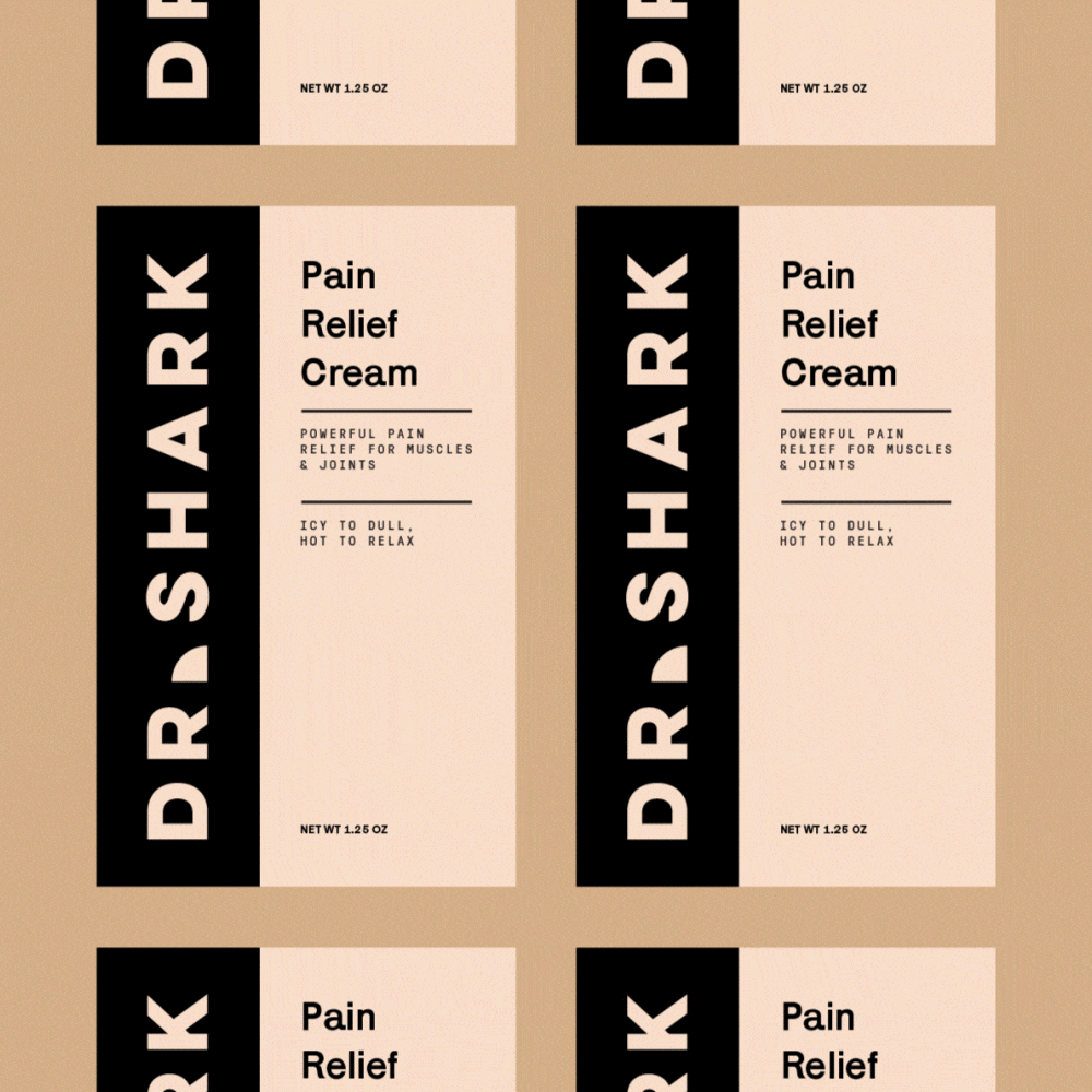
The founders of Dr. Shark didn’t want to have a brand that was too vibrant in color, nor too simple and dull. At this point, we have considered all the desires of our client and we used nude tones and black with bold typography. We used nude colors to build an association for viewers with skin color shades. We have also included a shark fin as a highlight instead of a simple dot after the “Dr.”
The layout for the packaging has a combination of boldness and simplicity at the same time. We placed the logo to the left of the packaging, separated by a box filled with black. This way, the packaging attracts the viewers’ attention straight to the bold logo we have created.