HomeTown is a new brand in the dairy market category in Indonesia and is one of the new brands that are quite agile in the market.
HomeTown dairy’s unique selling value is fresh dairy products directly from the farm with a certain level of pasteurization, making HomeTown the highest quality dairy product in Indonesia.
But over time, there are several obstacles faced by HomeTown, one of which is not easy for consumers to recognize HomeTown products on supermarket shelves. Of course, this is a problem in itself considering the competition in the milk market in Indonesia is so tight.
Face to face with several global competitors and big local companies, of course, HomeTown must change the face of its packaging to be relevant to the competition and the market.
Working together and discussing with HomeTown’s internal team, Eko Widarto as a Creative Director of this redesign project said that the new HomeTown label design must clearly communicate the product’s unique selling point and still maintain HomeTown’s brand personality; simple, clear, and fun.
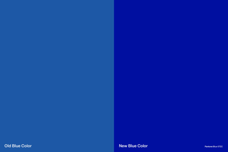
We chose Pantone Blue 072C as the main color to replace the previous blue color which is often inconsistent. This blue color is also one of the points recognized by customers.
We highlight the statement “100% Pure Fresh Milk” as a point of view of HomeTown’s new design label with a combination of cow farm illustrations.
Overall, the HomeTown label’s new design looks artisanal, youthful, and modern. This is to connect with HomeTown’s target market, namely young families, especially young mothers.


