A Beautiful Guilty Pleasure
Where there is craft and passion for products, there must be beauty and care for design. That is why when you look at the Rose Garden jams, there is no way you can resist!
Rose Garden represents jams and marmalades – but not just any. We are talking exquisite! Josefína Růžičková created her brand with honesty at heart and craftsmanship in hand. So it’s no surprise that in only a short time, she has gained well-deserved recognition in her field by making her products in exceptionally great quality. Her personal touch, passion, care for ingredients, local sourcing, and most importantly, the making of always-fresh batches all result in outstanding products. Not to mention the mouth-watering and downright sensual recipes. Unsurprisingly, they won awards in many international festivals and competitions! But we all knew that the design didn’t sufficiently reflect the premium quality. So we crafted it to be something exceptional!
After getting to know the founder and her story we defined the main strategic hardpoints: grounding the brand in emotions, passion, honesty and a very feminine and confident spirit. This helped the whole team of designers start creating plenty of unique creative ideas. The winning one captured everyone’s heart instantly, which is exactly what we wanted!
Everything revolves around a beautifully-crafted logo. It literally grows from the centre of the label. Every letter receives unique attention, incorporating organic and natural details like leaves and branches. The symbol of a butterfly was inspired by Josefína’s own interpretation of her brand: something quite common and everyday, but on a closer look extraordinary, magical and exceptional. Again, just like the products themselves.
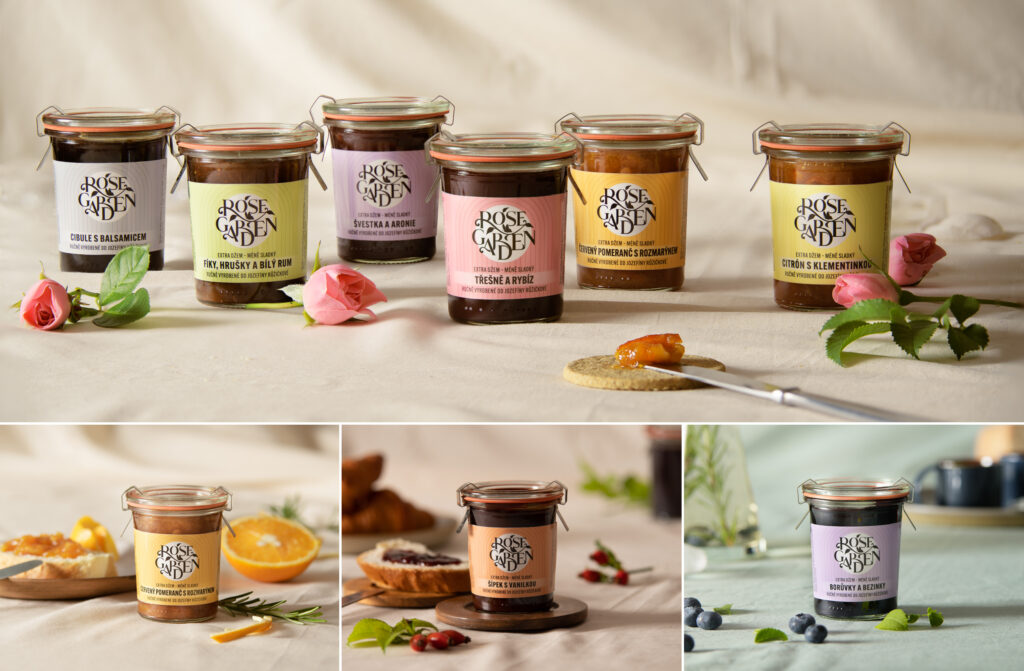
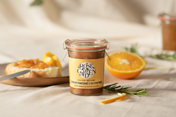
We wanted to create design that was not only beautiful, but also unique and different from competitors on the Czech market (and others). As the packaging is the main medium, we knew that a powerful, decorative logo was the way to go since the previous logo lacked significance, was hard to read and was almost invisible on the labels. The labels are very tiny, so in the limited space the rest of the design elements and texts had to be kept simple and neatly organised. The brandmark is overarched by a simple “garden gate” shape to nestle it nicely into the heart of the label. Black type, which is always surrounded by the friendly white circle device unifies the whole portfolio to gain recognition on shelves and in the e-shops. Tasty, fruity, and feminine soft colours alternate on the labels to match each flavour and jam variant.
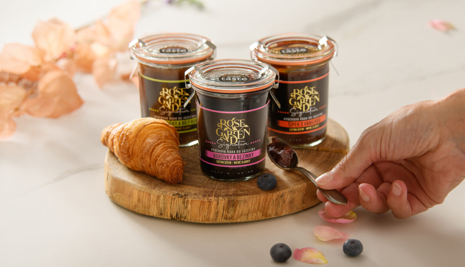
We considered several products to be even more special – perfect for gifting and unique occasions. We proposed giving these a premium subrange design. The black label premium edition uses more fine cues including shiny metallic print elements. After we labelled (tasted and became addicted to!) all the jams, we also proposed the website imagery and enjoyed a really tasty photoshoot.
So enjoy and get addicted too! After all, Rose Garden is the place where it is perfectly natural to fall in love and not resist temptation.