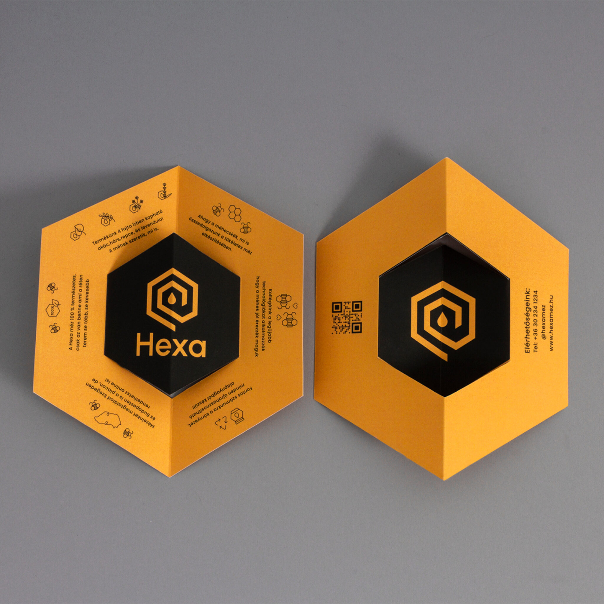
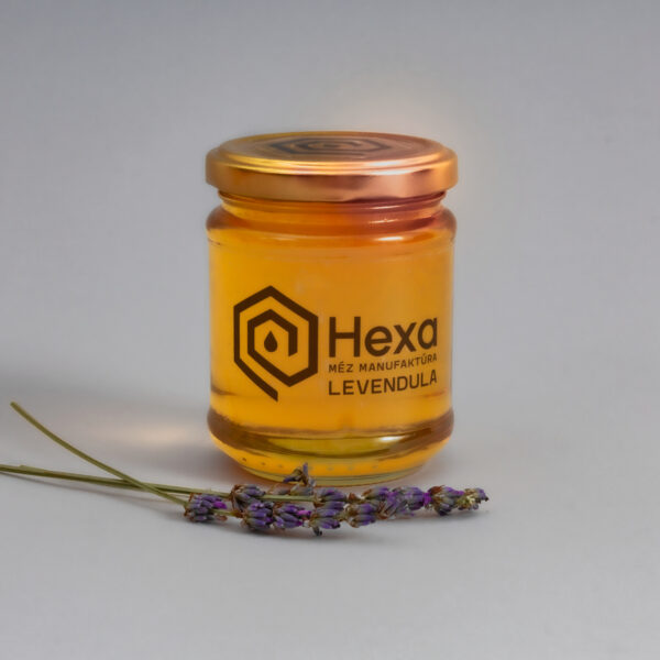
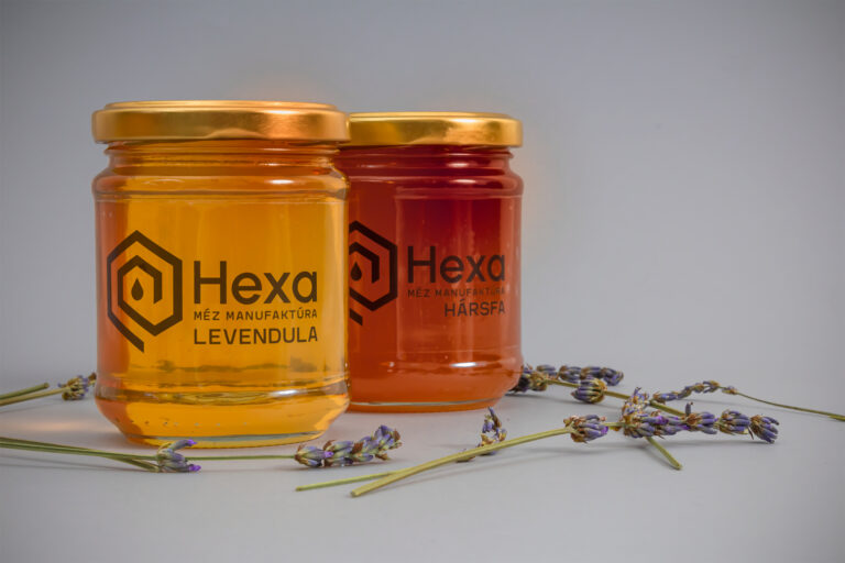
The concept was to create a modern, handcrafted honey brand, which futuristic style is strengthened by the shape of the hexagon that resonates in the pictograms and image elements as well. The Hexa logo symbolizes a minimalist honeycomb with a drop of honey in the middle.
The brand name means 6 in ancient Greek, but can also be equated as an abbreviation for the hexagon. Simplicity is one of the main buzzwords of the brand that wants to symbolize that the product contains nothing but honey.
For typography, I chose a refined geometric font to match the logo and a slightly more experimental organic but modern font. Hexa uses 2 colors, black and yellow, which refers to bees and energy, as honey is also perfect as a power food.
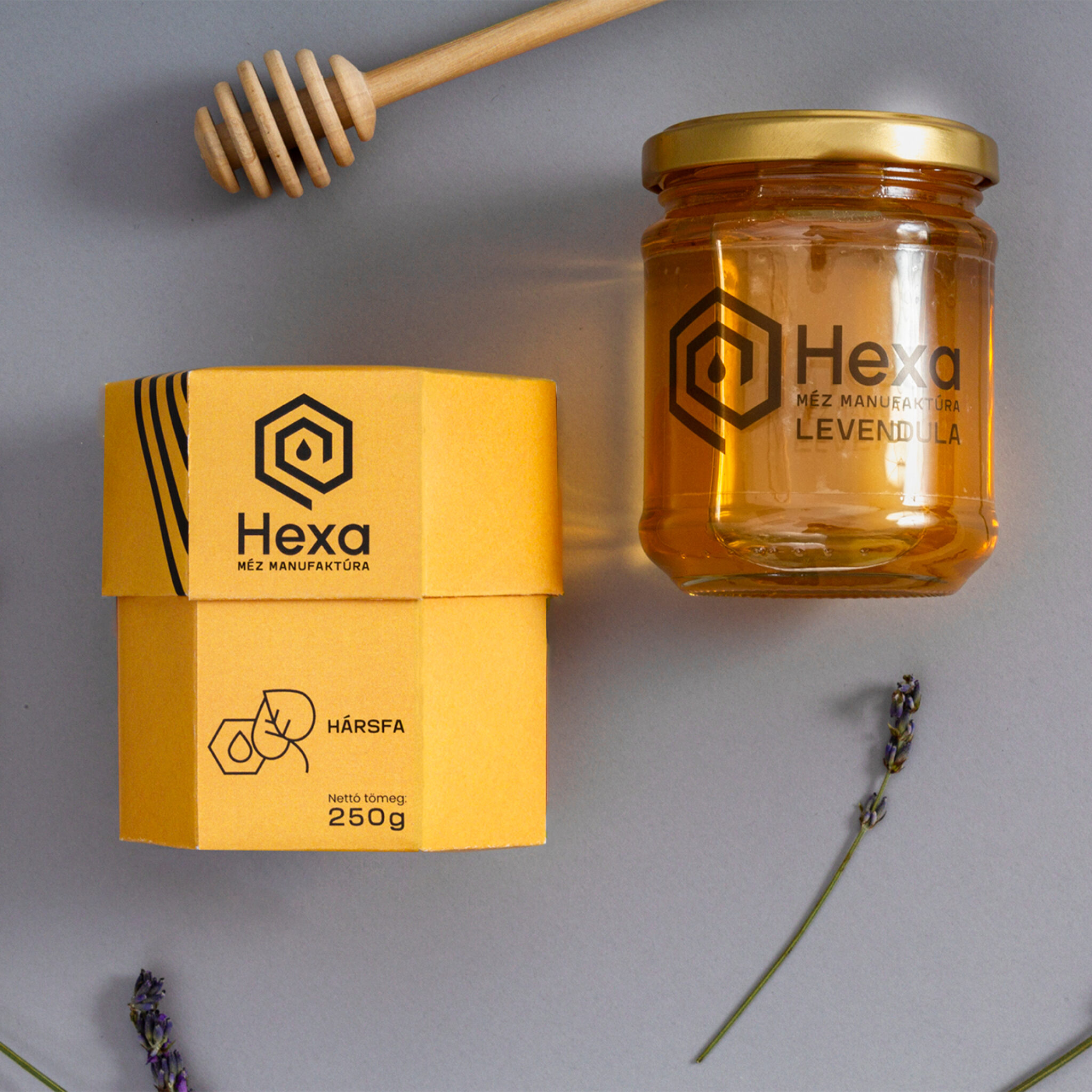
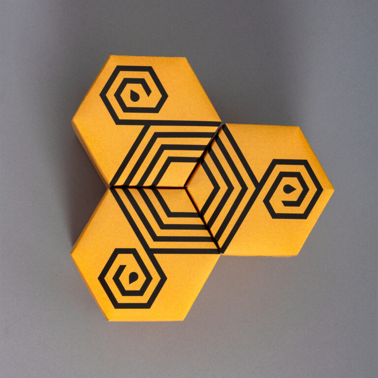
The packaging is a hexagonal box with pictograms next to the yellow and black image world to indicate the type of product. Starting from the top of the box, there are running geometric line elements next to the logo, thanks to the 3 products can create a hexagon, from above.
