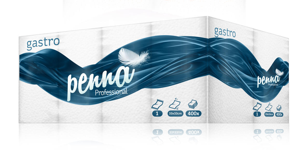
Penna, meaning feather in Latin, wanted us to transform the image of its wide variety of product lines. We decided to keep the use of instead a generic logo but to make it more eye-catching by adding an actual photograph of a feather, instead of using an illustration.
This was a bit tricky for further use and application on the packaging itself. However, we have solved the problem by creating a solid secondary graphic element covering most of the product, making it clearly distinctive on a shelf. The purple tones of brand identity vary for different product lines including home, professional, and luxury products.