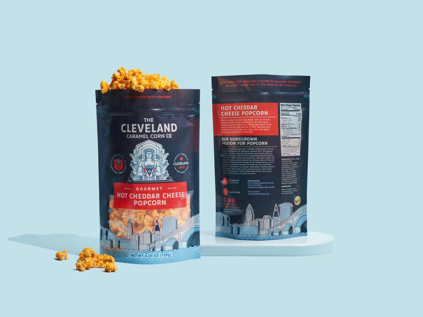
Opportunity: After years of growth as a retail store, Cleveland Carmel Corn was ready to grow retail partnerships and gain greater brand recognition. With a robust local customer base that fell in love with their high-quality popcorn, they knew they would need to preserve customer loyalty while appealing to a new generation of popcorn lovers.
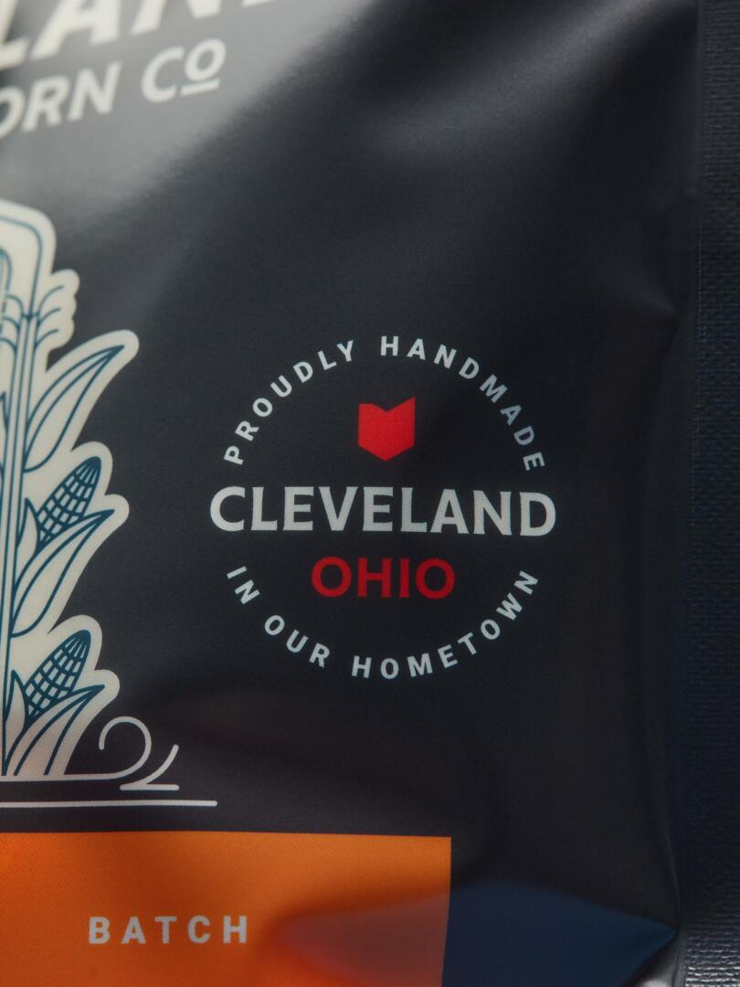
The Change: It was essential to hold onto the brand personality while refreshing the visual elements. We developed a fresh approach to the illustration, typography, and brand elements that paid homage to their hometown pride while elevating the brand experience. Five flagship SKUs were introduced, along with a custom unit that would accommodate hand-applied stickers for custom flavors while minimizing print expenses.
Impact: Since launching their refreshed brand and packaging in 2020, the new look has received an overwhelmingly positive response from customers and new retail partners. They have landed opportunities at Quicken Loans Arena, increased retail and corporate sales, and expanded their shipping across the United States.
Curator’s Insight: The Cleveland Carmel Corn brand and packaging redesign is a successful example of how to balance tradition and innovation. The new design retains the charm and personality of the original brand, while adding a modern twist that appeals to a wider audience. The illustration style is playful and inviting, capturing the essence of the product and the city. The typography is clean and elegant, conveying a sense of quality and sophistication. The brand elements are consistent and versatile, allowing for easy adaptation to different flavors and formats. The custom unit is a smart solution that reduces costs and increases flexibility. The new design reflects the company’s values and vision, while enhancing its marketability and recognition. It is a delightful and delicious visual treat that makes popcorn lovers want to try more.