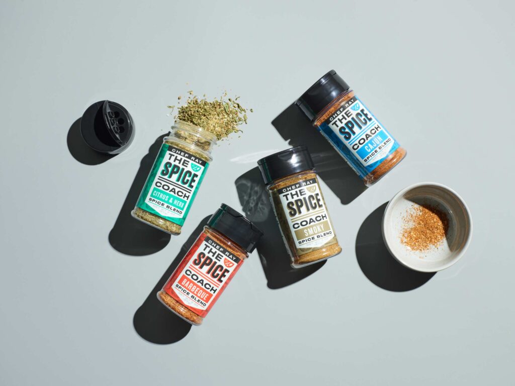
Opportunity: Chef Ray spent many years as a professional chef, developing his spice blends as he worked at different restaurants. Realizing that nothing else on the market matched his products’ quality and flavor, he decided to launch his own brand.
The Change: Standing out in the crowded spice category can be exceedingly challenging, especially considering the small package size. We sought to develop a highly visual brand with a bold name and a strong shelf presence. The Spice Coach name has a friendly, supportive vibe and denotes an earnest desire to help customers cook better meals. We paired this with flexible-width fonts and quick-read callouts for busy consumers. Assigning a single color for each label allows for immediate differentiation.
Impact: The Spice Coach brand was enthusiastically received. Chef Ray hit the ground running with a strong social media presence and is growing sales.
Curator’s Insight: The brand name is catchy and memorable, and conveys a sense of expertise and guidance. The label design is simple yet effective, using bright colors and clear fonts to attract attention and communicate the product benefits. The brand also leverages Chef Ray’s personal story and credentials to establish credibility and authenticity. The Spice Coach brand has a strong potential to appeal to consumers who are looking for high-quality spices and cooking tips.


