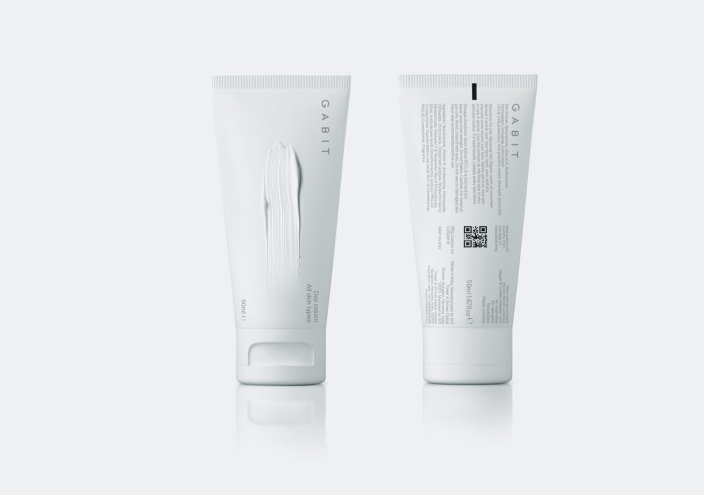
Our client is a cosmetics company based in India.
They requested a brand identity and packaging design that would deliver the message of simplicity encapsulated in the “-bit” part of their brand name. “The most basic unit of information” became thus our guiding principle.
To build in components is a design strategy as much as the very articulation of cosmetic care.
In order to capture both fundamentals and process we made two choices: We opted for a monochromatic, white surface that conveys an almost transcendental feeling, a sense of healing, of floating without weight and context. We then shifted into things personal and specific by suggesting flaws, cracks and textural touches onto the packaging surface. Each of these subtle formations emerges, in a photorealistic relief that does not describe but rather signals toward a particular need and use (acne, wrinkles, sun-protective layering). There is tactful de-dramatization, a quiet sense of peace, of being at ease with one’s own skin in this artful approach. It makes space for blemishes, problems, age signs without recourse to clinical austerity and excessive labeling.


