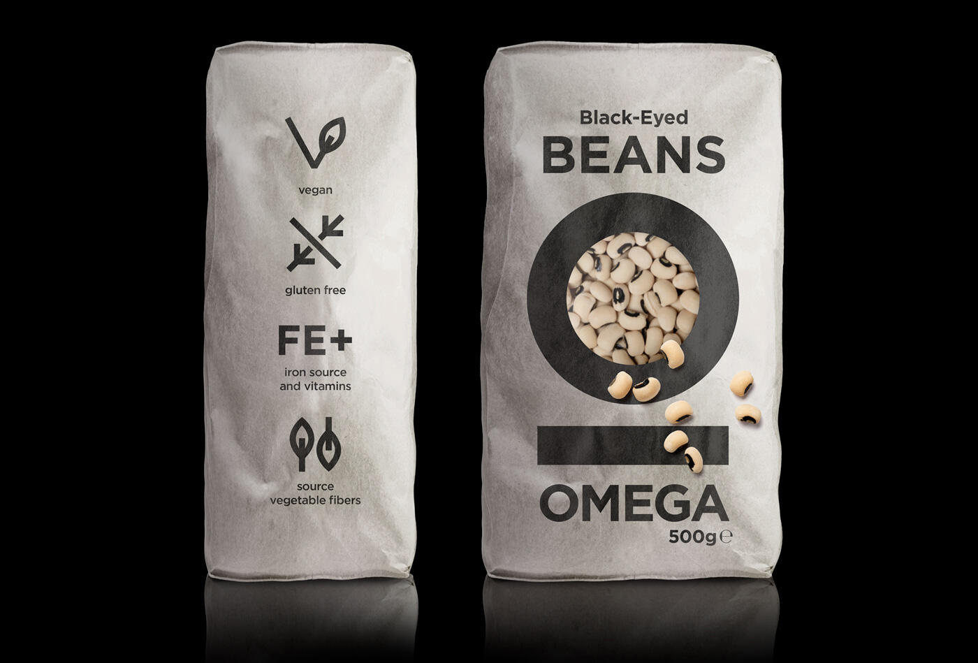
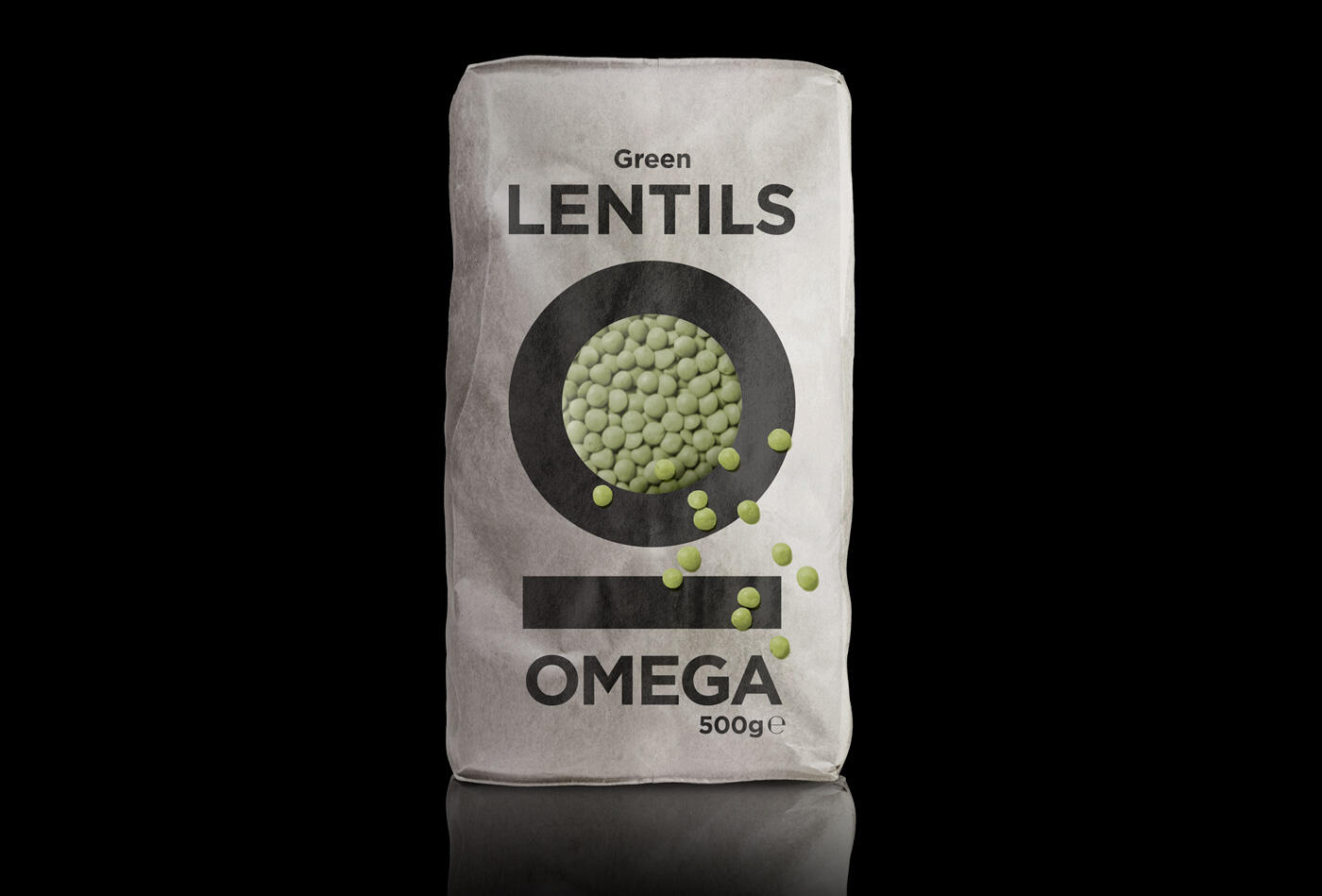
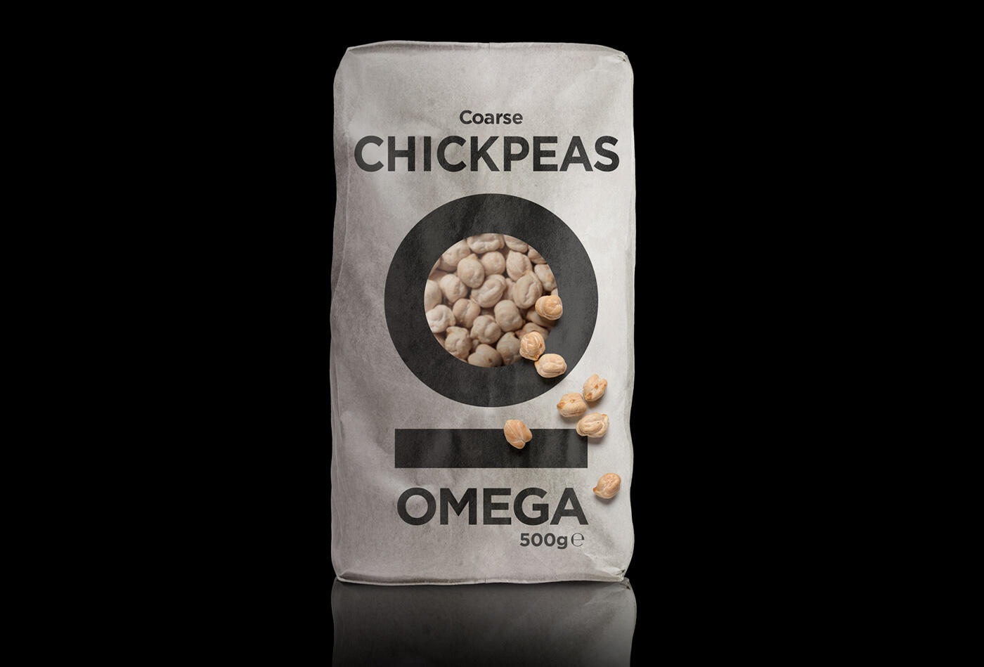
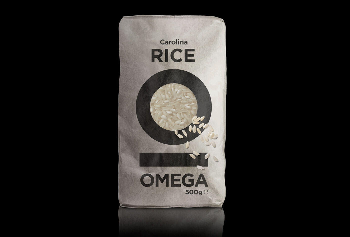
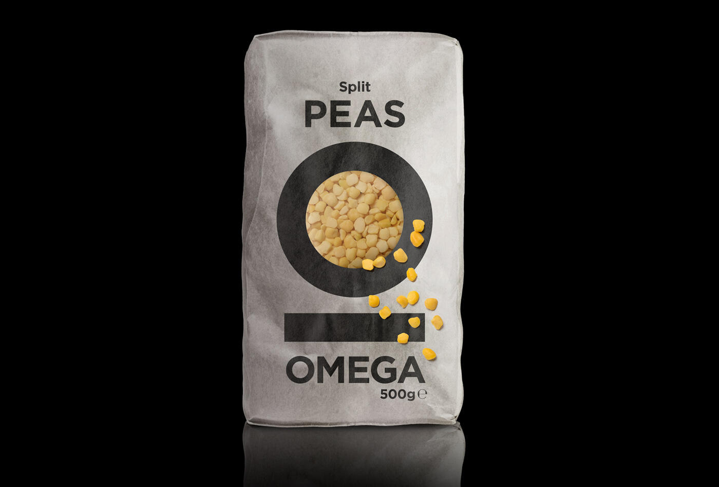
We designed the new identity and related packaging for this Greek company that produces and markets various types of rice and legumes.
We used the Greek initial letter (Ω) of the brand-name (OMEGA) to shape the paper surface. This was a key choice: it allows the product to be visible through the letter outline and, most importantly gives us the chance to avoid color-coding on the packaging.
The natural presence, the real look and feel of the products provide all the information the customers need with only a photographic spill over to animate and unify the whole.
In a market complicated by an ever-confusing application of color-related differentiations, our kind of clear and eco-functional packaging offers a sense of authenticity that compliments the product itself.
Bold typography spells out the name of the food that inhabits the distinguishable package.
If in Greek alphabet the last and 24th letter ‘Omega’ symbolizes greatness, we like to think that we used it in a way that identifies greatness with naturalness and simplicity.