Project Description: Clean Protein: Elevating Athlete Nutrition with Innovative Packaging Design
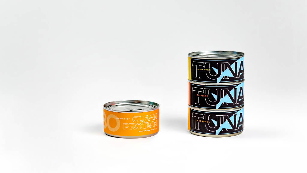
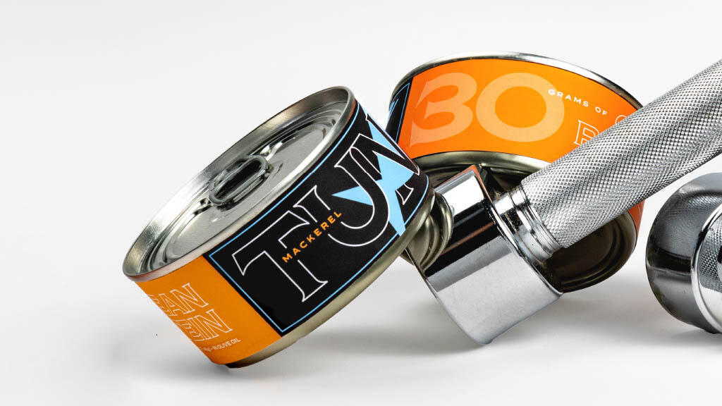
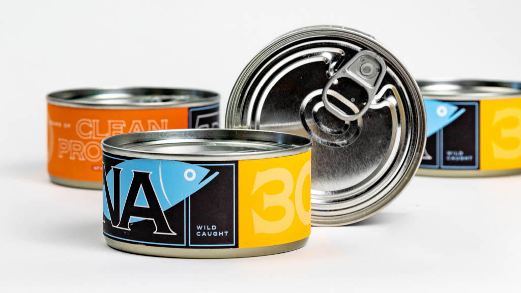
About the Product: Introducing Clean Protein, a groundbreaking range of packaged tunas meticulously crafted for athletes and individuals leading an active lifestyle. Clean Protein offers a delectable source of clean protein, specially designed to cater to the unique dietary needs of fitness enthusiasts. Each package contains a selection of sashimi-grade albacore, skipjack, and mackerel tuna steaks, hand-filleted and hand-packed to perfection, ensuring superior taste and nutritional quality. With twice the protein content of traditional supplements and absolutely no fillers, Clean Protein is a game-changer in the world of sports nutrition. The sleek packaging features an easy access pull tab for the on-the-move lifestyle.
Concept Behind the Packaging Design: In a world where athletes often rely on protein shakes for their protein intake, Clean Protein presents a natural, savory, and convenient alternative. Our packaging design revolves around showcasing the immense benefits of clean protein from tuna. The design highlights the versatility of Clean Protein – it can be effortlessly incorporated into salads, toasts, and various dishes, offering a seamless way to boost protein intake. The vibrant visuals communicate the nutritional value and tastiness of the product, encouraging athletes to make healthier choices.
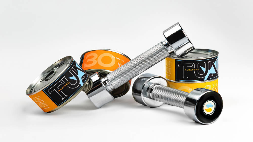
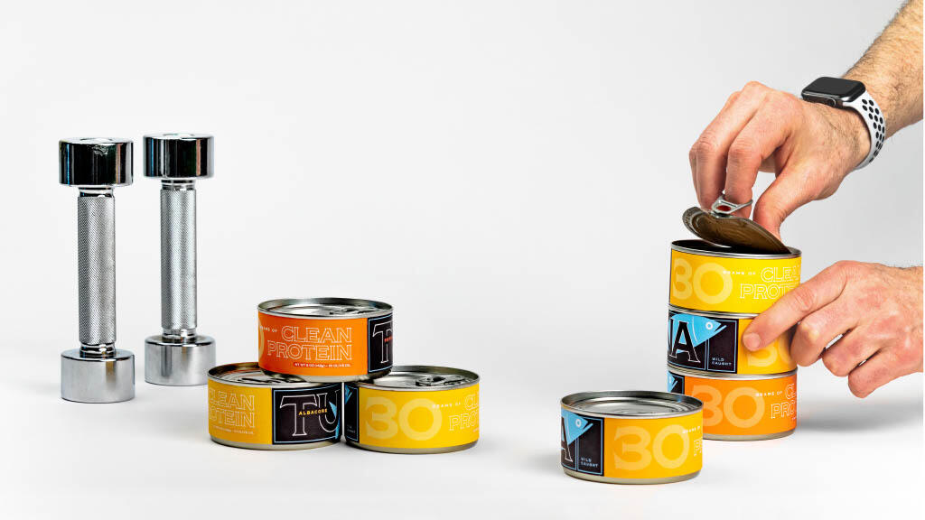
The Solution: Our solution bridges the gap between nutrition and design. I developed packaging that not only protects the product but also serves as a source of information and inspiration for consumers. By prominently displaying the protein content, I want to empower athletes to make informed decisions about their diet. The packaging design fosters a sense of trust and reliability, assuring consumers that they are choosing a high-quality protein source that aligns with their active lifestyle. Furthermore, by photographing Clean Protein alongside barbells and weights in our product photography, I establish a powerful visual connection between the product’s protein potency and the might of muscle. This clever juxtaposition sparks an immediate understanding of Clean Protein’s role in fueling physical strength. The packaging design amalgamates striking visuals, informative content, and a robust appeal to authenticity, establishing consumer confidence in their protein choice.
Technique Used for Packaging Design: Inspired by the kinetic dynamism of athletes, I incorporated sleek lines and bold shapes into the packaging. The design elements evoke the sense of empowerment, vitality, and fortitude. The interplay of contemporary typography and captivating visuals ensures that the product stands out on the shelves while conveying the essence of athleticism and clean nutrition.
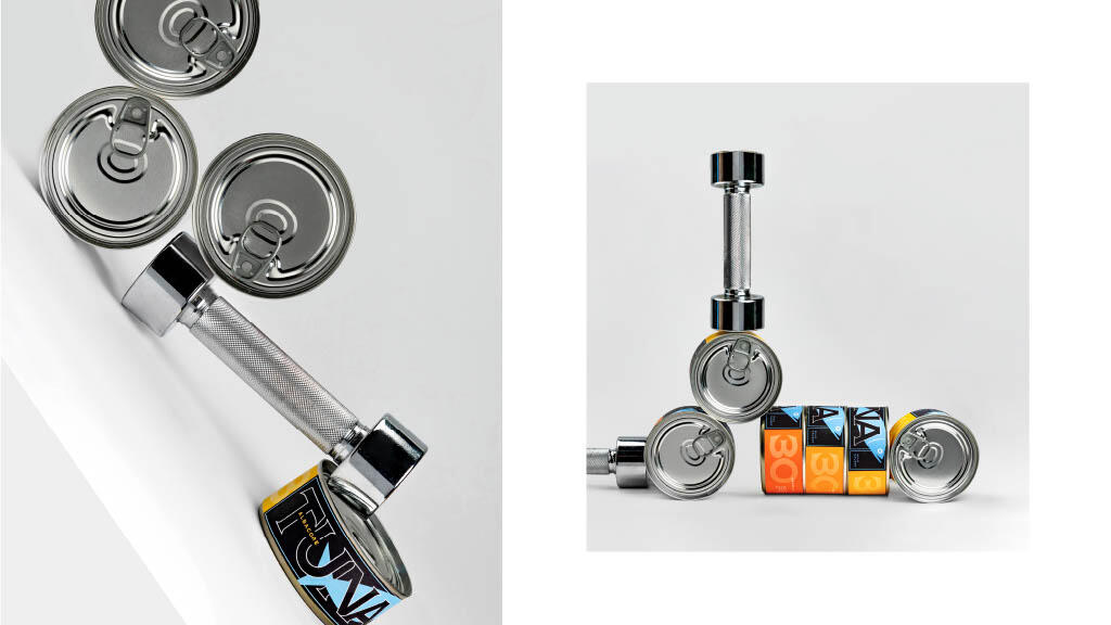
Unique Features of the Packaging Design: Clean Protein packaging design boasts several unique attributes. I introduced a color-coded system that sorts the tuna variants, making it easy for consumers to identify their preferred choice at a glance. The stackable can design optimizes storage and enhances the overall user experience. Moreover, the incorporation of an easy-access pull tab caters to the fast-paced, on-the-go lifestyle of athletes, enabling quick consumption anytime, anywhere.
Results: The result of my design not only showcases the product’s excellence, but also resonates with the target audience. Clean Protein packaging design redefines how athletes perceive protein sources, shifting their focus from artificial supplements to natural, high-quality alternatives. The design effectively communicates the essence of an active lifestyle while providing an engaging and memorable experience. Clean Protein stands as a testament to the perfect synergy of nutrition and design, inspiring individuals to fuel their ambitions with the power of clean protein.