While the main bourbons aged, Bourbon Cream put Doc Brown on the map
Since autumn 2020, we’ve been helping our clients at Doc Brown Farm & Distillers develop their brand and launch several product lines. Based near Senoia, Georgia, the company specialises in making bourbon from heirloom Jimmy Red corn.
The business challenge for whiskey start-ups is how to begin revenue streams while the first batches of your lead products take years to age in their casks. Rather than make gins and vodkas, which would immediately water down the brand’s association with premium bourbon, Doc Brown founders Paige, Amy and Daniel decided to release a line of bourbon cream liqueurs while their hero bourbons – Effie Jewel and Uncle Bogue – matured down in the rickhouse.
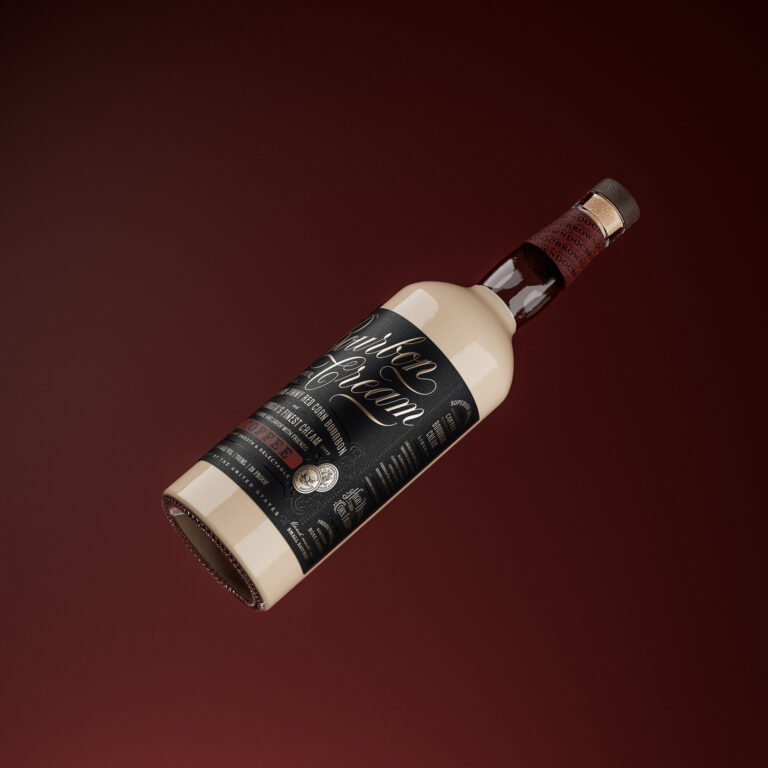
The product they created is silky smooth, rich, sweet and heart-warming, and the flavour range now includes Butter Pecan, Coffee, Peppermint Mocha and Salted Caramel.
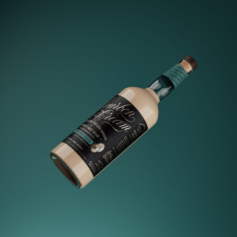
The visual language needed be consistent with the designs for the full bourbons, which could already be seen on the Doc Brown website. The bottle form used for the bourbon creams is the same as the core products, giving the consumer a recognisable Doc Brown silhouette to look for on the shelf.
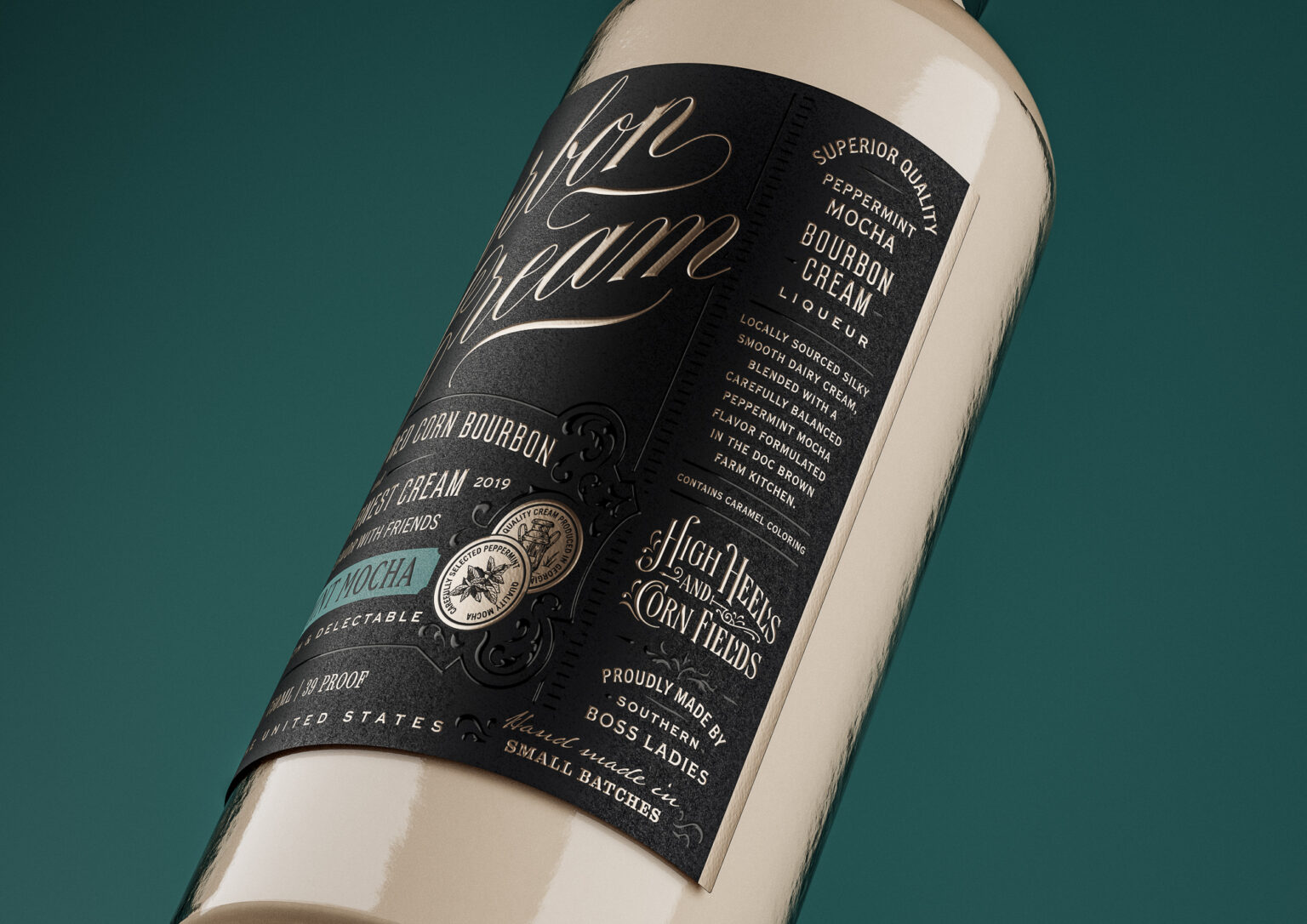
Similarly, the label design locks in Bourbon Cream’s association with the straight bourbon, but also makes it feel unique. The script is smooth and flowing, expressing the product qualities in traditional hand-rendered forms that appeal to both male and female demographics. Light and curvaceous like traditional English Roundhand calligraphy, its flourishes suggest it is one of life’s little luxuries. The message structuring is inspired by 19th century signwriting, continuing that traditional feel.
Doc Brown is proud of its Georgia origins and sources everything locally, so we added ‘Sweet Georgia in a glass’ to emphasise this. The brand believes that bourbon isn’t just for men – all are welcome to enjoy the bourbon creams – and the High Heels & Cornfields brand pillar is included.
Layers and textures give Bourbon Cream physicality, alluding to a sensory experience. Debossed metallic script and raised spot UV all around the label provide tactility, while an overlapping secondary label encroaches for visual interest, carrying the main Doc Brown identity.
True to the Ginger Monkey approach, little details throughout the design support the brand narrative and values. Old coins are among the family heirlooms kept by the Brown and Dockweiler family and have influenced the brand aesthetic. Here, small coins within the label design convey the brand’s heritage, the Jimmy Red Corn grown on the farm, and the ingredients used in each bourbon cream.
Considered and consistent design has led to huge demand for the products. On launch, the Butter Pecan, Peppermint Mocha and Coffee sold out with Doc Brown making new batches to keep up with orders. In autumn 2023, Doc Brown added a fourth bourbon cream flavour – Salted Caramel.
As a testament to the quality of the bourbon cream itself, the product came runner up in the Drink category of Gun & Garden’s Made in the South Awards for 2023. Retailers have been falling over themselves to stock Doc Brown Farm & Distillers Bourbon Creams, and this enormous accolade will only add to their fervour.


