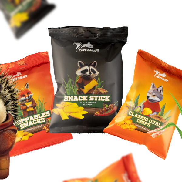
Rebranding & packaging design for Skyur Snacks
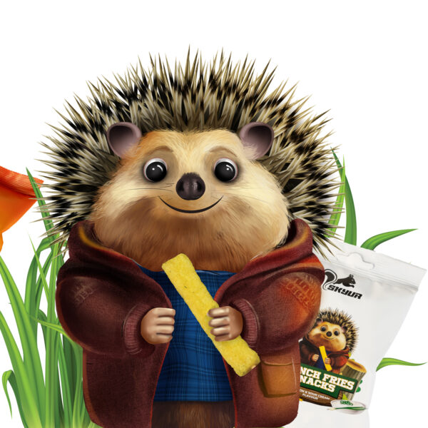
This colorful and interesting branding is very important for us, because we implemented this project together with our students. It turned out very beautiful and interesting, and received a lot of feedback. We made an interesting team work, where every character and every details have their own interesting and unique meaning. These crispy chips stand out for their distinctive taste and color variety, that’s why the packaging design is also so interesting and colorful. Since it’s already on the market, we can clearly say that it stands out from the competition. and is distinguished by its interesting characters, which allows the brand to become more recognizable and popular.


