A Modern Legacy in Every Sip
Situated in Illinois, USA, Crystal Rain Distillery stands as a family-owned venture dedicated to the craft of distillation. This young establishment embodies a commitment to craftsmanship, driven by the family’s passion for creating exceptional spirits. Among their endeavors, the creation of Kristone Craft Gin exemplifies this dedication to quality and innovation.
A Monogram Reimagined: The Birth of a Logo
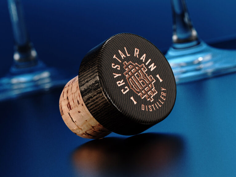
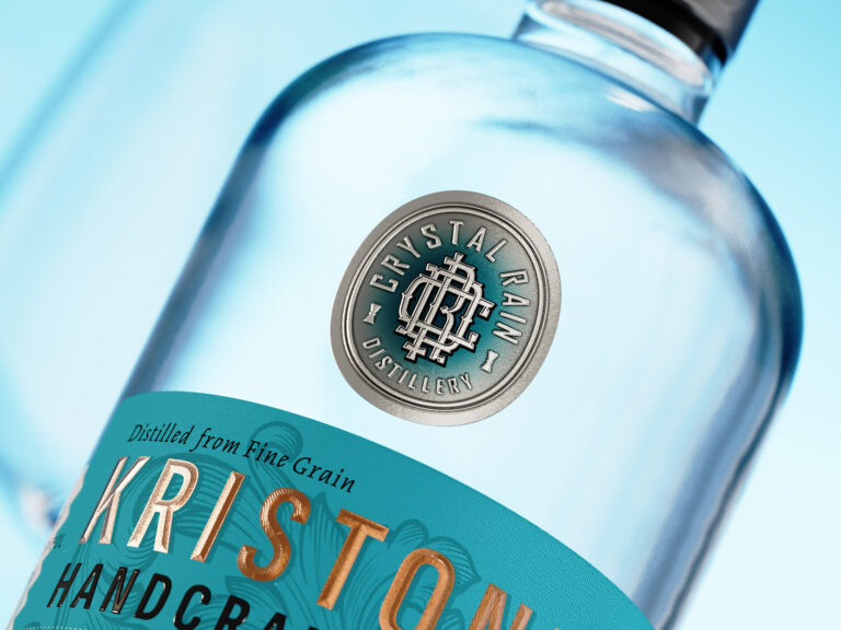
Taking on the role of designing a gin label, my task was to encapsulate the identity of Crystal Rain Distillery. The outcome was the creation of a new logo, a cohesive monogram intertwining the letters C, R, and D. This insignia serves as the foundation from which the story of Kristone Craft Gin originates and unfolds.
Modern Elegance with a Vintage Whisk: The Gin Bottle’s Story
The canvas for Kristone Craft Gin is a modern gin bottle, but with a twist of vintage elegance. It’s a dance between the contemporary and the classic, a vessel that mirrors the essence of the craft within.
Layers of Luxury: The Two-Part Label
The label itself is a story in two parts – a solid paper stock with a smooth texture forms the base, while the top boasts a metal foil adorned with the distillery’s emblem, stamped with robust embossing. It’s a tactile experience, inviting hands to explore the layers of craftsmanship.
Turquoise Elegance, Copper Finesse: The Color Palette
A sophisticated turquoise background forms the canvas, seamlessly paired with the matte copper hot foil on the label. The combination creates a harmonious visual appeal, offering a glimpse of the bottle’s refined character through a well-balanced play of colors.
Sensory Exploration: Debossed Texture and Custom Roof Embossing
Run your fingers across this gin label, and you’ll encounter a deep debossed texture, an unspoken promise of the complexities within Kristone. The custom roof embossing on the gin’s brand name adds a bespoke touch, an invitation to explore the layers of flavor.
Modern Minimalism with a Vintage Echo: The Label Design
Kristone gin label design echoes a minimalist ethos with a vintage twist. It’s a nod to tradition, a canvas that captures the essence of modernity without losing touch with the timeless elegance associated with fine craft gin.
A Limited Edition Tale: Crafted by Dagaprint.com
In the hands of Dagaprint.com, each label comes to life in a limited edition run, a testament to precision, care, and the art of small-scale craftsmanship. It’s not just a gin label; it’s a testament to exclusivity.
Finishing Touches: Capsule and Embossed Logo
The black matte capsule, adorned with an embossed logo and delicate floral elements in dark silver foil, adds the final strokes to this masterpiece. It’s the crowning jewel, a promise that what lies beneath is nothing short of premium.
Kristone Craft Gin is a testament to the distillery’s commitment to quality and innovation. The label, a result of thoughtful design, features a new logo—a harmonious monogram reflecting the distillery’s essence. With a modern yet vintage touch, the two-part gin label, crafted by Dagaprint.com invites a tactile exploration of craftsmanship. The turquoise backdrop and matte copper embossed foil harmonize, providing a visual sneak peek into the refined character within each bottle. From the debossed texture to the embossed logo, Kristone Craft Gin Label is a sensory journey, embodying a marriage of tradition and modernity.


