A CHEWY PACKAGING CONCEPT FOR OUR FURRY FRIENDS
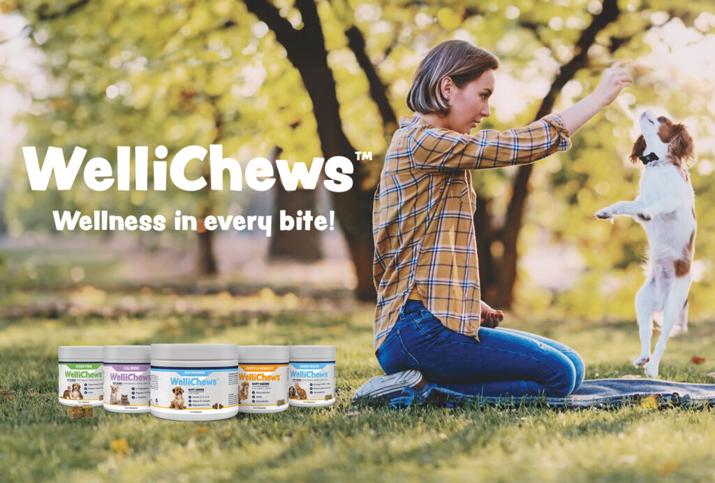
WelliChews™ – a new soft chew with fresh packaging, is now launched on the European market.
PLAYFUL HEALTH BENEFITS
WelliChews™, is the new playful “little brother” in the animal supplement range NutriScience. The objective was to create an attractive and fresh packaging concept for these soft chews in line with previous NutriScience packaging design but with a unique expression that communicates that it is a new and unique product.
NutriScience is a premium brand within the Swedish pet health company Swedencare. The agency Adentity developed a brand and communication platform with a brand story, a brand concept of “Targeted health for dedicated care,” and a corporate visual identity with guidelines steering the brand.
WelliChews™ is a functional soft chew targeting different health benefits. It is a smart and easy way to give something tasty that also supports our furry friends´ well-being, based on veterinary and pharmaceutical expertise with high-quality and effective ingredients.
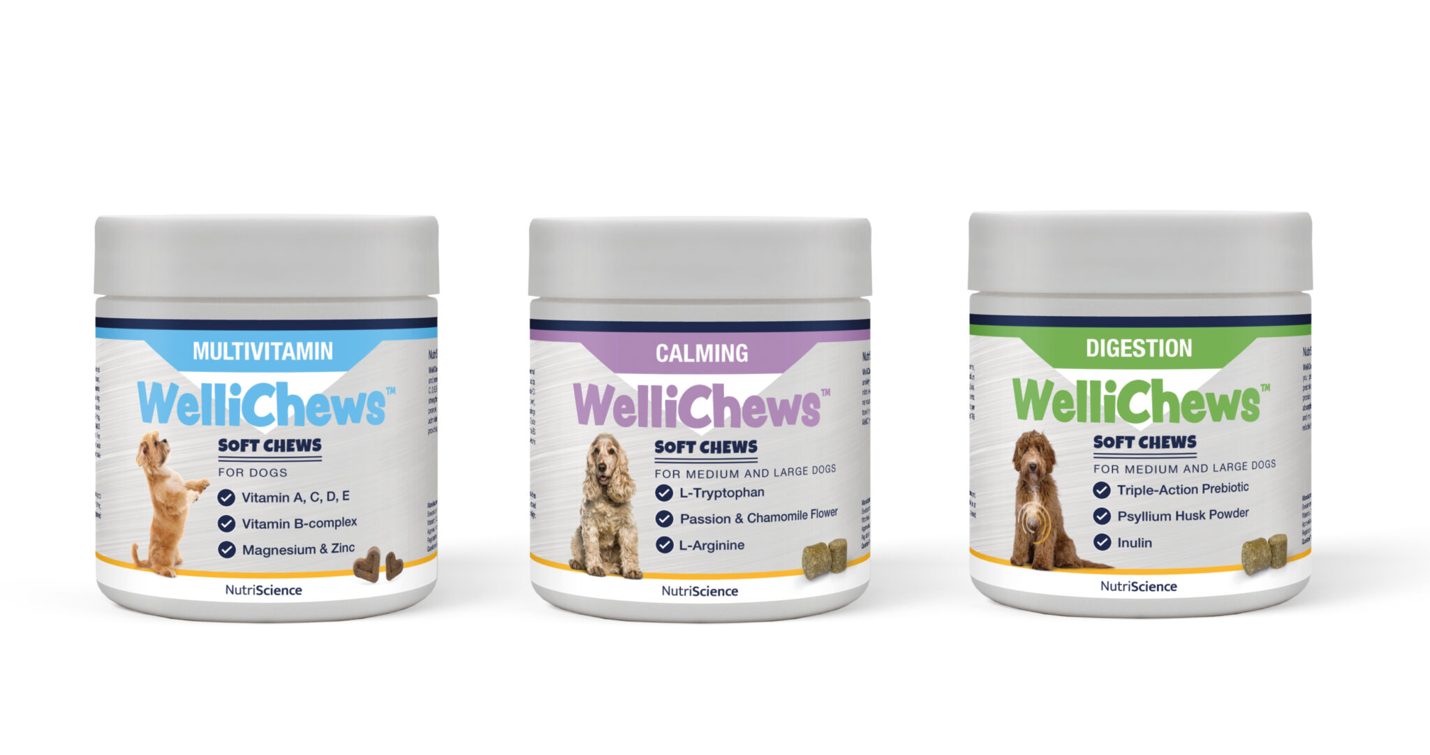
The packaging concept for WelliChews™, developed by Adentity, was created to appeal to the younger pet parents with a playful design based on the feelings of do good, taste good, and motion. It features cute, popular pets as well as attractive colours for easy recognition and to stand out on the shelf. The main ingredients and the target areas are highlighted on the front for quick identification of health benefits.
DESIGN PROCESS
The design process started with analysing the products to develop a range and product messaging structure. This formed the basis for creative planning and development of the packaging concept routes, resulting in different design proposals.
Finalising the chosen proposals involved fine-tuning the concept. A new frisky typography playing with colours for the product name and colour ribbons for therapy areas created an inviting and joyful feeling. Defining the right pet image to capture the essence of the product and its benefits gave the packaging unique targeted features.
COLOURS AND ICONS – HIGHLIGHTING THERAPY AREAS
The packaging includes different elements that highlight the target areas. A swirl indicates the health area covered; ingredients are clearly visible on the font pack, marked with coherent icons, and the colour ribbons emphasise the therapy area.
PACKAGING IMAGES WITH FURRY FRIENDS
The pet images reflect the health benefits with a charming expression. These breeds are popular among younger pet parents, and the images connect with the target group and express healthy pets and overall wellbeing.
WELLICHEWS LOGOTYPE DESIGN
For the logo, the typeface Peachy Keen is used. The playful sans-serif letterforms give a lighthearted and fun touch, and the colours create a link to the therapy area. It is as joyful as a soft chew!
THE RESULTS
A playful and streamlined packaging design with clear messaging that will make every pet parent fall head-over-paws for the new product WelliChews™!
SOON IN STORES
For happy and healthy wagging tails, look out for the new WelliChews™ in your online or offline pet store!

