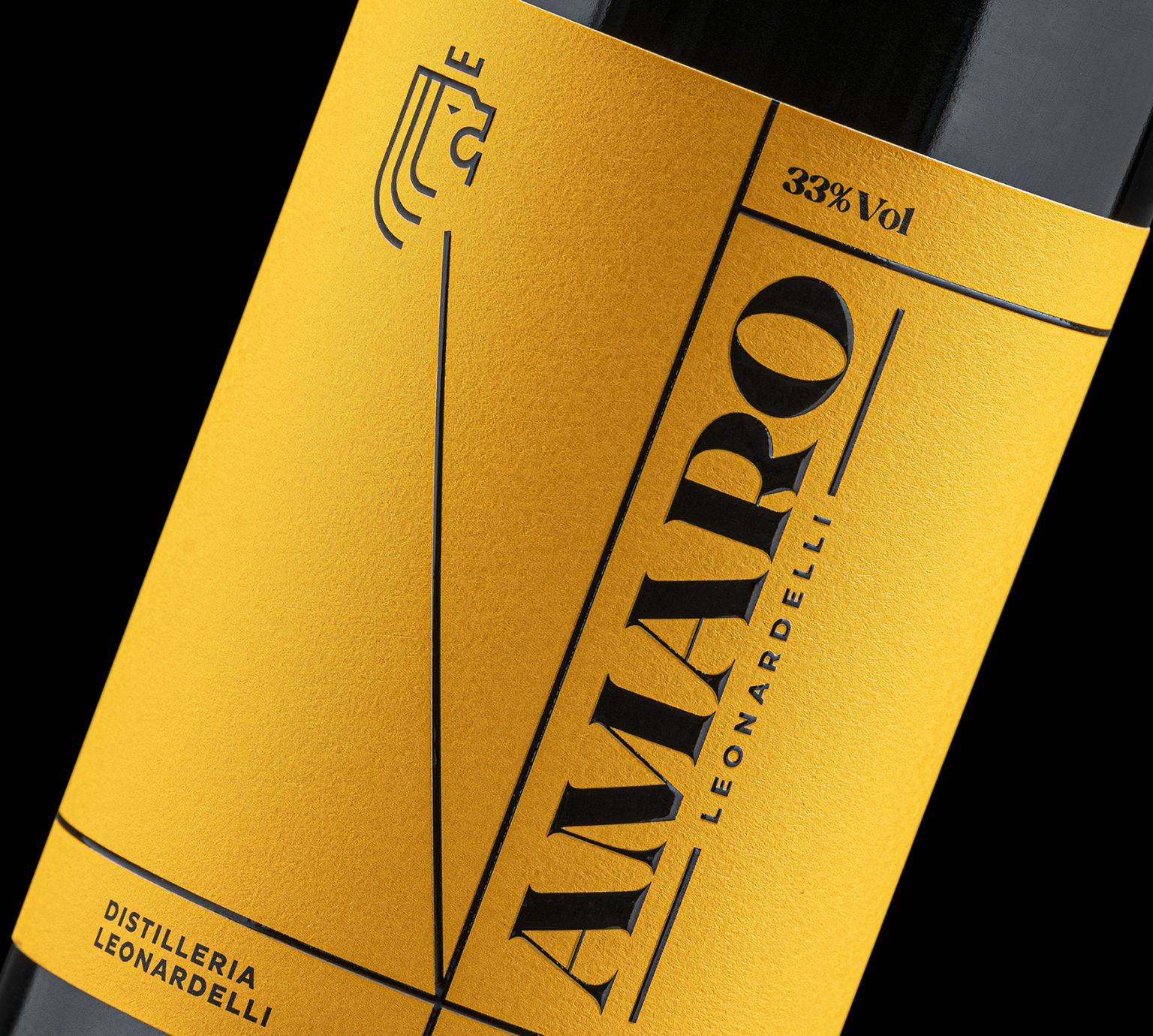
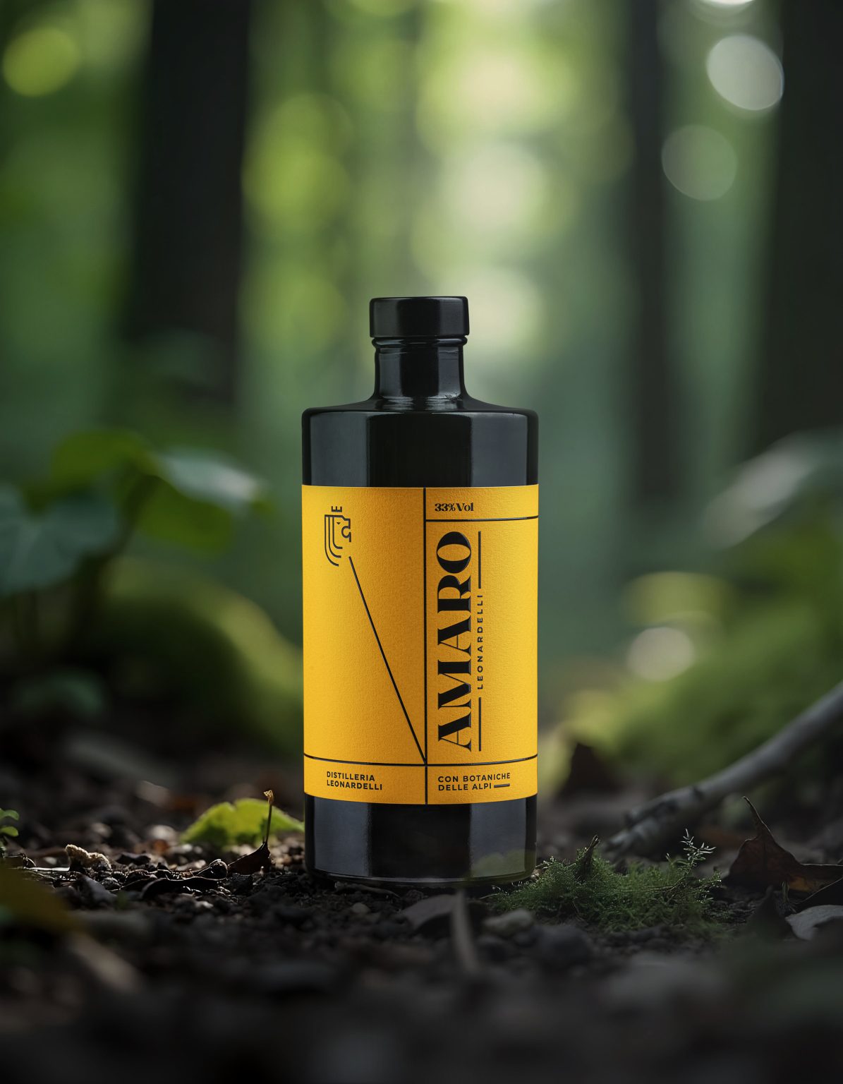
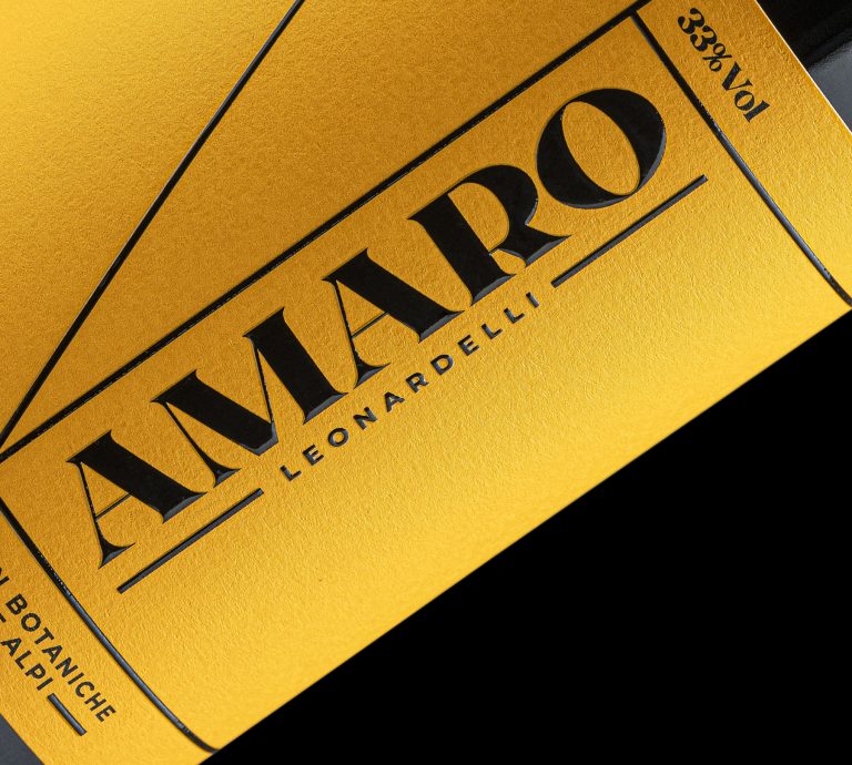
For this project, I adopted an approach consistent with the distinctive style of the distillery’s other products, characterized by the thoughtful use of colors and typography. I aimed for a solution that, while maintaining a modern touch, respects tradition. This is reflected in the choice of a typeface that evokes the elegance of classic fonts from the past, offering a sense of authenticity.
The design is balanced by a warm yellow tone, which mirrors the natural hue of the amaro itself, creating a direct visual connection to the product. The label is printed on 100% cotton paper, chosen to reflect the natural essence of the amaro’s ingredients and emphasize the focus on quality and sustainability.”


