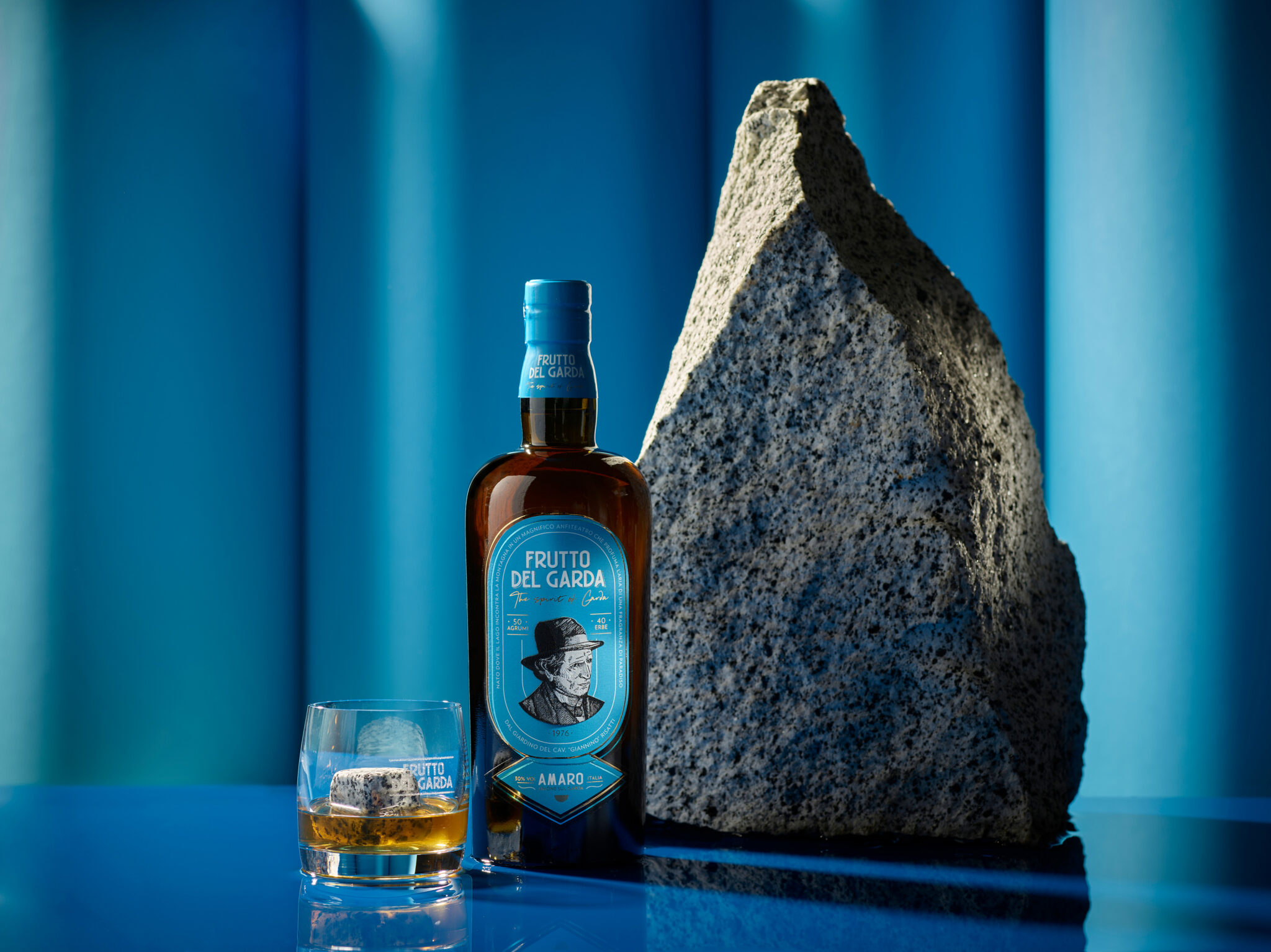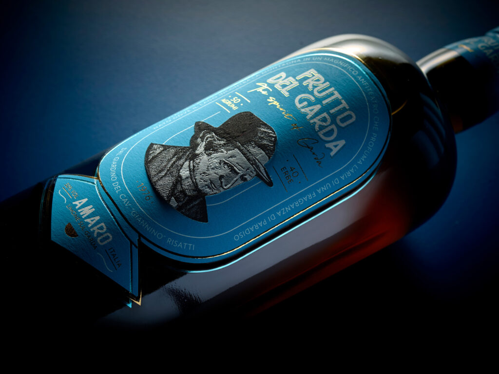
A label for a new product in the world of Italian bitters. the graphics recall the elaborate styles of the labels of the early 1900s using the producer’s face as a symbol and guarantee of quality.
The color blue was chosen to describe Lake Garda also called “the blue lake” by poets and painters of the past. The 3 layers of paper, the staggered lines in foil and the use of real embroidery, applied as a third layer, make this label modern and unique. the application of the embroidery, obtained thanks to an innovative process, made the label three-dimensional with an elegant tactile sensation.