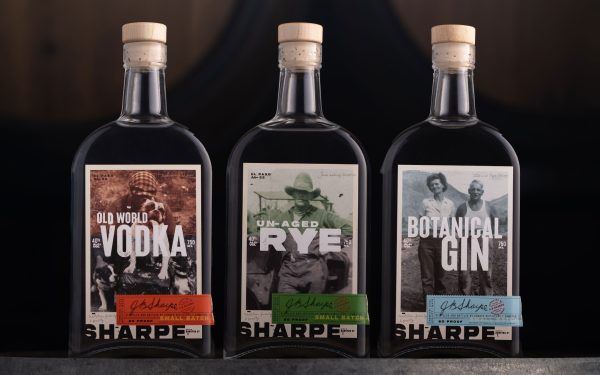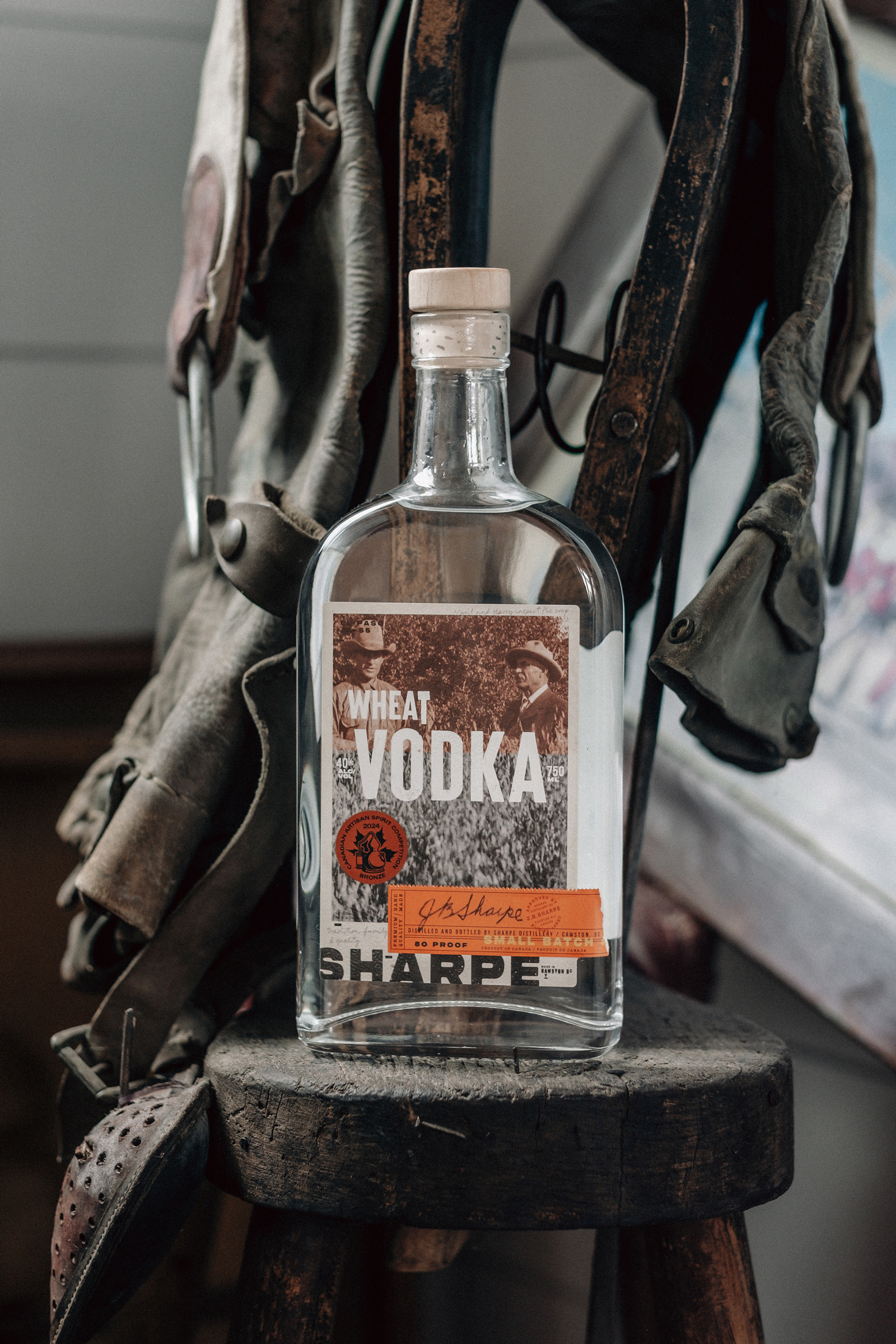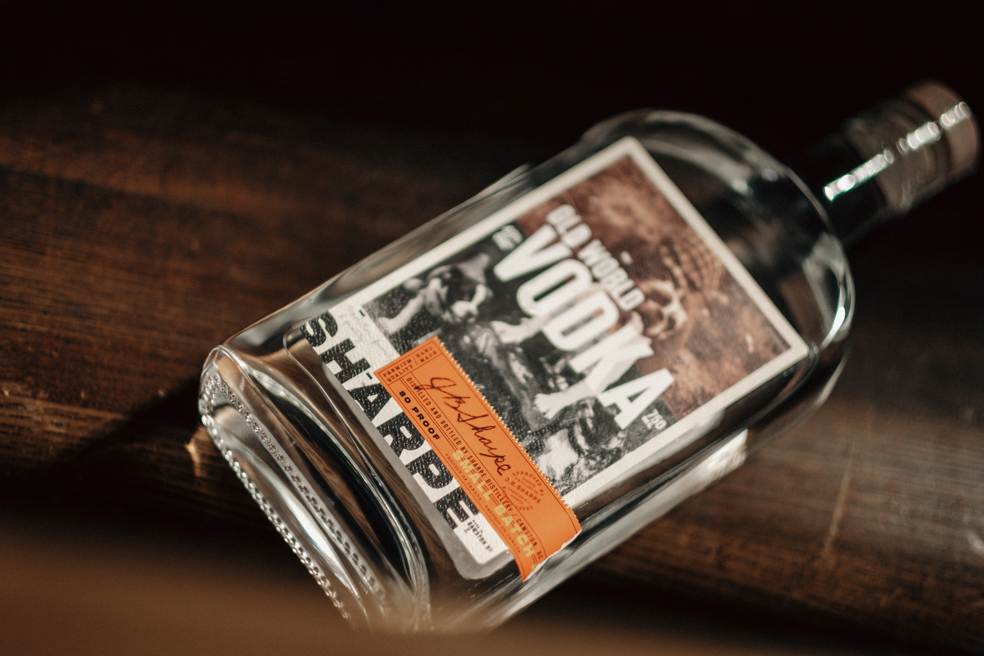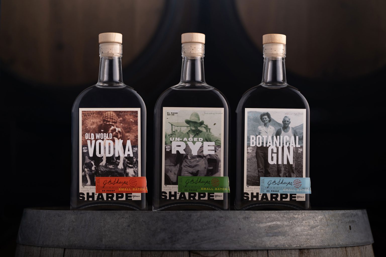
Rebellion and refinement. Sharpe Distillery’s packaging design is a visual narrative that celebrates outlaws, visionaries and an evolved family history in spirit making—timeless, raw and honest.
Each label tells a story, with visual elements layered to evoke a “WHO’S THAT?” and a “WHAT’S THIS?”
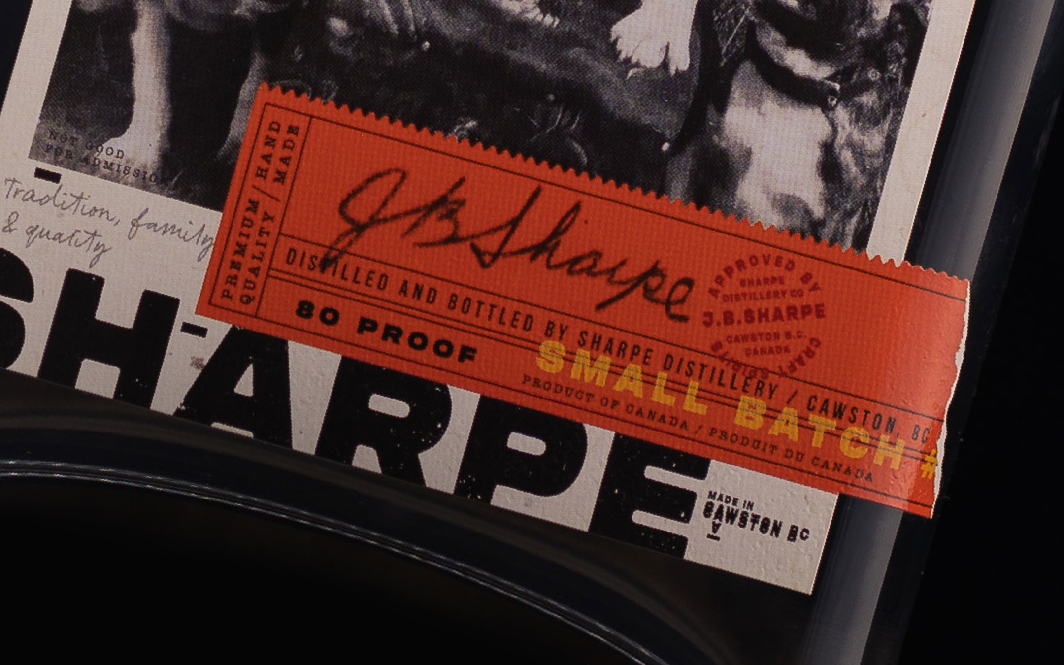
Bold typography, embossed textures and intricate details all reference a treasure trove of family historical documents and photographs.
The main typeface, reminiscent of 19th-century wanted posters pays homage to the distillery’s outlaw roots.
Uncoated, heavyweight paper stocks, faux rips and embossed textures create an unpolished vibe, echoing the ethos of the brand. Foil accents in gold provide a striking contrast and elevate the design, reflecting the interplay of rawness and luxury.
We aimed to design a suite of labels that would create a visual language that speaks to traditional spirits aficionados and an audience seeking authenticity.
Recognizing the distillery’s growing lineup, we developed a modular system that allows for cohesive diversity. While each product—from the Unaged Rye to the forthcoming whiskey has its distinct personality. Shared design elements ensure brand recognition and scaleability.
The packaging invites consumers into a world where moonshiners and modern spirit making collide. It’s an extension of the Sharpe family legacy, transforming a bottle into a keepsake and a conversation starter.
We wanted packaging that resonated with those who enjoy not only an award winning spirit, but a story.