Skincare shelves are crowded with loud packaging, big claims, and hard-to-read ingredients. With Into, the goal was to create something that felt like a deep breath in all that noise.
From the beginning, we approached this brand with one thing in mind: make it feel as good to use as it is to look at. That meant crafting a design system that was clear, informative, and emotionally grounding.
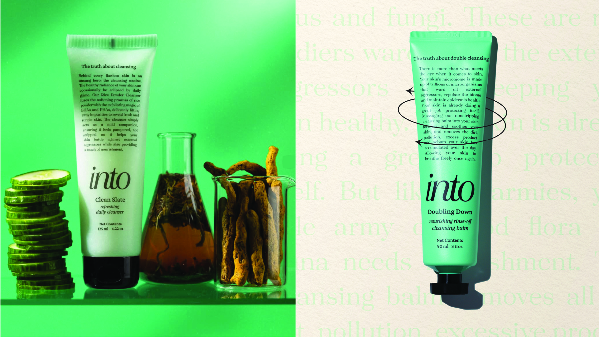
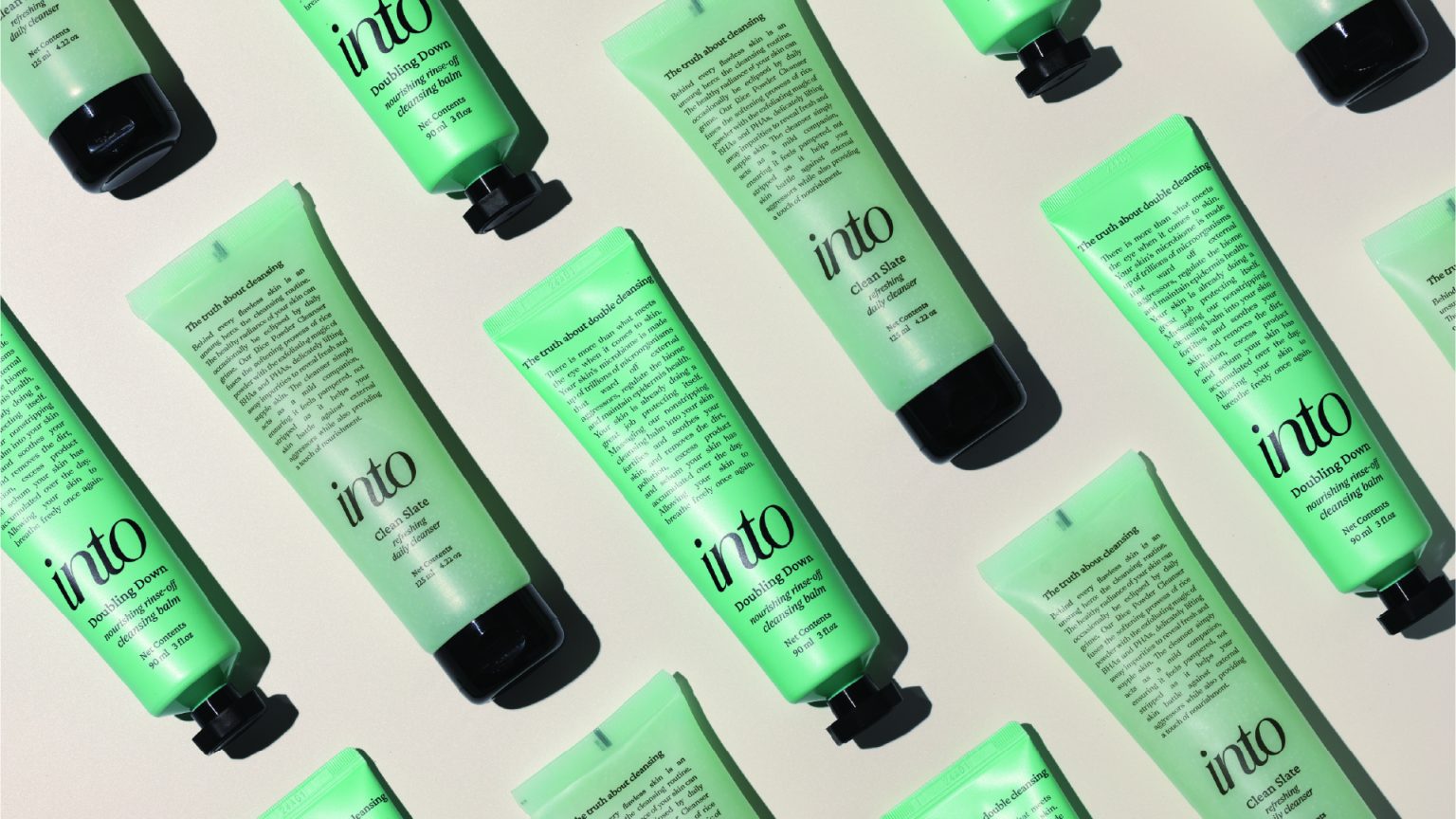
Visually, the brand leans into simplicity and not minimal for the sake of it, but to create space. Space to focus, to understand, to connect. We used a soft, neutral palette to evoke calm, paired with clear, friendly typography that feels informative without being clinical.
The packaging was where the brand really came to life. Every label was laid out with intention. Icons were used as visual entry points, product benefits were simplified without being diluted, and white space was used to build trust, not emptiness. The goal was to design for real users – people who are curious, cautious, and just want to feel more confident about what they’re putting on their skin.
Behind every decision was a series of trials, iterations, and test prints, exploring how the brand would feel in someone’s hands, not just on a screen.
Into doesn’t shout. It speaks clearly. And that clarity is exactly what makes it stand out.