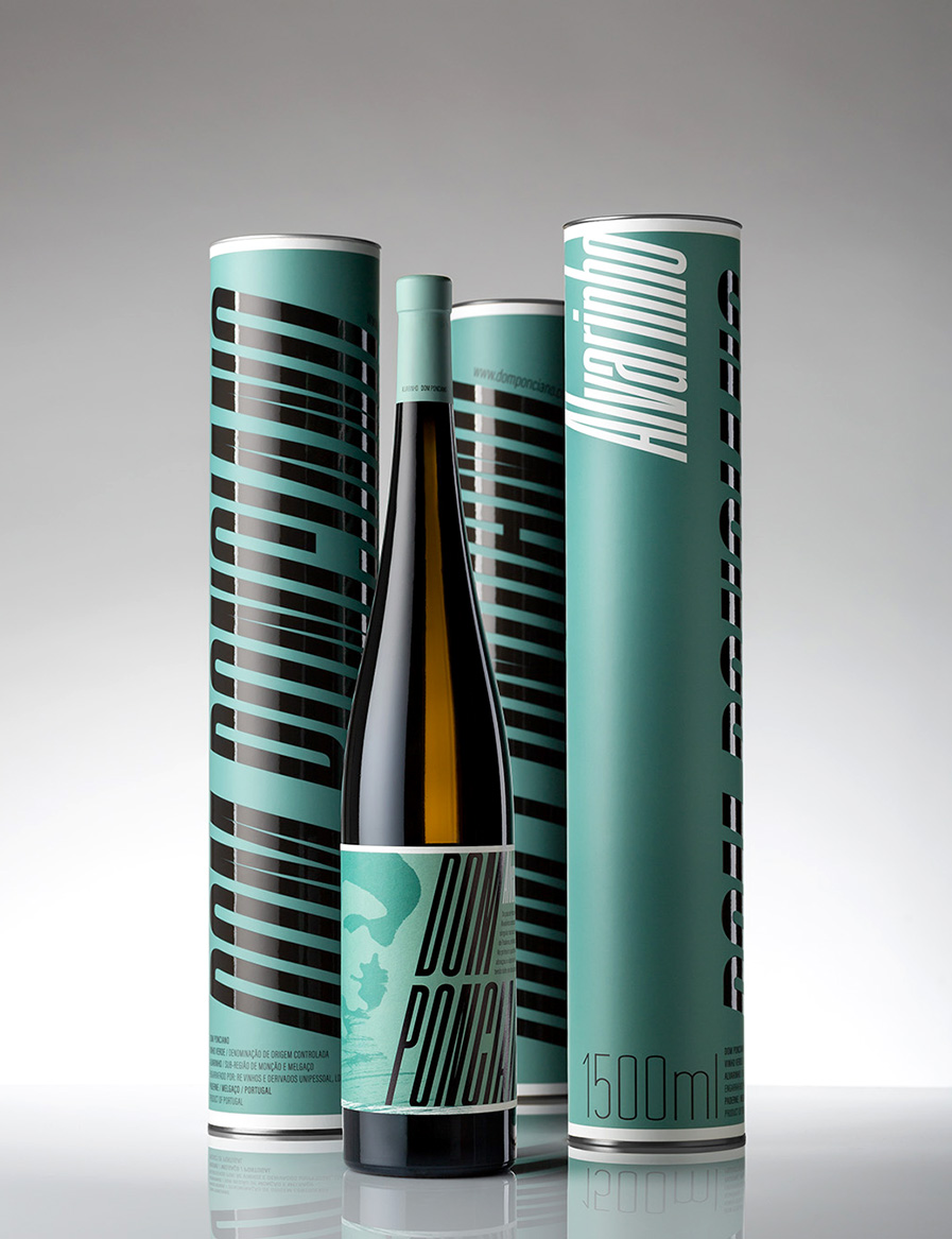
Three key ideas were taken into account in the design of the graphic image and packaging for the 1500ml bottle of Vinho Verde Alvarinho from the DOM PONCIANO brand:
- colour as a distinctive element of the identity and referring to the idea of freshness characteristic of the type of this wine (Vinho Verde Alvarinho)
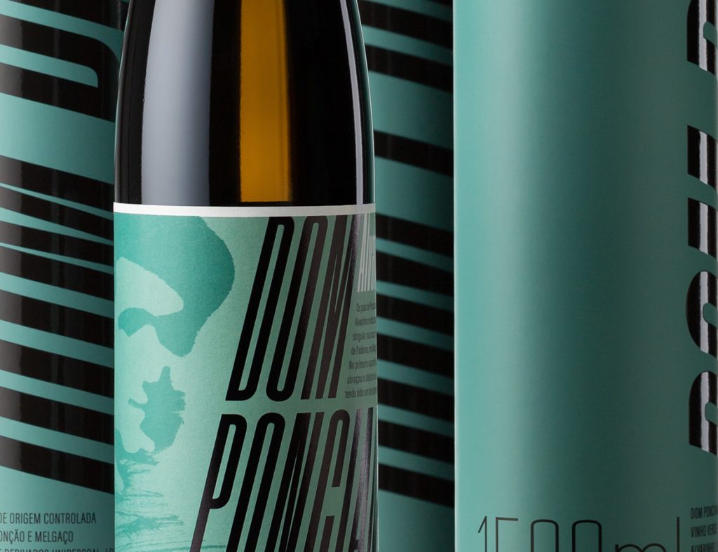
- the presence of a graphic element that refers to the ‘brand subject’ (who gives the brand its name) through an illustration of strong contrast and expression, based on an old photograph
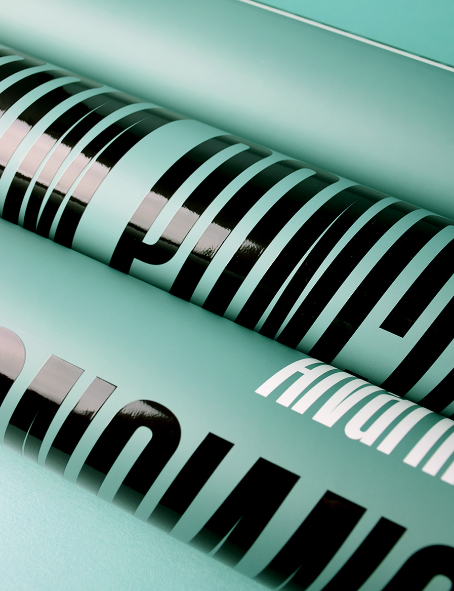
- the choice of a contemporary, high-impact and easy-to-read typeface that refers to the geometric organisation of the vineyards, conveying an idea of repetition and dimension.
The entire design project, graphic image and packaging, was conceived simultaneously: the label, which goes almost completely around the bottle, encompasses all the brand’s graphic codes and the packaging enhances the colour and lettering.
The volume of the 1500ml bottle and its slim, elegant design required equally tall packaging. The tube with a metal cap, despite being a recurring model for different products, is also a solution that allows the bottle to be well packaged, has a considerable printing area and in this case allowed the brand name to be emphasised through the size of the letters, reinforced by the glossy varnish applied. As well as being reusable, this type of packaging is also easy to recycle as it uses paper and metal.