
ABOUT
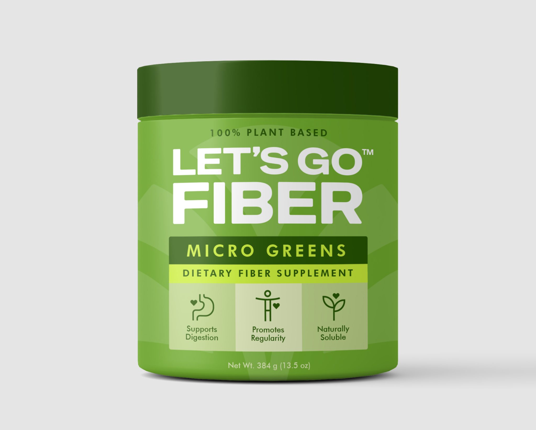
Let’s Go Fiber is a modern dietary supplement brand built around digestive wellness and daily health. The challenge was to design a packaging system that simplifies functional nutrition into a visually engaging, scalable, and easily distinguishable format across multiple variants and formats.
Since the product line spans multiple flavors and ingredients, locking the brand into a fixed color palette was not viable. The packaging needed to accommodate variation while still maintaining a strong and consistent brand identity across all SKUs.
SOLUTION
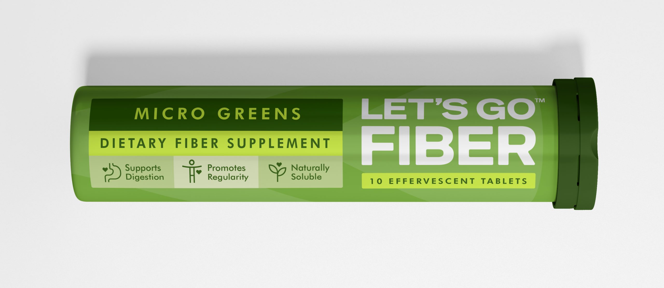
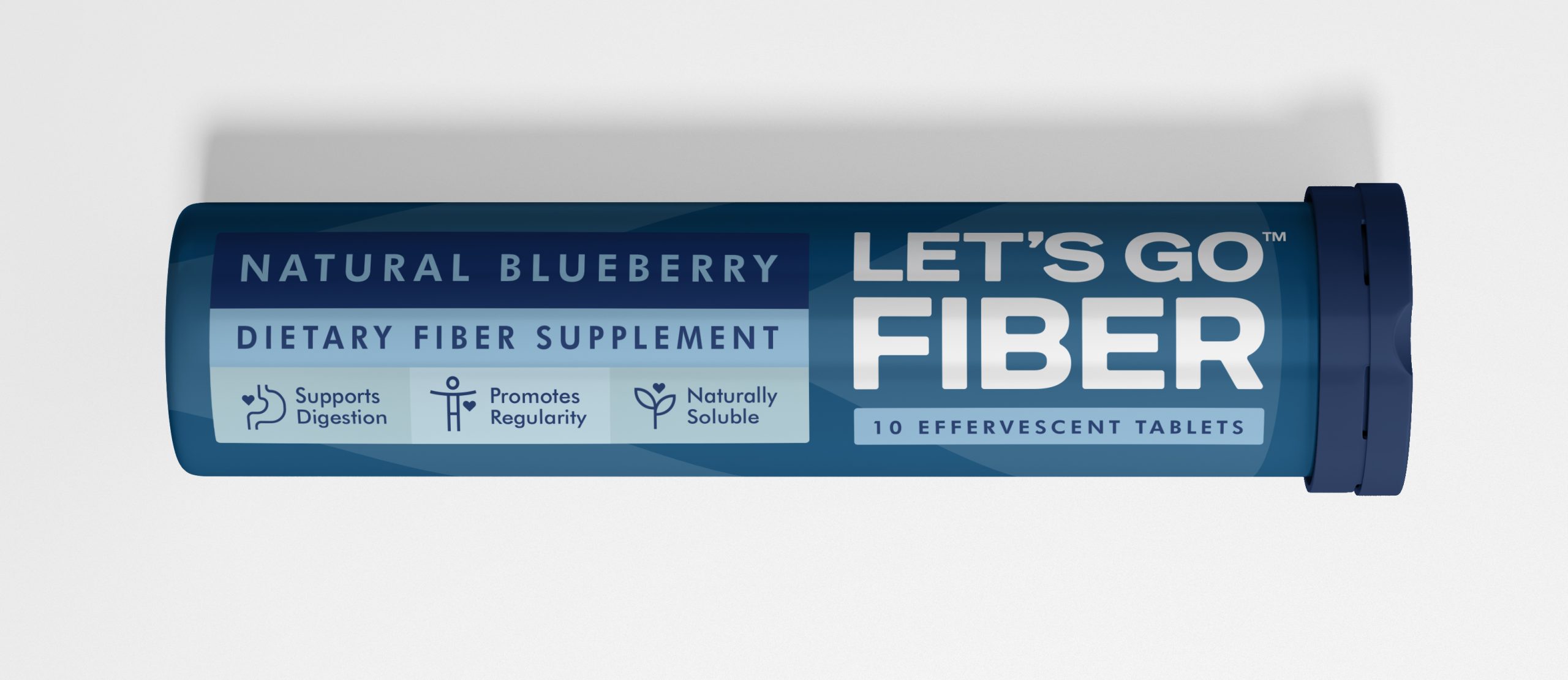
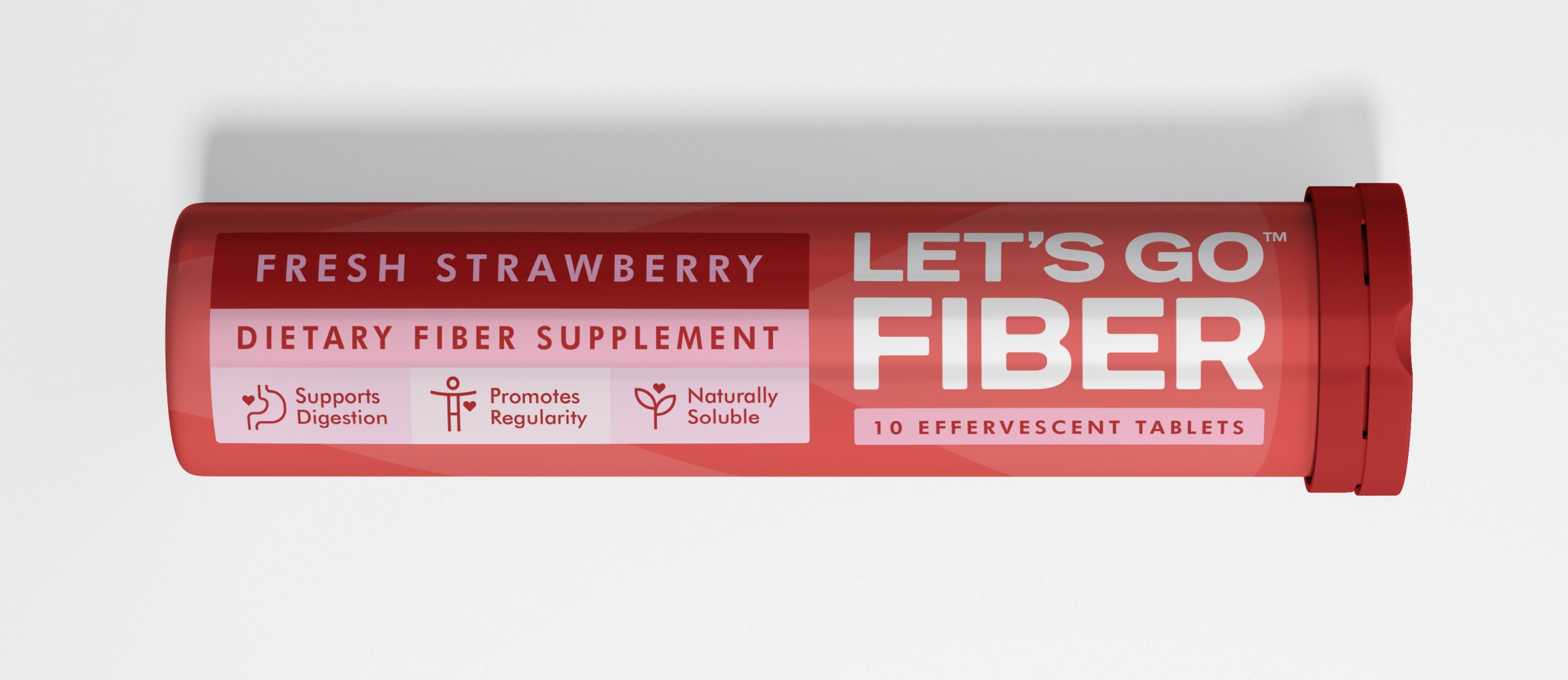
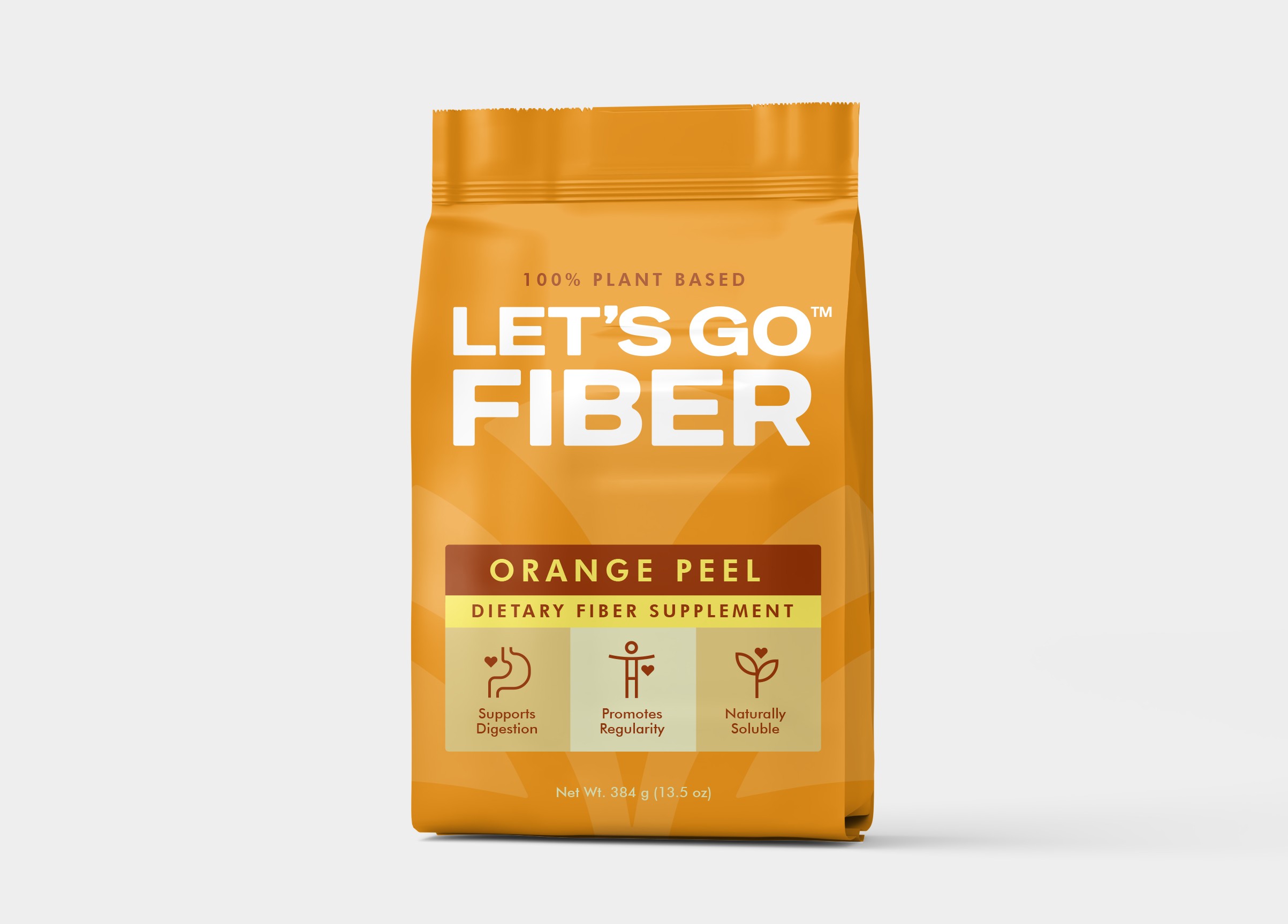
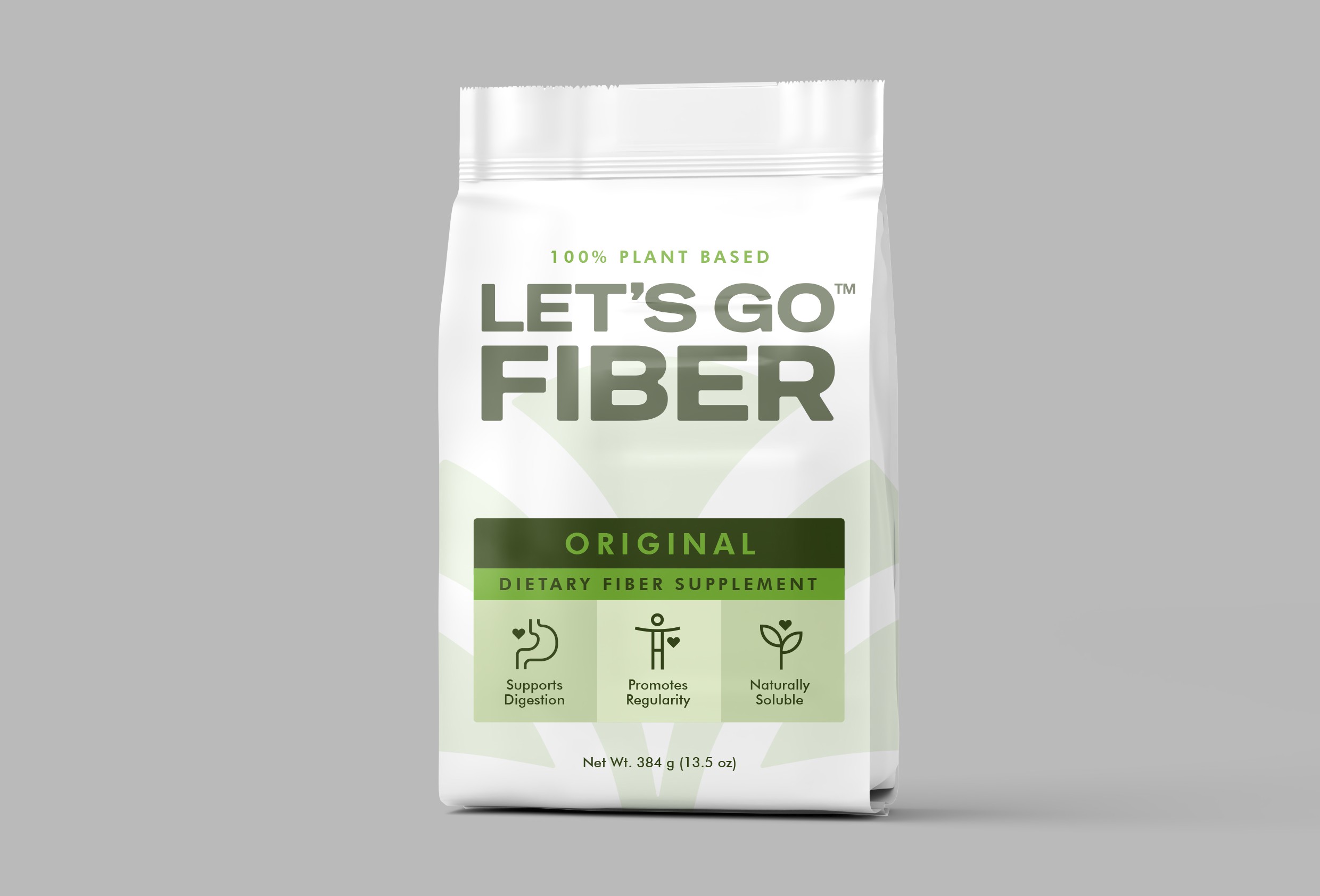
The packaging is built as a format-driven design system, where structure and layout define the identity rather than color. This ensures that even as colors change across variants, the packaging remains instantly recognizable as part of the same brand.
The bold “FIBER” wordmark acts as the primary visual anchor. It is intentionally given more scale and weight, as the brand is strategically positioned to sell through both the flavor and the clarity of the product category. Emphasizing the word “FIBER” strengthens recall and improves shelf recognition.
A structured information hierarchy organizes content into clear layers — variant name, product category, and functional benefits. Key benefits such as digestion support, regularity, and solubility are communicated through simple iconography, making the product easy to understand at a glance.
Color is used as a flexible system for differentiation, allowing each flavor to have its own identity without breaking brand consistency. Subtle background textures add depth while keeping the layout clean and controlled.
The system is designed to extend seamlessly across multiple formats including tubes, jars, and pouches, ensuring consistency across the entire product range.
RESULT
The final outcome is a cohesive and scalable packaging system that maintains strong brand recall across diverse product variations. By relying on format and typography rather than fixed colors, the design ensures long-term flexibility as the product range expands.
Each product stands out individually through color variation, while the consistent structure ensures it is immediately identifiable as part of the same brand.
The result is a bold, structured, and adaptable packaging system that enhances shelf presence while supporting brand growth.
PROJECT DETAILS
Brand: Let’s Go Fiber
Category: Dietary Supplement Packaging
Designed By: Creative Branding Agency (CBA™)
Scope: Brand identity, packaging design system, and packaging assets

 NEV
NEV Stefano Bracci
 Alina
Alina monther al omari
 Lizakjx
 JOAOMARCOSDESIGN
 alchimistestudioParis
 Harriet Neild
 octavio rojo
 宏洛图品牌设计HONGLT
 DESIGN CONCEPTS
 Alexander Skurihin
 Studio K95
 ARMBRAND
 Richa Rai
 houseoferas by Miti
 Agence des Coteaux
 Kushi Eaknath
 Ann Treasa
 Xiao Ning
 krrrrrllii
 babyage
 Deep
Deep