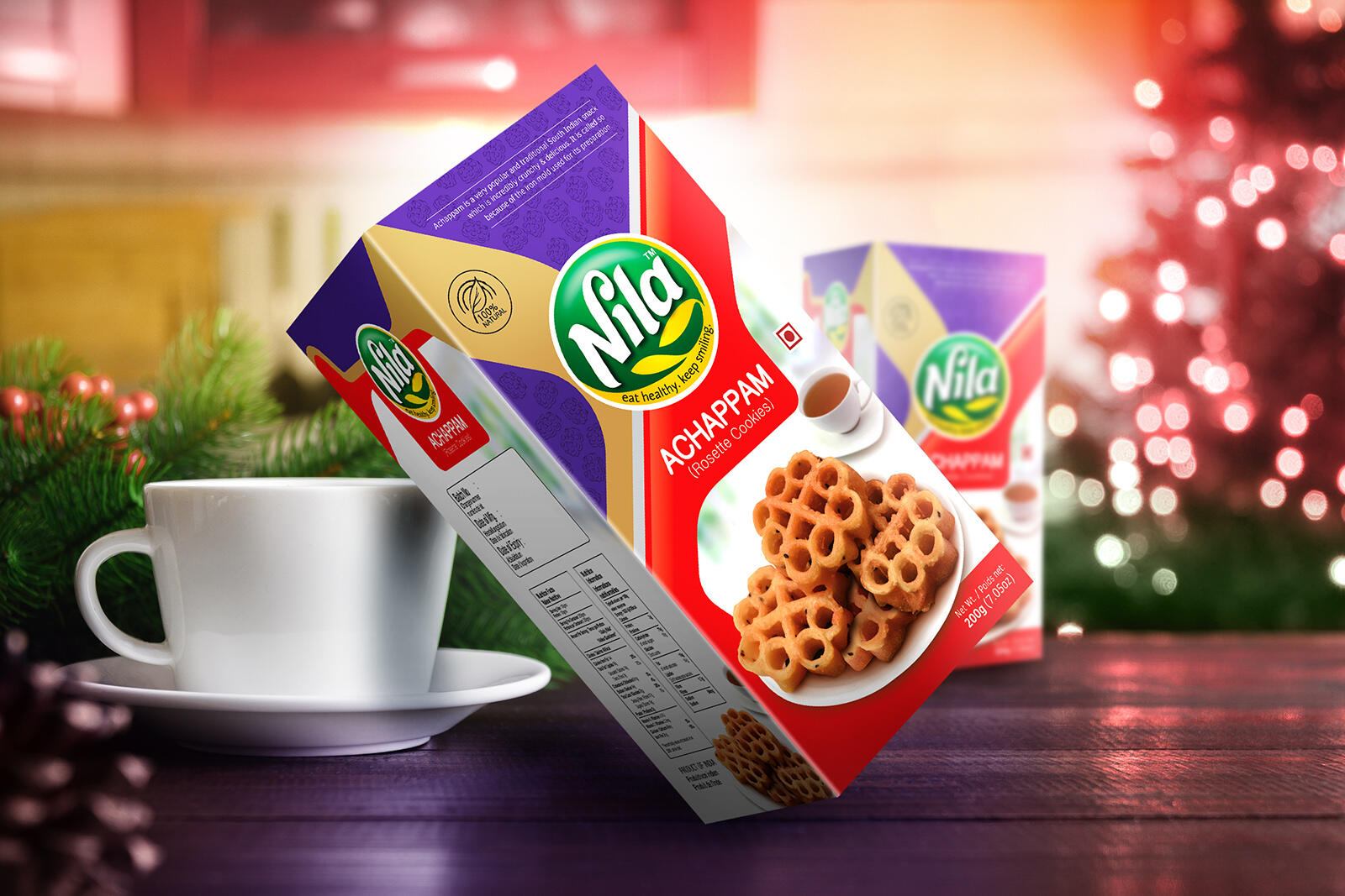
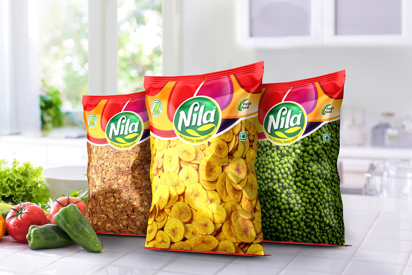
The team NILA is one of our most important assets. The first thing we have done was to design a simple but remarkable logo for the team. Based on the brand name, We came up with a light & clean Hand drawn logo which reflected a Vegan, fresh & natural feel. For packaging and all the other assets, We brought it to life by using lines & curve forms, fresh-looking photos, and a contrasting color palette along with gold foil highlights that create a delicious, levitating & premium feel & Vibration to communicate with customers, who want healthier nourishment.
![](https://i0.wp.com/packagingoftheworld.com/wp-content/uploads/2022/09/01-Logo-Sketch.jpg?fit=1600%2C1066&ssl=1)
![](https://i0.wp.com/packagingoftheworld.com/wp-content/uploads/2022/09/02-Logo.jpg?fit=1600%2C1067&ssl=1)
![](https://i0.wp.com/packagingoftheworld.com/wp-content/uploads/2022/09/03-Rice-Bag-Front-Back-FINAL.jpg?fit=1600%2C1067&ssl=1)
![](https://i0.wp.com/packagingoftheworld.com/wp-content/uploads/2022/09/04-Achappam.jpg?fit=1600%2C1067&ssl=1)
![](https://i0.wp.com/packagingoftheworld.com/wp-content/uploads/2022/09/06-Common-Pouch.jpg?fit=1600%2C1067&ssl=1)