

远山奈何 (Yuan Shan Nai He) — Cocktail Packaging
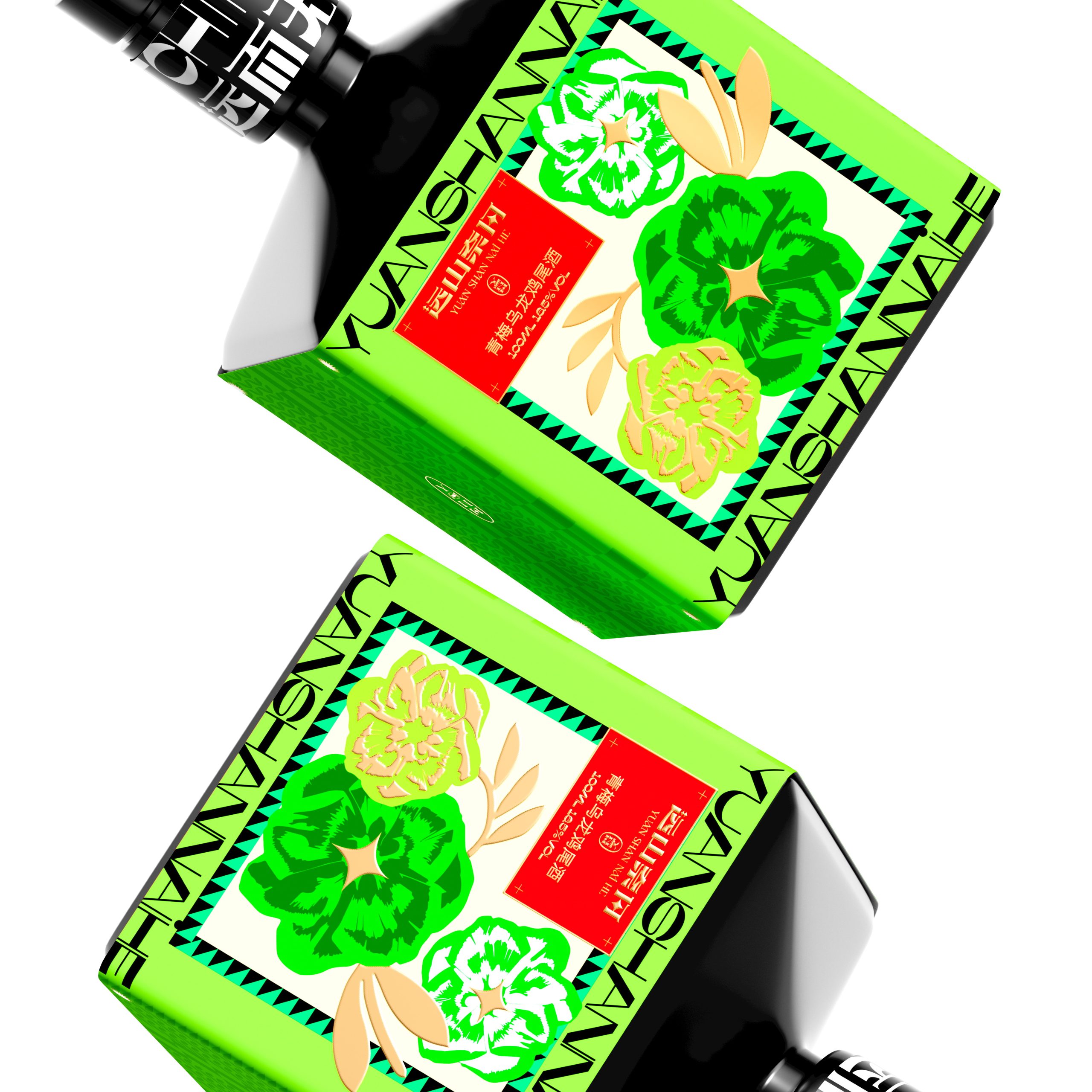
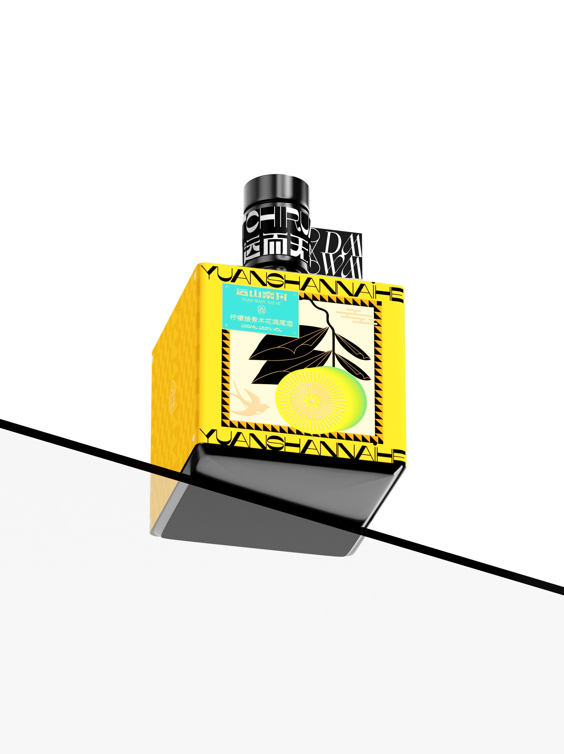
Yuan Shan Nai He’s cocktail packaging strikes a confident balance between classical Chinese aesthetics and contemporary graphic boldness. Each bottle in the series is wrapped in a vivid color-blocked label — red, lime green, yellow, and purple — that serves as both a flavor cue and a visual identity marker across the range.
The label artwork draws from traditional Chinese motifs: chrysanthemums, cranes, irises, and ginkgo, rendered in a flat, illustrative style that feels rooted in heritage yet unmistakably modern. Framing these illustrations is a dense typographic band running the full perimeter of the bottle, mixing Latin and Chinese characters in a high-contrast, condensed typeface that gives the packaging an almost editorial energy.
The matte black bottle body grounds the composition, preventing the saturated labels from tipping into chaos. As a collection, the four variants feel cohesive yet distinct — unified by a shared design language but individually expressive. It’s packaging that understands its audience: design-literate drinkers who appreciate craft with cultural depth.






 NEV
NEV Stefano Bracci
 Alina
Alina monther al omari
 Lizakjx
 JOAOMARCOSDESIGN
 alchimistestudioParis
 Harriet Neild
 octavio rojo
 宏洛图品牌设计HONGLT
 DESIGN CONCEPTS
 Alexander Skurihin
 Studio K95
 ARMBRAND
 Richa Rai
 houseoferas by Miti
 Agence des Coteaux
 Kushi Eaknath
 Ann Treasa
 Xiao Ning
 krrrrrllii
 babyage
 Deep
Deep