Design: Getbrand
Location: Russia
Project Type: Produced
Client: Stoilenskaya Niva
Product Launch Location: Russia
Packaging Contents: Flour
Packaging Substrate / Materials: Paper
About the project
Stoilenskaya Niva company occupies one of the leading positions in the production of flour and bakery products. Grain processing and production complexes are located at 16 enterprises. The enterprises are located in 9 regions of the Russian Federation – mainly in the European part. The company is one of the three leaders in production on the Russian market. The complex for the production of flour and animal feed includes three enterprises. Production capacity: 435 thousand tons of flour and 250 thousand tons of compound feed per year. Flour production is closely monitored at every stage. For the production of flour, grain of the best quality is purchased. The products receive awards at the annual international competitions. Stoilenskaya Niva flour mills are multiple holders of the title of “The Best Mill of Russia”.Task
The Stoilenskaya Niva company commissioned us to do the redesign of the Starooskolskaya flour brand and set the following tasks:
- Update the visual layer: make it more modern, strengthen the sign in the logo
- Develop a conversional layer
- Develop the design of the back side
- Adapt the design to the pasta category.
Solution
The flour packaging design looked rather outdated and had a number of disadvantages. Our audit «Three Layers of Efficiency», showed that while the design was visible on the shelf with the blue stripes accents and the mill sign, the package was far from unique. Family caricature in the packaging center in the center of the packaging made the product cheaper and less credible.The contextual layer was done well – the product category was well defined, but the information content of the packaging had to be worked out. There was no conversion – there was no USP, there were no brand values. The design did not convey the high quality of the product.
The overall efficiency was 35%. For us, this graphic with layers is a kind of roadmap that helps to see in which direction we need to move, where are the growth points and how to refine each layer.
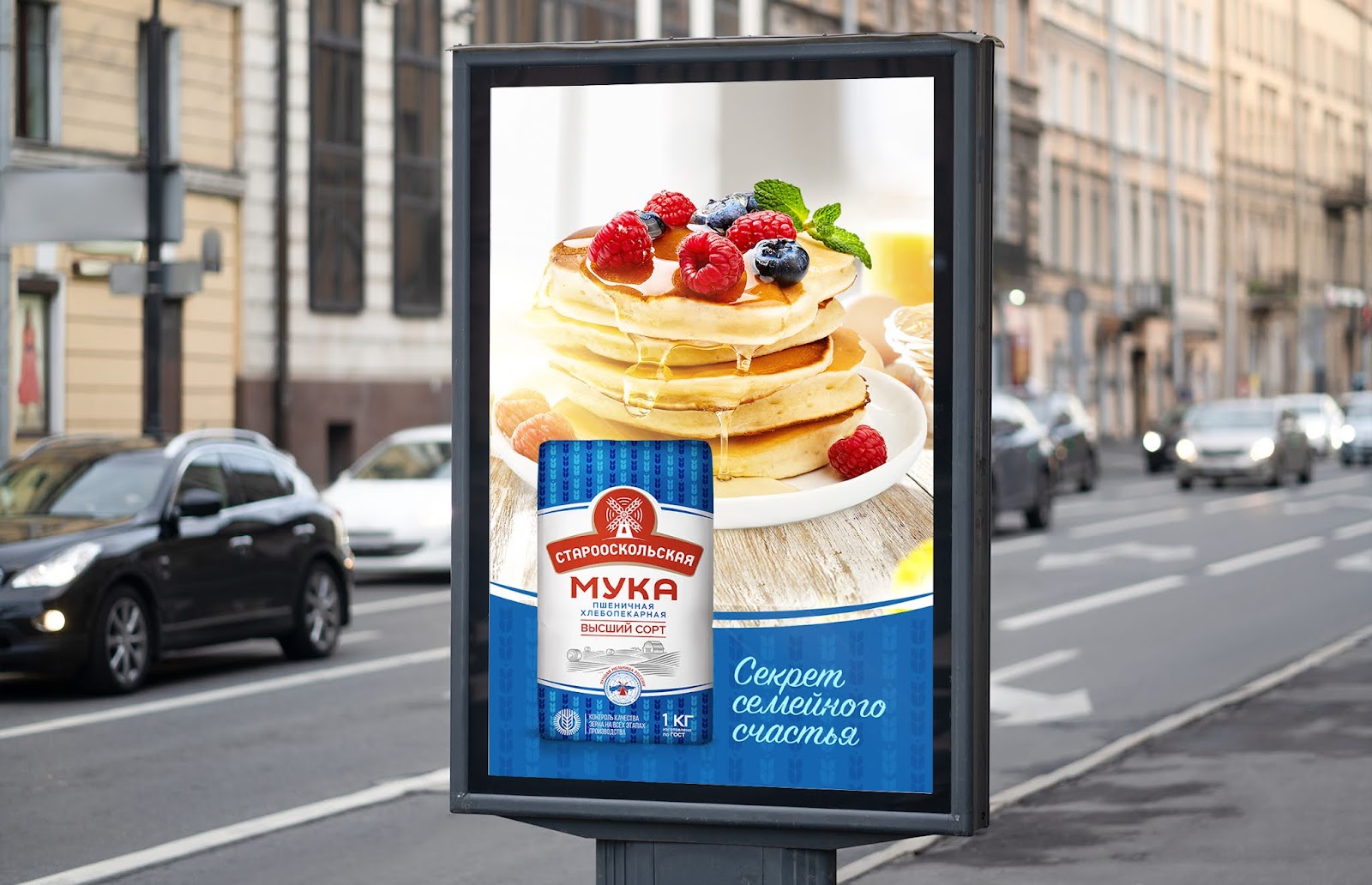
The new design was created on the basis of the current one, since we did not want to change the image of flour much, so as not to scare away loyal customers. Our task was to make it more visible and familiar. We have enhanced the image of the mill on a red background by combining it with the Starooskolskaya logo. Instead of caricatures, engravings of a farm, village, harvested field and sheaves appeared. We choose the same architecture – blue bottom and top, white center, accent in the form of a red logo. At the bottom of the package, we added a symbolic image of the globe with a mill, on which we wrote “the best mill in Russia” and claim “Grain quality control at all stages of production” to show the responsibility and seriousness of the manufacturer.
On the back side, we talked about the quality of grain control, which go through 4 stages of control “from field to plant” and focused on the functional characteristics of the product, revealing its culinary properties, as well as recommendations for use and preparation.
An important strategy was not to lose current buyers, but to acquire new ones. Sales continue to grow steadily, which indicates that we have coped with the task.