The field, a deep shade of green. It is open (honest), contrasting and ethnic. The outline is reminiscent of the same rounded margins of the former logo, which have become iconic for us.
Why didn’t we make the two ‘F’ and ‘M’ symbols bigger?
They are conspicuous and from another area, which is irrelevant to us. We got around this by adopting the first particle ‘fresh’ and emphasising the freshness of the product rather than the fact that it is a market.
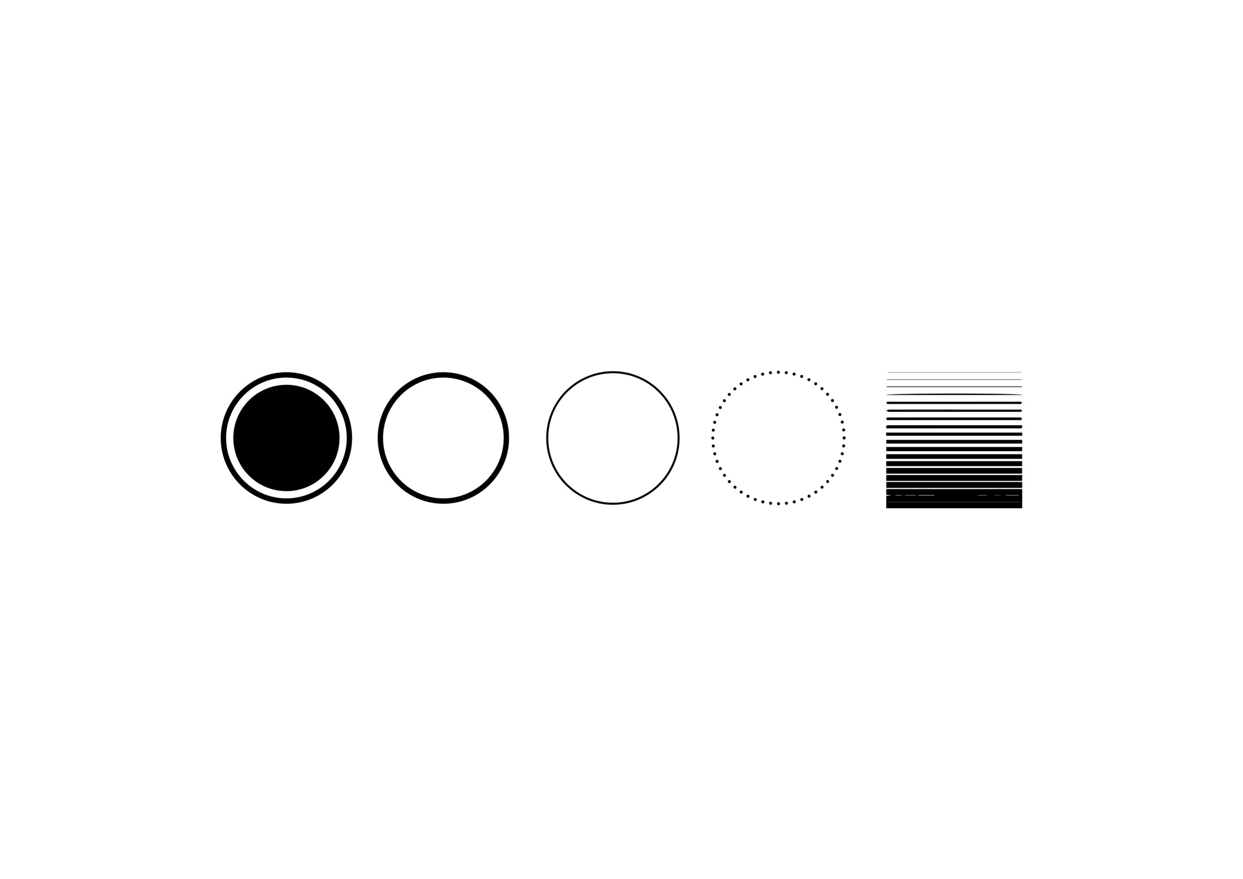
Circle. It appears as the outline and boundaries of an existing logo. Radial shapes are everywhere, in all elements of the internal composition.
The circle itself is the shape of the planet, which in macro space, globally, touches on many exciting environmental themes. The Earth is our planet and is the primary source of our mode of nourishment.
The key idea behind the existing logo is that what grows from the earth is the credo and essence of the Freshmart brand. This same circle symbol is any fruit, any vegetable in a cut.
We are not afraid to show what’s inside because we are confident that we are good on the outside as well as the inside. The sign also reflects the element of the product’s delivery radius.
The leather, its facets, the shape of the planet, the radius of delivery, and, importantly, the direct translation of the key word in the new concept, encyclopedia, to take responsibility for becoming a source of knowledge, from the Greek for ‘learning in the full circle’.
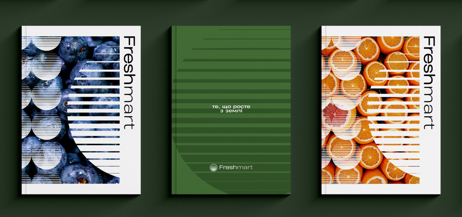
We dilute all this with horizontal lines that disperse and symbolise the product that has grown from the soil itself, from the earth. A stylization of the look of a farmer’s field with straight rows of beds.
The hue itself is called “the colour of the fern”, which symbolically reinforces its position. White is the basis for reproducing all specific volumes of information. It is mainly used for advertising purposes, corporate literature, business documents and website.
Outdoor advertising is large-scale and the main focus is on the key communication exact slogans that will resonate. The logo, the field of activity, i.e. the descriptor and most importantly, what the potential customer wants to see – something new, from a new angle. A clean white background enhances the truthful composition. If this is complemented with a circle symbol, we bring the pieces of one element together, bringing it to the forefront of the monochrome composition. One of the most important roles in building a quality product presentation on the basis of the updated design the company’s emphasis on product photography. Footnotes, details, and a play with typography are key elements of the digital space.