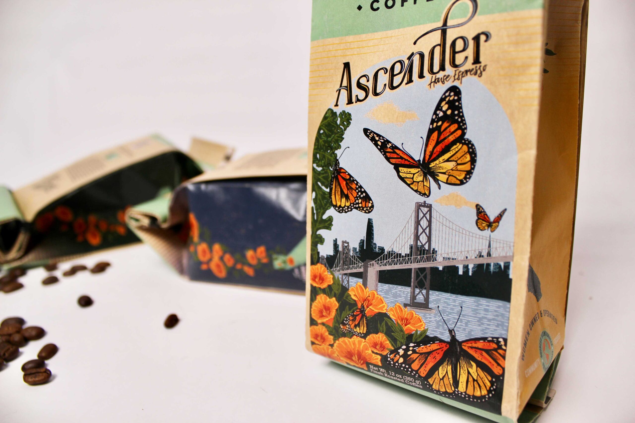
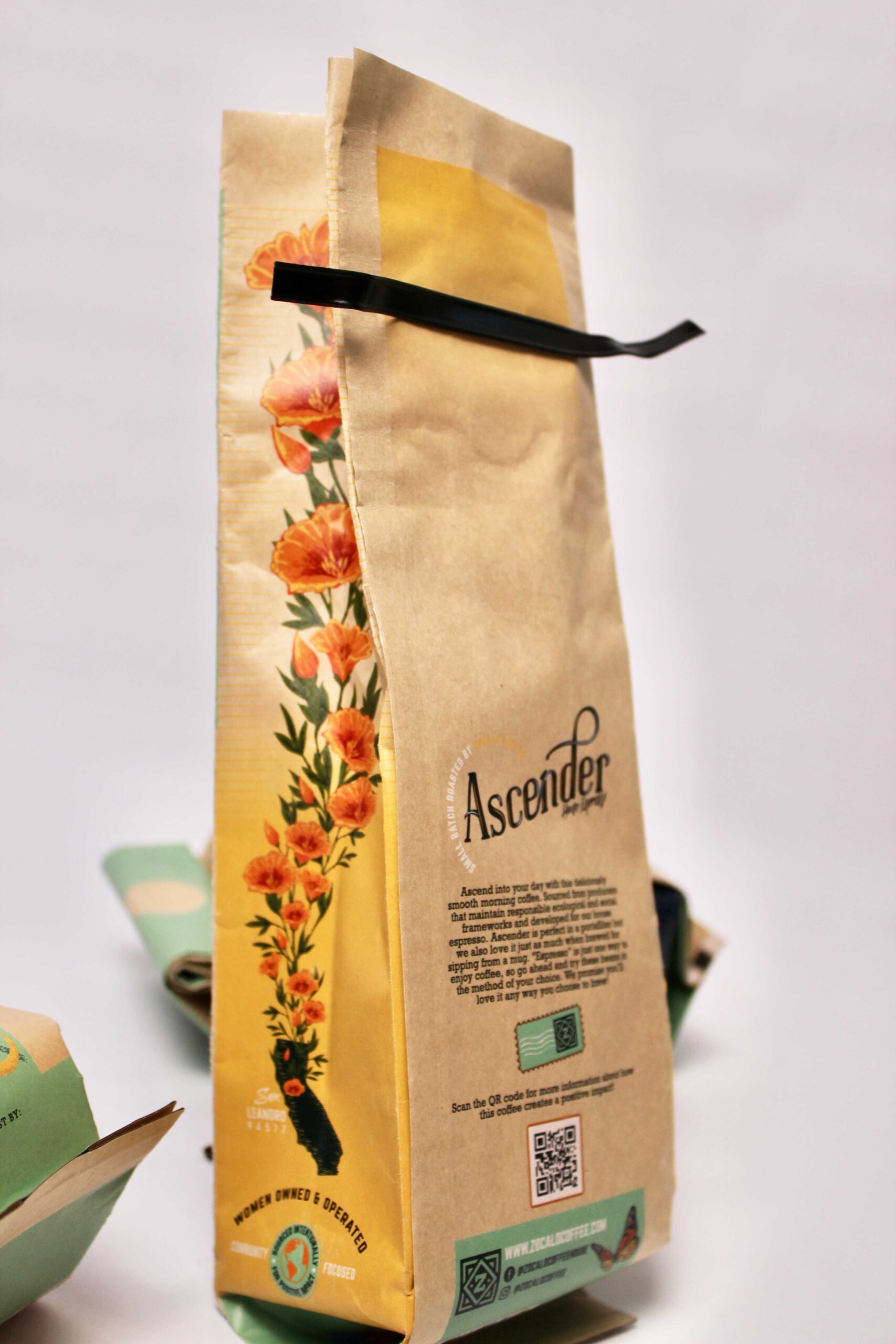
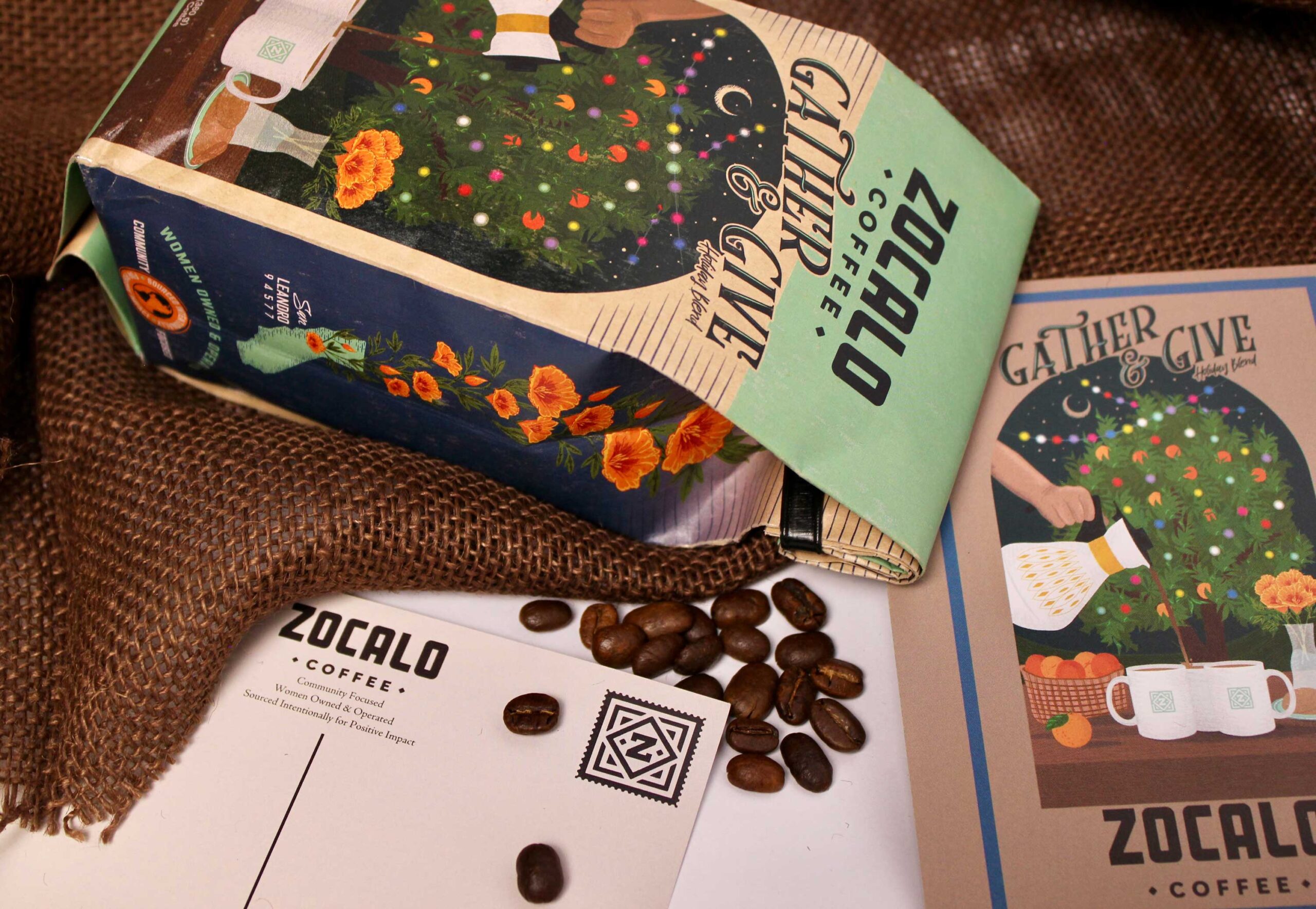
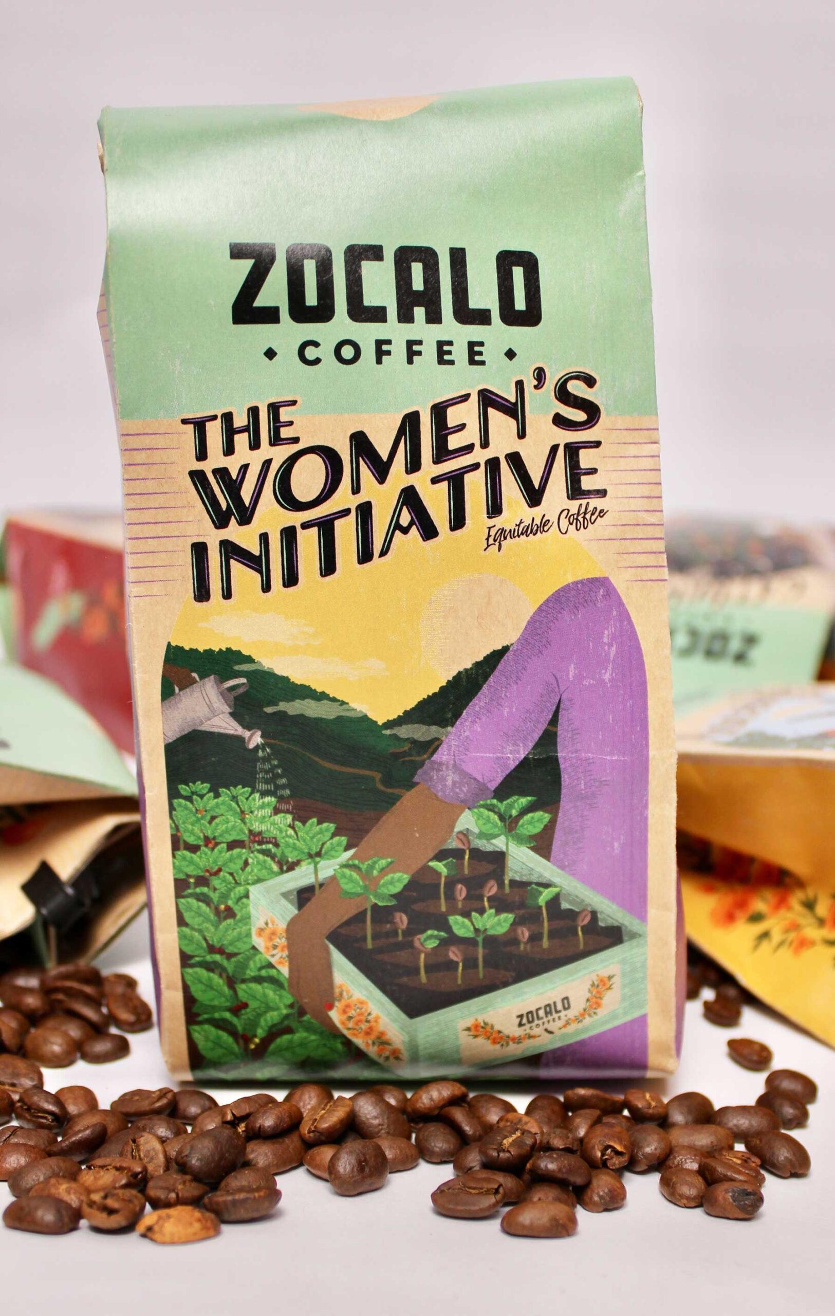
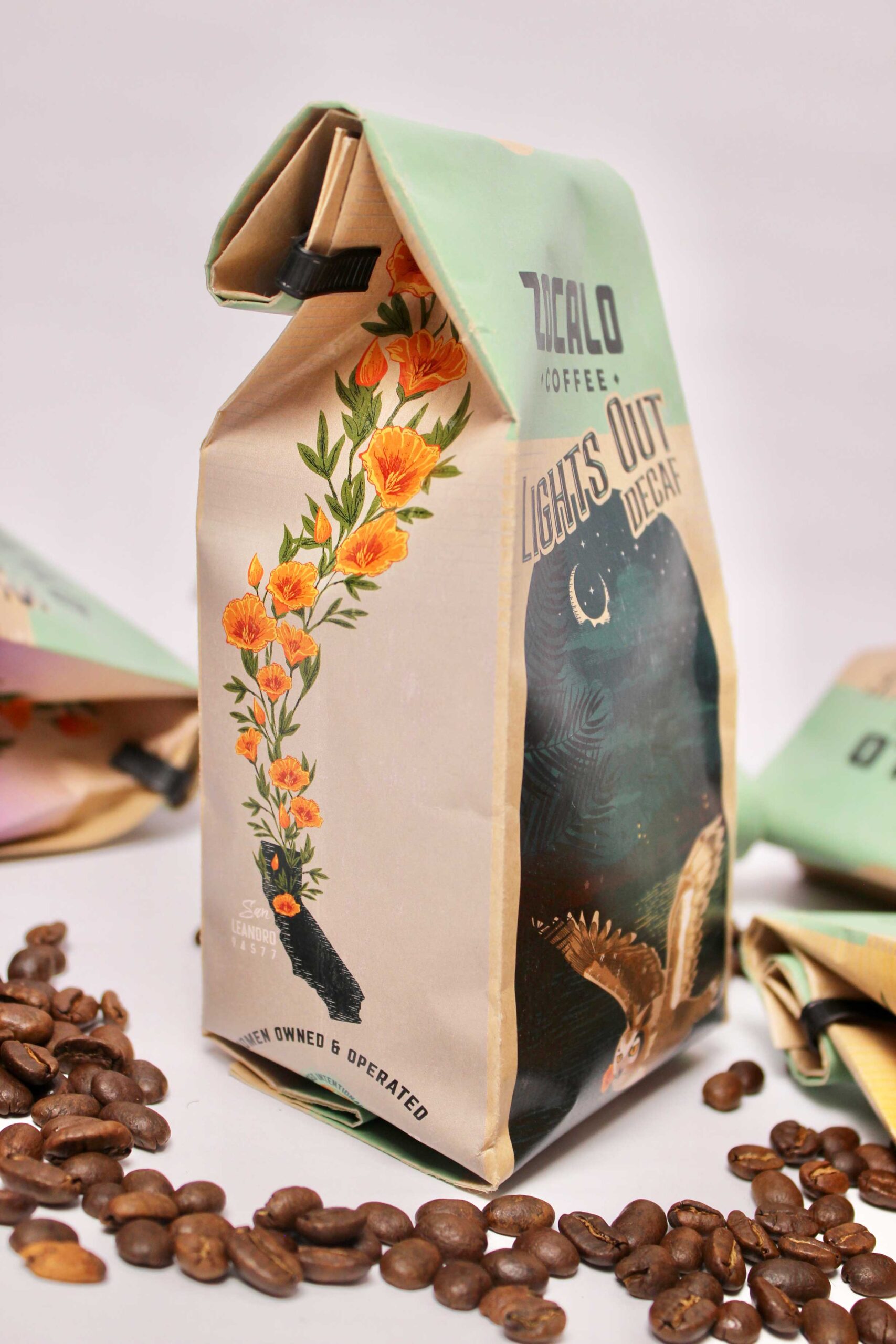
Zocalo Coffee came to us wanting an elevated look for their coffee beans that represented their hometown and their values – all while evoking a nostalgic and vintage feel. So, we did just that! We redesigned their series of six compostable 12 oz coffee bean bags. Each bag has a custom unique illustration and wordmark respective to that particular roast.
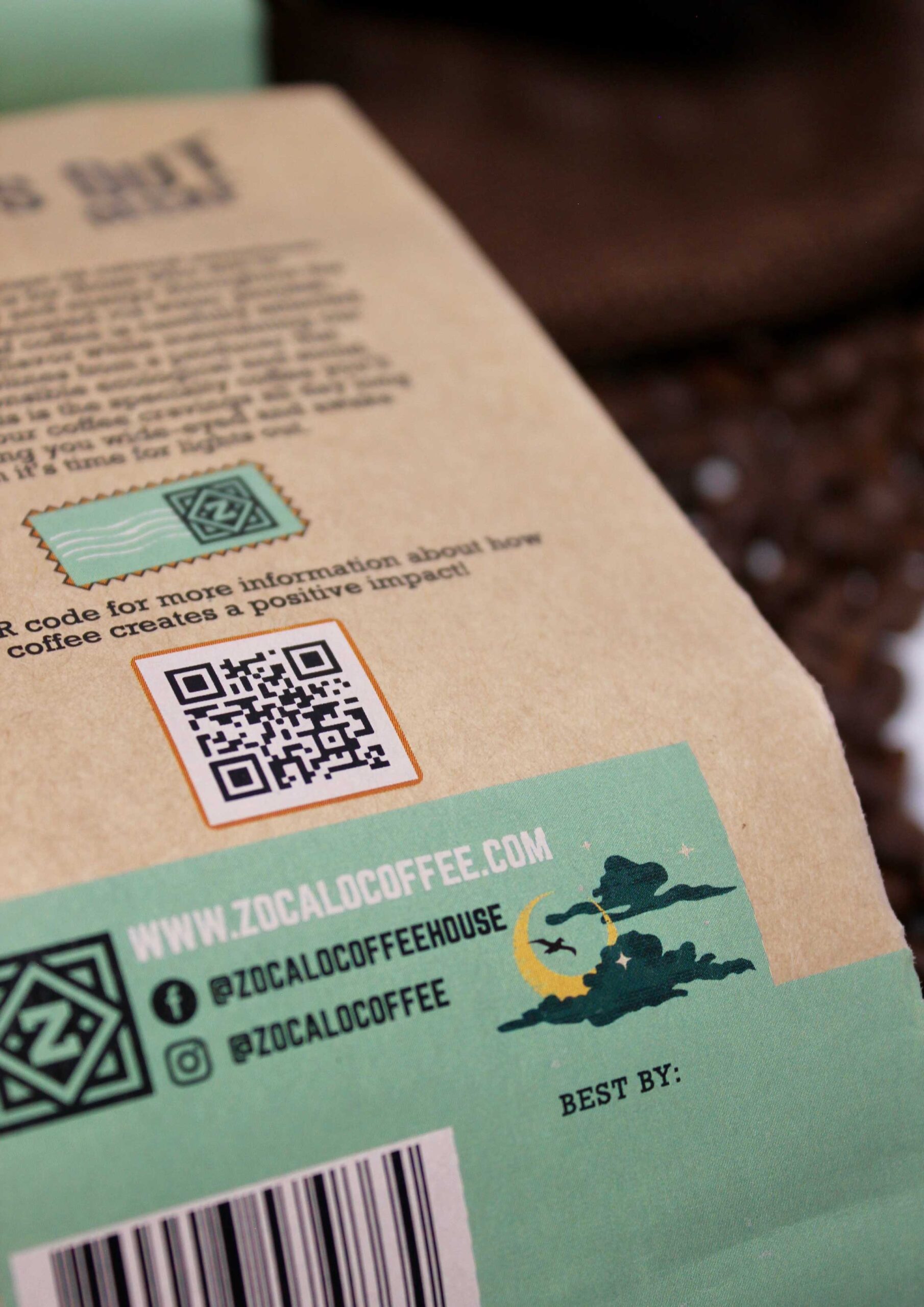
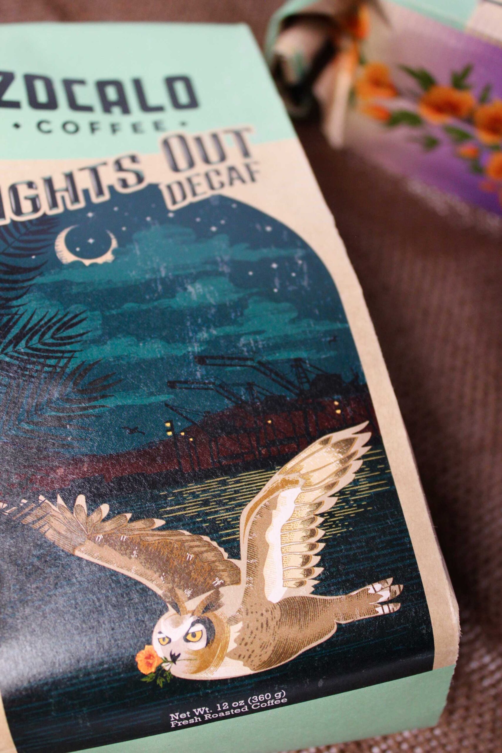
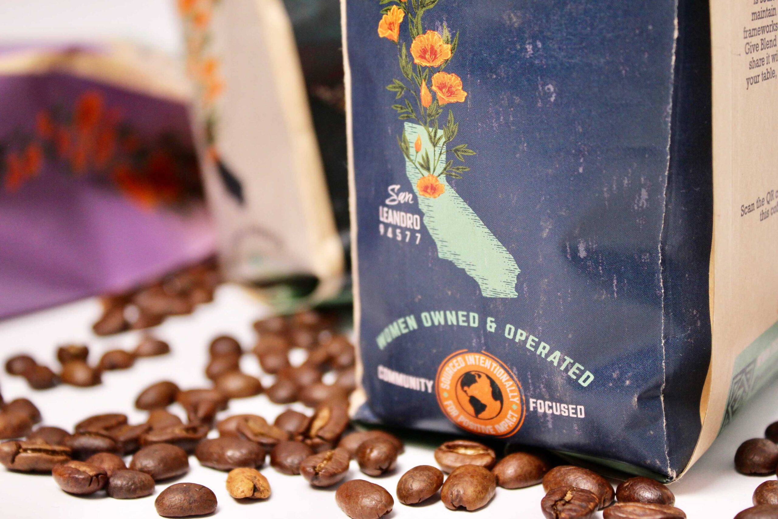
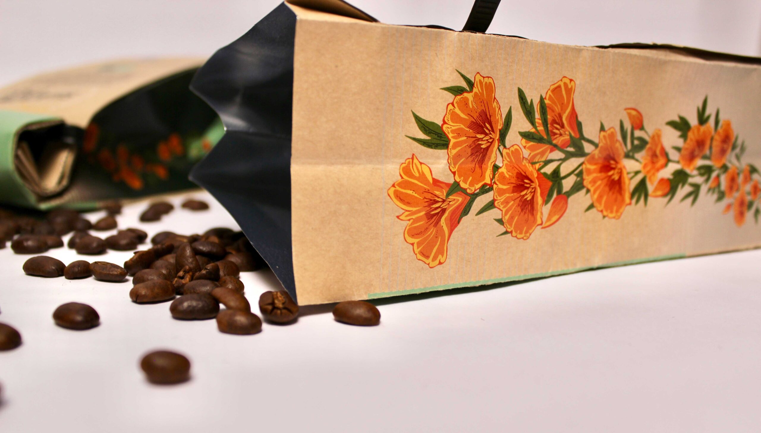
We carried over the arched window shape from Zocalo’s Craft Coffee cans and made every bag illustration fit within that same frame. They all have a single ‘punched out’ element within their illustration where there is no ink printed and the tan color of the Kraft bag material shows through, helping to create multiple points of interest. We illustrated California Poppies to be subtly featured throughout every bag’s design and to grow up the side of each bag as a nod to the state of California where Zocalo Coffee has their storefront and roasting facility. Each roast has a differing color gradient featured on the sides while overall maintaining the same composition and layout throughout the entire series.
Ascender: We chose to keep the Monarch butterfly imagery from the original Ascender label, but we elevated it even more by adding a lot of regional and meaningful detail. The Bay Bridge spans across the water while the San Francisco skyline is visible in the background. Valley Oak leaves sneak up the side as another tribute to California.
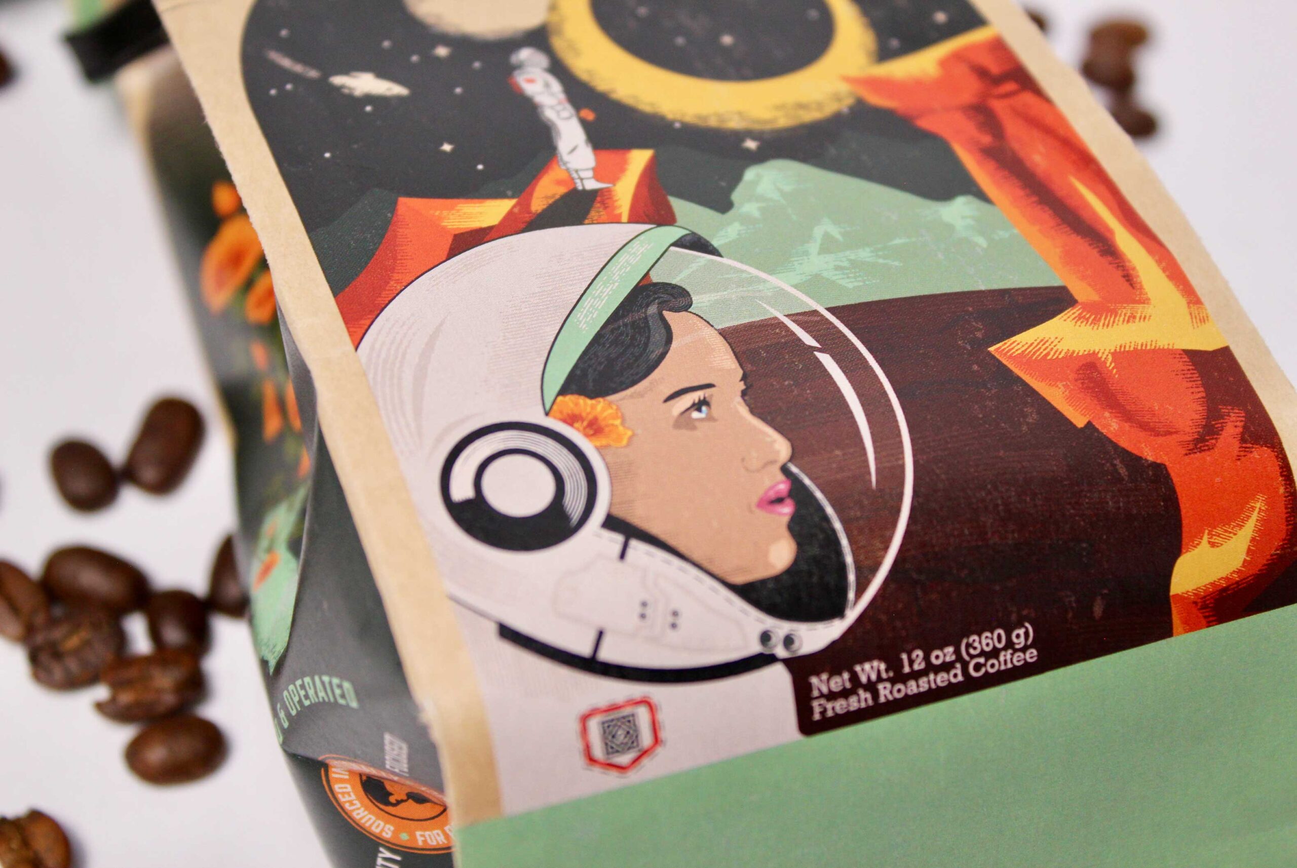
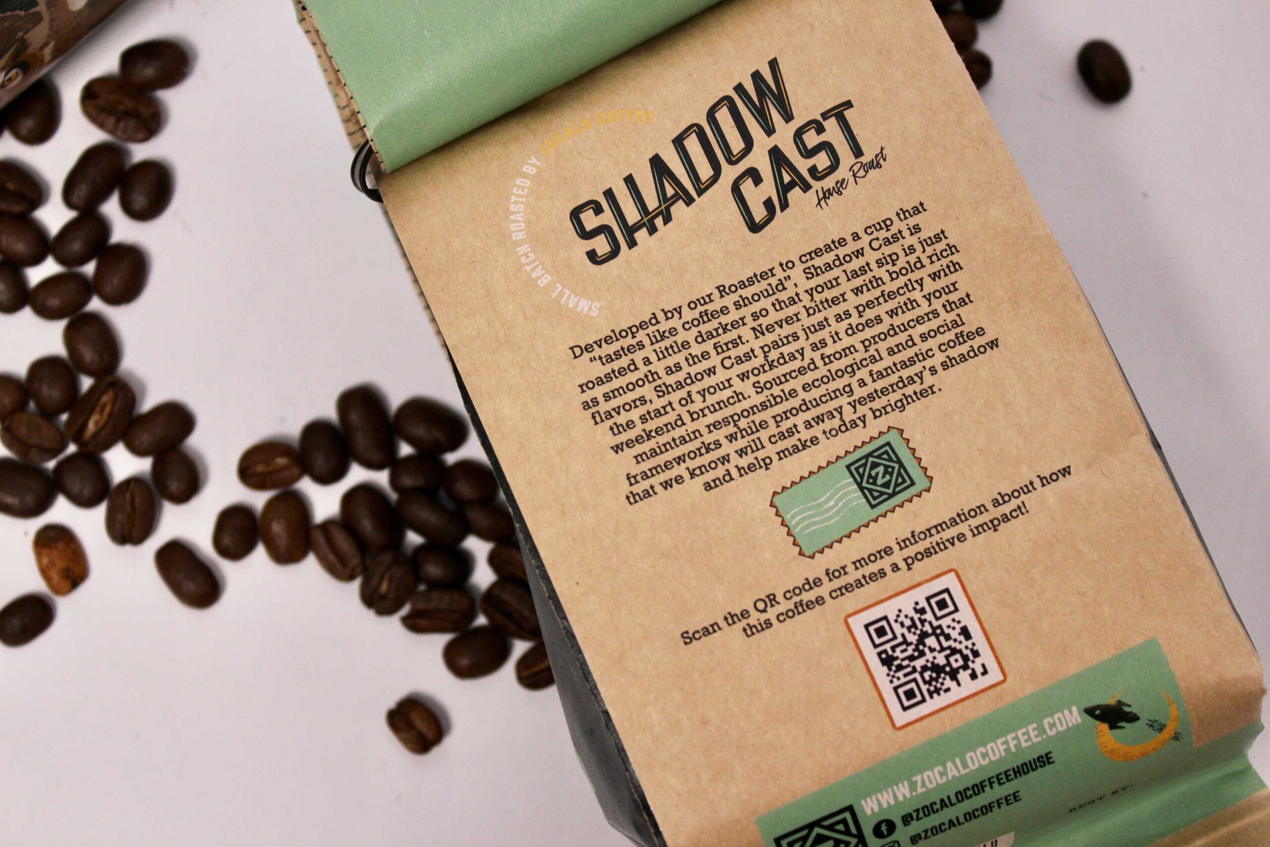
Shadow Cast: Shadow Cast is Zocalo’s house roast and features a woman astronaut to represent this woman-owned and operated business. Zocalo Coffee wanted a space theme for this label, so we illustrated a whole other planet to make it look like an old vintage space poster.
Flourish: Keeping with the same direction as the original Flourish label, we illustrated California Poppies intertwined with a coffee plant to represent both coffee communities across the world simultaneously thriving when working together. You can see the different life stages of the coffee ‘cherries’ as the producer picks them while the rolling Northern California hills are featured in the background.
The Women’s Initiative: This label is a nod to women-owned coffee farms and cooperatives as these beans are selected only from them. We chose to portray a woman owned coffee nursery where you can see the life stages as the beans are sprouting, representing new opportunities for women.
Lights Out: Zocalo’s decaf roast is represented by a great horned owl carrying a California Poppy through the night sky. The Oakland skyline is just visible and features Port of Oakland’s massive cranes. This label is another one within this series that displays all regional features.
Gather & Give: This particular roast is Zocalo’s holiday blend. The word Zocalo means town square or the center of the community. For this reason we designed a scene where friends or family have gathered and are sharing within each other’s company. Oranges bloom during the winter months in California so we have those represented in this festive scene as well.