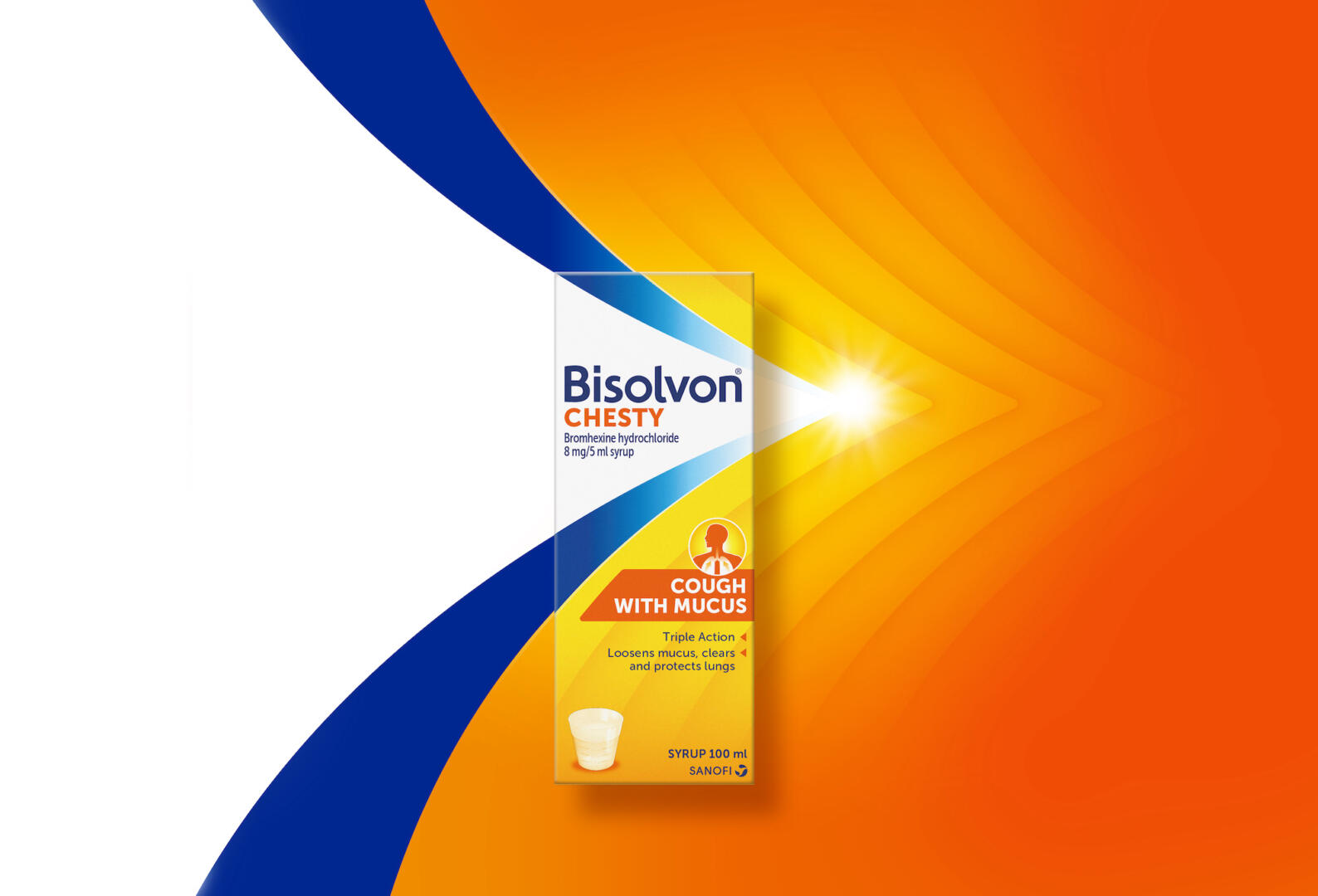
Creative agency Free The Birds reveals its latest project with global healthcare company, Sanofi, including a transformative brand identity and packaging refresh for the lead global cough products Mucosolvan and Bisolvon. It is the latest in a long line of creative projects from Free The Birds, which in recent years has established itself as a design expert in the field of healthcare.
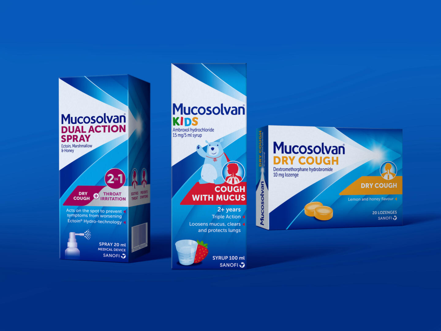
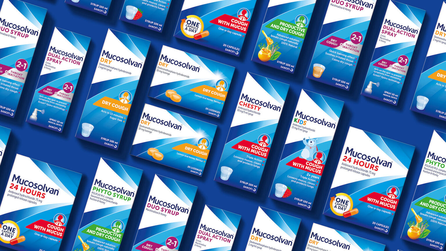
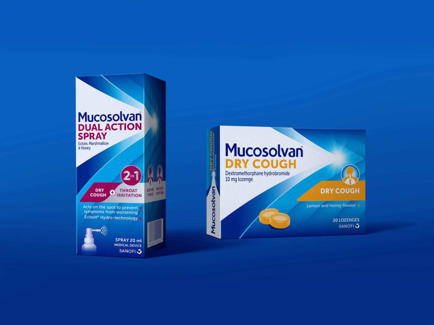
Already distributed in 5 markets including Australia, Netherlands, Turkey, Russia and Philippines – with further launches in Africa, Europe and South America this year – Free The Birds has aligned Sanofi’s world class cough brands, Mucosolvan and Bisolvon, under one brand world. Revising typography, iconography and layout, ensured both product ranges are easily and universally recognised on pharmacy shelves. The new design also serves to better communicate the efficacy and purpose of the product, to aid pharmacist and customer decision making.
Nick Vaus, Partner and Creative Director at Free The Birds stated: “We wanted to create a commonality in the packaging across all the regions, in order to ensure people identified them as Sanofi brands straight away, no matter the location.”
Underpinning this sense of familiarity is the brands’ heritage colours of blue and yellow, which have been extended across all the packs. The decorative curvatures of the original packaging design have been transformed into a multi-layered arrow to illustrate the quick recovery process that the cough treatment offers.
To further drive recognition, Free The Birds introduced Bearsolvan, the playful bear character, to all children’s packs. This, along with the rest of the updated design has since been absorbed into Sanofi’s broader marketing mix, appearing in Sanofi’s 2022 TV advertising campaign “Don’t Hide The Cough, Fight It.”.
“The trend for healthcare brands is to retain a clinical exterior. But Sanofi is an established caregiver known for easing suffering from colds and coughs, which is what we aimed to encapsulate through Bearsolvan.” Nick Vaus, Partner and Creative Director at Free The Birds added.
More prevalent efficacy messaging and clearer symptomatic call outs on the front of the packs help customers understand the category, brand and benefit quickly. Visual icons such as a cup, tablet, and spray now indicate the form of the medicine, while pieces of fruit indicate flavour.
Sara Jones, Partner and Client Services Director at Free The Birds said: “Sanofi is a formidable healthcare leader, and we wanted to ensure this was reflected in the packaging of its cough treatment range. This task was a brilliant challenge, and we’re excited to see the global rollout of the design.”
Gladys Peters, General Manager, Australia & New Zealand at Sanofi Consumer Healthcare commented: “Free The Birds successfully provided the brand unification and stand out we were looking for. The contemporary design – particularly the unmissable yellow – stands out like sunshine on the shelf. The new design also does a fantastic job of showcasing our products’ efficacy, and highlighting our expertise and heritage of trust across all our markets. You will see the rollout of the new design in The Netherlands, Spain, Australia, and further Europe and APAC regions very soon.”
The new brand identity and packaging design will also be implemented across the brand’s website and social media communications.